Friday, December 24, 2010

Biographical note


I was hit by a bus yesterday.

Something I definitely could live without. But it's holiday time so I'll try to be optimistic and repeat to my self: “Una desgracia con suerte” (words of wisdom by Belen, a friend of mine).


Tuesday, December 21, 2010

Assorted links on Spatial Segregation


  • Post: On sputtering integration in Toronto (by Demography Matters)

  • Demographic Buffet: explore data from the Census Bureau's American Community Survey at the block level: race and ethnicity, income, education, and housing and families. (by the NY via FlowingData)

  • Article: Blacks and Hispanics Take Different Segregation Paths (by Brookings).
    - Segregation Data: Download segregation measures for U.S. states and the 100 largest metropolitan areas

  • extra link: US Census 2010 - first data release. (via Urbanophile)
    - Presentation
    - The data!


Friday, December 17, 2010

The rise and fall of Urban Sociology (?)


Google has scanned 15 million books originally published from 1800 on. And they have also developed the Google Books Ngram Viewer. It's a tool that charts the usage of any word over time in literature and other books (Google books database). One could irresponsibly use it as a proxy for the popularity of words in literature. And I did!


This chart above shows how often "Urban Sociology" has appeared in the literature (Google database - english literature only) since 1800. It looks to me that the Chicago School have had played an important role in the rising 'popularity' of Urban Sociology*. And it looks that Urban Sociology is not as 'popular' as it used to be....

*obviously, it would be necessary to scrutinize other keywords to conclude this (such as the major researchers in the first Chicago School)


And here are some queries of other keywords of interest:

And my favorites:

Traffic Jam:


Urban sprawl, compact city, smart city, smart growth, compact growth, New Urbanism.


Thanks Vinicius Netto for the tip!

Thursday, December 16, 2010

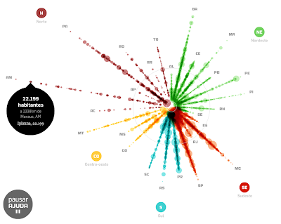
Population dispersion infographic

This infographic shows the municipalities population distribution in relation to the distance from the capitals of Brazilian states (preliminary data from Census 2010)*.

Move the mouse over the points /stantes/regions to explore them. You can also click and drag the outer circle to calculate how many live in a range of (i.g.) 300 km from the capitals.

Thanks Prof. Romulo Krafta for the tip.

*It's a peculiar way to visualize urban hierarchy as well.

(By Carlos Lemos via Estadão)

Monday, December 13, 2010

off-topic: Top Pictures of 2010

If you are not really in the mood for work: You might like these very good pictures of 2010 - Part 1 and Part 2. I do not have enough adjectives to describe 2010 but the pictures help a little.

ps. and don't forget to listen to Stan Getz on the right.

(Photo by Fabrizio Bensch/ REUTERS)

Friday, December 10, 2010

You get all the data you can eat!

(picture by Matthias Tunger via Gettyimages)


The Technology Review (a blog published by MIT) posted a list of The 70 Online Databases that Define Our Planet (the original list was done by Helbing and Balietti)*.
So I picked up a few of them that would fit the research interests of this blog authors (me and you all):


Metropolitan Travel Survey Archive
The Metropolitan Travel Survey Archive to store, preserve, and make publicly available, via the Internet, travel surveys conducted by metropolitan areas, states and localities.

National Household Travel Survey
The National Household Travel Survey (NHTS) collect data on both long-distance and local travel by the American public. The joint survey gathers trip-related data such as mode of transportation, duration, distance and purpose of trip. It also gathers demographic, geographic, and economic data for analysis purposes. It is part of RITA.


Large collection of datasets covering economics, demographics. Extractions are freely available, full access requires subscription.

OpenStreetMap
OpenStreetMap (by UCL) is a free editable map of the whole world. OpenStreetMap allows you to view, edit and use geographical data in a collaborative way from anywhere on Earth.

Gapminder Data
Gapminder is a popular technology and Web application for cross-visualisation of trends in time series of data. It also opens an archive of multiple datasets on diverse socio-economic indicators.


* ps. It’s awkward that they didn’t mentioned the UN Population Prospects nor The Human Mortality Database.

Sunday, December 5, 2010

Dubai Urbanization (1973-2006)

No wonder Dubai is known as The Sudden City.


Source: NASA images created by Jesse Allen, Earth Observatory, using data provided by Laura Rocchio, Landsat Project Science Office.


The town of Dubai first conducted a census in 1968 (with approximately 59,971 inhabitants then). The city reached a population of 183 thousand in 1975. According to the Statistics Centre of Dubai, the population of the emirate is estimated to be over 1,800,000 as of 2010. (Active Population During the Day: 2,885,459 !) Persistent strong population growth. Do the math!


Photo Credit: Miragestudio7.


And here is a beautiful Timelapse video of Dubai: Sky.

Thursday, December 2, 2010

Brazilian Census 2010: first results

This 4-minute video shows Luiz de Oliveira (from IBGE) talking about the preliminary results of the 2010 Brazilian Census (Population growth rate, Fertility rates, urbanization, regional disparities and migration).
(unfortunately the video is available in portuguese only)

Not so exciting as Hans Rosling, but still interesting.

Thanks to (o)ecocidades.

Tuesday, November 30, 2010

Just in case you haven't met him yet

Hans Rosling presenting the last 200 years of world development history (truly ablaze).

(Thanks to flowingdata)

Monday, November 29, 2010

Global Dependency Explorer

This is a very noteworthy project that everyone interested in Urban Networks and Urban Systems should take a look at.

It's an interactive application that tracks the commercial ties between most countries across the globe (check it here). It also allows you to compare a variety of socio, demographic and economic indicators on the national level.

It was developed at the University of Amsterdam and it uses data from the CIA World Factbook.

Monday, November 22, 2010

Demographic trends shaping US metropolitan areas


This is a video report by the Brookings Institution on the demographic trends that have affected US metropolitan areas in the 2000s. The study focuses on the metro scale and stresses five demographic trends that are currently undergoing in the US:

  1. Growing fast
  2. Diversifying rapidly
  3. Aging Tsunami
  4. Selectively educating
  5. Divided by income

The video is realy good and the Full Report looks even better. "The State of Metropolitan America: on the front lines of demographic transformation" Download it here.

ps. You can also explore data for the US 100 metro areas and 50 states (State of Metropolitan America Indicator Map).

ps2. I wonder when we are going to see a report like this on Brazil Demographics...

Wednesday, November 17, 2010

NeW! 'Stupid Measures' session: the Trick-or-Treat Index

(picture by Melissa M'Lou)

Ok. I'm now officialy creating a new session here at Urban Demographics Blog. It's called Stupid Measures*. The idea is to highlight measures and indexes constructed in a stupid way or that are simply worthless.


This is the case of the Trick-or-Treat Index developed by the controversial Richard Florida. This is the index well explained by Lauren Kelley:

"The index is based on five criteria: the percentage of children ages 5 to 14, for obvious reasons; median household income, because more money = more candy; the share of people who walk to work, because it’s easier to trick-or-treat in neighborhoods that are walkable; population density, which tells you where there are the most people around to fork over candy corn; and the prevalence of artists, designers and other cultural creatives, since those types tend to get more into the Halloween spirit"

Interesting, right? But still (stupid) worthless.... More about the the Trick-or-Treat Index here. This map below shows the Trick-or-Treat Index calculated for every major U.S. metro area.

*The Stupid Measures session was unofficially inaugurated with the iPod Index on 18th August, 2010.

(hat tip to Tyler Cowen)

Tuesday, November 16, 2010

Defining generational cohorts


How to define generational cohorts? The guys from US Today came up with this "generational quiz". It takes just 5 quick questions and it's pretty good (although I'm not sure if its going to help you with your next paper).

"The year you were born partly determines what generation you belong to, but so do your cultural experiences." It identifies 6 different generations: G.I, Silent, Boomer, 'X' (a.k.a. Savvy), Milenial and 'Z'.

ps. I would belong to the Milenial Generation because of my birth year... but it looks like I'm a 'X' according to the quiz result....

Thursday, November 11, 2010

Assorted links

  1. Half the world’s population lives in 6 countries (via Visualizing Economics).

  2. Google maps suggestions for low carbon travels in Europe.

  3. Average age of US Congress over time (via FlowingData).

  4. How immigrants create jobs (a pretty interesting article by Tyler Cowen Via Marginal Revolution), and another article on this here (by Catherine Rampell-NYT).

  5. A selection of 75 videos about cities and urban policies (via Ciudades a Escala Humana). I, myself, would include this taxi traffic visualization presented by BBC (series Britain From Above)

Monday, November 8, 2010

Thursday, November 4, 2010

Social Geography of Votes in Brazil

Now at the intraurban-scale: these maps show the Brazilian Election results* by electoral zones for São Paulo e Rio de Janeiro.

Nelson Rojas and Luiz Cesar Ribeiro (from Observatório das Metrópoles) discuss the social polarization over space that emerges from these election results (here, in portuguese). The main conclusions drawn by the authors is that:

  1. The maps of 2010 election results are very similar with the electoral map of 2006 - the last confrontation between the PSDB (right wing) and the PT (left wing); and

  2. In both cities PSDB clearly had more votes in the more affluent urban areas meanwhile PT had an overwhelming victory in the depressed urban areas.
[it looks to me that the "Social Geographies of Votes" at regional and intraurban scales are similar to some extent. As a rule PSDB has the preference of richer araes, PT has the preference of deprived ones]


* ps. update regarding the last post: this is the best map of Brazilian Election results by municipality. It's possible to filter results by GDP, homicide rate, % of population receiving Bolsa Família benefits, etc. (tip from a friend of mine: Mauro Oddo, the best storyteller).


    (maps by Estadão via Observatório das Metrópoles)

    Monday, November 1, 2010

    Brazilian Election results


    On January 1st Dilma Rousseff will become Brazil’s next president (our first female president!). As The Economist Magazine said: "[...] it was the poor and those in the less-developed northern regions who swung it her way. Richer and better-educated folk preferred Mr Serra, but Brazil has fewer of them." And they are not wrong.


    This interactive map shows the Brazilian election results in each municipality (by Folha de São Paulo).

    ps. Her victory speech analyzed by BBC here.

    Upcoming event: XIV National Meeting of ANPUR


    Upcoming event: XIV National Meeting of ANPUR. It's going to be held in Rio de Janeiro/Brazil (23 may to 27 may - 2011).

    Deadline for abstracts/proposals: 30 december 2011

    ANPUR is the Brazilian National Association of Graduate Schools and Research on Urban and Regional Planning. The motto of this year's Conference is: Who plans the territory? actors, arenas and strategies. [direct translation].

    Thursday, October 28, 2010

    Potential bridge: OSM and Space Syntax boring

    Jonathan Crowe came up with this video down here (via OpenGeoData). It's pretty impressive how collaborative people can get and share public datasets on streets information around the world. [This video here is more surprising though]

    Whenever I hear about the OpenStreetMap Project I can't help thinking about Space Syntax. Hand drawing an axial map is really boring and takes a lot of time too! The point is: Does anyone have any idea on how to convert OSM data to space syntax softwares?

    Thursday, October 21, 2010

    ALAP 2010, cultural changes and low fertility rates


    A friend of mine (Joice Melo Vieira) has just reminded me about the ALAP* conference. It's going to be held in Habana/Cuba (16 al 19 de noviembre de 2010). The motto of this year's Conference is "Condiciones y Transformaciones Culturales, Factores Económicos y Tendencias Demográficas en Latinoamerica" (Cultural Conditions and Changes, Economic and Demographic Trends in Latin America).

    About this I recommend the post "Philip Longman on global aging" at Demography Matters blog.

    The central argument presented by Longman (as I see it) is that low fertility rates are connected to cultural norms. What are the social/economic perceptions people in general have about raising a child? a burden? a gift? It's suggested that tackling subreplacement fertility will not go to far without a discussion about this.

    Ok, this is pretty obvious. It is not so obvious though how to deal with it. Economic incentives to child birth and raise don't seem to be effective enough to raise fertilty rates.

    *ALAP - Asociación Latino Americana de Población

    Monday, October 18, 2010

    How expensive is your city (iPod) ?


    The most expensive and richest cities in the world measured by the iPod index ! "And what the Hell is that?" you might ask. It's something similar to the "Big Mac Index" (but stupid).
    "The newly introduced iPod index measure how long an employee would have to work to be able to afford the Apple MP3 player." Here.

    Thursday, October 14, 2010

    Urban Pulse by UrbanMobs

    Visual representation of mobile phone activities (SMS, Roaming, Phone Calls, movements of mobile phones) in France, Spain, Poland and Romania - Presented by UrbanMobs.

    *It reminds me the BBC Series 'Britain From Above'.

    The video below shows the amount of SMS sent during New Year's Eve


    Urban mobs (sms - nuit du nouvel an 2009)
    Carregado por faberNovelTV. - Videos das ultimas descobertas cientificais.

    (Tip from Joy Till via Luciana da Silva Andrade)

    Wednesday, October 13, 2010

    Assorted links on Migration

    1. Immigrants Moving to the Suburbs in the US: migration from ethnic urban neighborhoods into the suburbs (via The Map Scroll)

    2. Migration driven by environmental change (by Matthew Kahn via DemographyMatters)

    3. Urban psychology”: examiningt how certain character traits vary across urban centers in the United States. Selective migration is only one hypothesis among others. (via Infrastructurist)

    4. Forced Migration: Visualizing international refugee flows (based on the annual UNHCR Refugee Report) - via FlowingData

    Tuesday, October 12, 2010

    Subways of the World at the same scale

    An interesting infographic comparing subway systems at the same scale. I'm sure this is not updated. Nevertheless, we don't have much to celebrate about Sao Paulo's subway system.


    ps. Radical Cartography has a similar page with more North American cities.

    Friday, October 8, 2010

    Fastest-growing cities

    Joel Kotkin wrote an article about the "The world's fastest-growing cities". It's an interesting piece seasoned with a bit of controversy*. If anyone gets interested in the case of Campinas/Brazil, I recommend this paper (here) from my colleagues at NEPO (Population Studies Center /UNICAMP). It makes clear that "Bigger often does not mean better".


    ps. The Metropolitan Area of Campinas is not growing that fast. Its population growth rate (average geometric rate of annual growth) from 2000 to 2009 was estimated as 1.90% with a declining trajectory.

    * E.g. "Overall, the populations of Europe's cities are growing at barely 1%, the lowest rate of any continent. With low birthrates and growing opposition to immigration, it seems unlikely that any European city will emerge as a bigger global player in 20 years than today."

    Thursday, October 7, 2010

    IBM CityOne - Gaming can make a better world

    Now back to virtual reality with a tip for the geeks interested in city simulators.

    Daniel Lippman (from Infrastructurist) pointed out that IBM has released its first “Smarter Planet” simulation game - called CityOne. It looks something like SimCity 3000, but more ecologically oriented and with much more detailed problems to tackle. Check the IBM CityOne Trailer.

    It made me believe that Gaming can make a better world. But just for few seconds....

    Sunday, October 3, 2010

    Time Lapse + Tilt Shift Brasília DF - Brazil

    The "Central Bus Station" of Brasília (DF - Brazil) captured in a pretty TimeLapse. (mandatory suggestion of my girlfriend! Thanks cute!)


    Thursday, September 30, 2010

    Out for vacation!

    Close to heaven! I will be out for vacation for like a week. (and I do not intend to check my emails!)

    Tuesday, September 28, 2010

    UN Demographic Manuals On-line

    Here is the link for the classical manuals and guides of demographic methods and techniques issued by the United Nations over a long period of time. It presents a series of 23 manual organized by thePopulation Division of the Department of Economic and Social Affairs of the United Nations Secretariat.


    Monday, September 27, 2010

    JTLU - Journal of Transport and Land Use

    The latest JTLU (Journal of Transport and Land Use) is on line with a special issue: Land Use-Transportation Modeling with UrbanSim. Some interesting papers!

    Wednesday, September 22, 2010

    off-topic: twitter Demographics

    twitter: I'm really not into it. But if you are, you can check some twitter Demographics. [viaUrbanTick]

    Tuesday, September 21, 2010

    DEMIG research project at Oxford

    The International Migration Institute (IMI) at the University of Oxford seeks to award two fully-funded DPhil studentships commencing 1 October 2011 for the ‘Determinants of International Migration’ (DEMIG) research project.

    Closing date for applications: 30 September 2010

    More information here.

    Race and ethnicity mapped

    Inspired by Bill Rankin’s Chicago Boundaries (2009), Eric Fischer mapped race and ethnicity for other 40 American cities! obs. Red is White, Blue is Black, Green is Asian, and Orange is Hispanic, and each dot is 25 people. Data from Census 2000.


    Washington DC


    Detroit


    Los Angeles
    (by Eric Fischer via FlowingData)