Wednesday, July 27, 2011

Phoenix (suburbs) urbanzation 1989 - 2009

These images (taken by NASA) show the urbanzation of Chandler (the fastest-growing satellite city on the outskirts of Phoenix).


ps. 1-  According to NASA: ""Chandler grew from just 3,799 residents in 1950 to 176,581 residents in 2000, based on 10-year census figures." That's an average population growth rate of 8% per year (over a fifty-year period!!!)

ps. 2 - Would you call it 'urban sprawl' ?


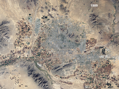
[Image credit: NASA Earth Observatory image created by Jesse Allen, using Landsat data provided by the United States Geological Survey. Caption by Michon Scott]


MORE posts on the Urban Evolution of VegasSão Paulo and  Dubai.

Saturday, July 23, 2011

Regional Disparities in Brazil

Daniel Brofen (a brazilian designer) came up with these distorted maps depicting regional disparities in Brazil (data from Brazilian Census 2010).


[Click on the chart to enlarge the image]

(via TRETA)


If you like this kind of map you should take a look at the experts: World Mapper and Views of the World.

Friday, July 22, 2011

Parking Rates Worldwide

Colliers International (a big real estate company) did an international survey on the cost of car parking. The results are presented in the chart below, which shows the monthly cost of parking rates. (via The Drunkeynesian)

What caught my attention:
  • Prices that are too low (in my almighty opinion of course): Bangkok , Delhi, Jakarta,Mumbai, Buenos Aires, Rio de Janeiro, Los Angeles, Seoul, São Paulo, San Diego, Santiago, Beijing, Mexico City, Istanbul and Atlanta.

  • Prices that are too high: _________.

Monthly Parking Rates Worldwide* (USD)


[Click on the chart to enlarge the image]

*Monthly unreserved median rates.

Wednesday, July 20, 2011

off-topic: Intellectual Freedom

Do you identify yourself with this? These guys know what they're talking about!


(shameless copied from Via Urban Planning Blog)

Monday, July 18, 2011

Assorted links on Migration

  1. Call for papers for the VII National Meeting on Migration (organized by the Brazilian Working Group on Migration) - Deadline for submission of abstracts: august 19th 2011 (thanks Ricardo Ojima for the tip)

  2. IBGE came up with a new publication on population movements in Brazil (portuguese version only)

  3. From selective migration to skill-selected migrants: rethinking visa policy in the USA (via Peter Gordon)

  4. On African immigration to Latin America

  5. Revealing the Immigration Patterns in the World via (infosthetics)


Thursday, July 14, 2011

Urban Mobility solutions

You have probably heard about congestion pricing before. Now you should know these 'new solutions' for urban mobility that deserve our attention:
  1. Loyalty mileage program for Public Transit. Great idea! (thanks Leo for the tip)

  2. Cash lotteries for off-peak commuters (here)

  3. Discard your car and get free public transit for life (via BBC Brasil)

    extra: This video presents another inventive although stupid idea*


*WARNING: This city is not advisable for people with labyrinthitis.

Wednesday, July 13, 2011

off-topic: child dream

I once wanted to be an astronaut instead I ended up being a sociologist and demographer.

This post is my tribute to NASA.

Monday, July 11, 2011

Contrasting Flickr and Twitter Locations

Erich Fisher came up with a new great visualization of web data. The maps highlight where people post geo-tagged photos to Flickr (red) from and geo-tagged tweets to Twitter from (blue), or both (white). (via Information Aesthetics)

What I like particularly about this kind of map is the way it unveils urban hierarchy.

USA
[all images credit: Erich Fisher] (via Information Aesthetics)

Europe
(via Information Aesthetics)

Could it tell us somthing about urban centrality?

NY

Rio de Janeiro

London

São Paulo

check out these other two “old” projects of him: tourists versus locals and the geographical distribution of racial and ethnic divides in cities around the world (originally inspired by Bill Rankin).

Assorted Links


[image credit:UrbanTick]

Friday, July 8, 2011

Evolving population pyramids

Jorge Camoes came up with this strange idea of an alternative way of representing population pyramids. Check it up!

Looking good!

[image credit: Jorge Camoes] (via Information Aesthetics)


I have tried something "similar". But it's not looking that good...

This chart shows the evolution of the population pyramid (Brazilian male engineers) from 2000 to 2020. Darker lines represent the earlier projection years*.

*That's the aging (and dying) process isolated. In a future post, I'll present the projection results including the trends in the number of graduated students every year.

Monday, July 4, 2011

Brazilian Census 2010: first results by census tract

IBGE released a few more results of the 2010 Brazilian Census by census tract! You can download the census tract shapefiles, some preliminary data (and more here). More information here. [portuguese only]

There are also some interactive maps and charts. You can check them out here.


[image credit: Yuri S Andrade]


[image credit: Yuri S Andrade]

[image credit: me, myself and I]