Thursday, July 30, 2015

Urban Picture

Embaba, Cairo (Egypt)
[Photo by: Karim Shafei] 

ps. I saw this via Telmo Ribeiro, who was my inspiring geography teacher at high school, by the way.

Wednesday, July 29, 2015

Drawing a Map from Pub Locations

There are roughly 29,000 pubs in Britain and Ireland on OpenStreetMap. Plot their locations and you will have a map to happiness  that is similar to the population density.

Monday, July 27, 2015

The Art of Communicating Science

Here is an important lesson to remember when communicating your research to a wide audience.

Dawkins has good point but I'm not sure this 'argument' is easily accepted by journal editors and reviewers .


Monday, July 20, 2015

How to Make Beautiful Charts With R and ggplot2

Some times, this is how I feel using R .


If that's the case for you as well, you might like this amazing post by Max Woolf showing how simple it is to make beautiful charts with R using ggplot2. You should check it out.


Friday, July 17, 2015

Wednesday, July 15, 2015

The world's largest megacity is larger than you think


If you want some academic publications on China's Pearl River Delta region, you can fin some interesting studies conducted by researchers from the Seto Lab on Urbanization and Global Change (Yale). I got this Time-Lapse from their website and it gives a glimpse of the fast  urbanization process of this region over the past decades. 


[image credit: IK's World Trip/Flickr]

Friday, July 10, 2015

ReDesigning the Global Map of Refugees

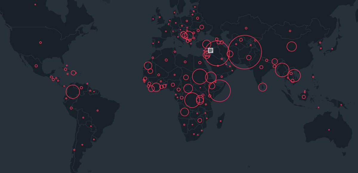
A couple of weeks ago, I wrote a post about the new UN annual report on forced migration and refugees and how the guys at the NYT (S.Peçanha and T.Wallace) did a great job in visualizing the data from the report. As a short update to that post, I would like to point out how the same dataset can be visualized in quite different ways. I highlight here only two other data visualization projects based on the same data set and which could be inspiring to other people working with flows data.

The first project is the Global Flows of Refugees, where Nikola Sander and Ramon Bauer have used interactive circular plots to explore refugee flows between countries, regions, etc. The plot is quite effective in showing how flow sizes and origin-destinations change from 2013 to 2014.


The second dataviz comes form the Refugee Project, which brings some geographical context and more historical information on forced migration year by year since 1975. It was designed by Ekene Ijeoma and the team at Hyperakt


Thursday, July 2, 2015

World Population Distributed by Latitude and Longitude

David Taylor and the team at CityMetric have recently posted a simple and effective chart to show that the population of Canada is not as north as we might think. This reminded me of a another map, that we posted almost five years ago ....

[image credit: David Taylor]


Bored of those traditional population maps, I've posted this inventive chart/map of the world population distributed by Latitude and Longitude. It was created in 2008 by Bill Rankin, who you might know from his website Radicalcartography.

[image credit: Bill Rankin]

The real-time city? Big data and smart urbanism

Professor Rob Kitchin is one the leading scholars on issues that arise at the intersection between big data, ubiquitous computing and smart cities (how software mediates everyday life in cities, more broadly). He is also one of the main researchers at the Programmable City project.

Rob delivered last year an interesting presentation at OII here at Oxford, where he gave a good summary of the scholar discussion on big data and smart cities, presenting a critical view on the political dimension of smart urbanism. I've embedded the talk in this post, but you can also watch it here. Rob's presentation was based on this paper: 

Kitchin, R. (2014). The real-time city? Big data and smart urbanism. GeoJournal, 79(1), 1-14. (ungated version). 

Abstract:
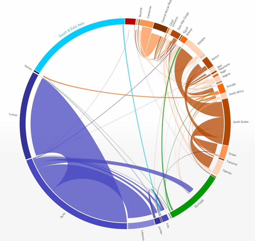
‘Smart cities’ is a term that has gained traction in academia, business and government to describe cities that, on the one hand, are increasingly composed of and monitored by pervasive and ubiquitous computing and, on the other, whose economy and governance is being driven by innovation, creativity and entrepreneurship, enacted by smart people. This paper focuses on the former and, drawing on a number of examples, details how cities are being instrumented with digital devices and infrastructure that produce ‘big data’. Such data, smart city advocates argue enables real-time analysis of city life, new modes of urban governance, and provides the raw material for envisioning and enacting more efficient, sustainable, competitive, productive, open and transparent cities. The final section of the paper provides a critical reflection on the implications of big data and smart urbanism, examining five emerging concerns: the politics of big urban data, technocratic governance and city development, corporatisation of city governance and technological lock-ins, buggy, brittle and hackable cities, and the panoptic city.


Wednesday, July 1, 2015