Sunday, November 29, 2015

Thursday, November 26, 2015
Revise and Resubmit
How motivated I am with a 'revise/resubmit' decision after six months of submitting the paper.

credit: Kostas Siozios
Wednesday, November 25, 2015
Where do women have Maternity leave and Who pays for it
Where do women get Maternity leave and Who pays for it Cc @simonhedlin @lisawade #maternityleave pic.twitter.com/Jv5oRSU3Dr
— Urban Demographics (@UrbDemogrphics) September 19, 2015
Monday, November 23, 2015
Assorted links
- Mapping LA's 20 Year Mobility Plan
- Should Your Driverless Car Kill You to Save Two Other People?
- 13 women who transformed the world of economics via MR
- Color use in paintings, by year
- Seagull Skytrails
- Same BMI, different bodies (the problem with averages)
- Ratio of Workers to Retirees Will Plummet Worldwide
- Grid-based statistics in 3D using Three.js and D3.js.

Thursday, November 19, 2015
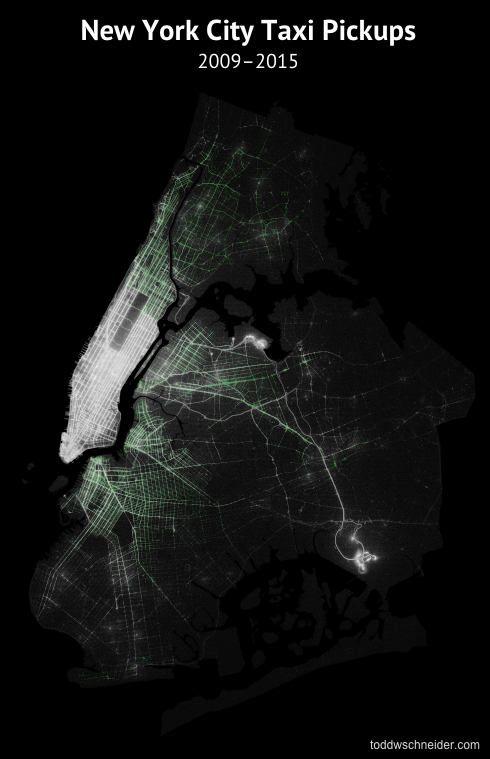
Exploring 1.1 Billion NYC Taxi and Uber Trips
Todd Schneider has posted a thorough analysis of 1.1 Billion NYC Taxi and Uber Trips where he explores the city's neighbourhoods, night-life, airport traffic etc. You can replicated all that using publicly available data, R, PostgreSQL and PostGIS. GitHub repository here.
Tuesday, November 17, 2015
Programming Music with Punched Cards
I've just learned this 'instrument' is called a fairground organ. This is as hipster as you can get with coding.
ps. in case you're under 30, there is a high chance you don't know what a Punched Card is. You might like reading this.
ps. in case you're under 30, there is a high chance you don't know what a Punched Card is. You might like reading this.
Monday, November 16, 2015
Walking Tube map, or the most important map when you are in London
Map of the last week: Transport for London (TFL) has recently published new map that shows how long it takes to walk between stations on the London Tube (a.k.a. underground or subway).
Click here for the full size map.

Saturday, November 14, 2015

Thursday, November 12, 2015
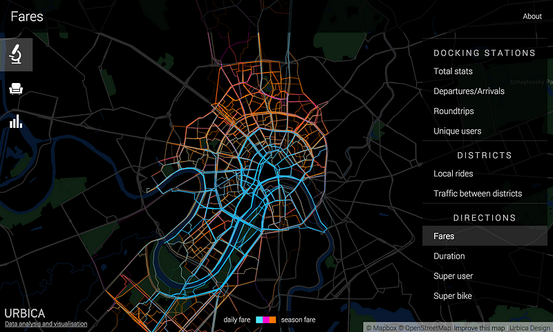
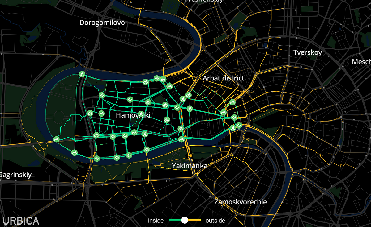
Spatial + Temporal patterns of bike sharing in Moscow
Urbica (a design company based in Moscow) have done a great job in analyzing the spatial and temporal patterns of bike sharing in Moscow (ht Andrey Karmatsky). To our delight, their source code is available on GitHub.
 I would highly recommend you to
 procrastinate on check their website. You can also read a nice summary of their results here.
ps. You might want to check a few related links at the bottom of this post.
I would highly recommend you to ps. You might want to check a few related links at the bottom of this post.
Quote of the Day
"Each of us knows that some of our opinions are wrong, and none of us know which they are. For if we did, they would not be our opinions."John Stuart Mill
Monday, November 9, 2015
Measuring segregation using patterns of daily travel behavior
Mental note: New paper in my reading list. Big names from transport/geography studies pushing the boundaries of segregation research by going beyond the debate on residential segregation.
Farber, S., O'Kelly, M., Miller, H. J., & Neutens, T. (2015). Measuring segregation using patterns of daily travel behavior: A social interaction based model of exposure. Journal of Transport Geography, 49, 26-38.
Abstract:
Recent advances in transportation geography demonstrate the ability to compute a metropolitan scale metric of social interaction opportunities based on the time-geographic concept of joint accessibility. The method we put forward in this article decomposes the social interaction potential (SIP) metric into interactions within and between social groups, such as people of different race, income level, and occupation. This provides a novel metric of exposure, one of the fundamental spatial dimensions of segregation. In particular, the SIP metric is disaggregated into measures of inter-group and intra-group exposure. While activity spaces have been used to measure exposure in the geographic literature, these approaches do not adequately represent the dynamic nature of the target populations. We make the next step by representing both the source and target population groups by space–time prisms, thus more accurately representing spatial and temporal dynamics and constraints. Additionally, decomposition of the SIP metric means that each of the group-wise components of the SIP metric can be represented at zones of residence, workplace, and specific origin–destination pairs. Consequently, the spatial variation in segregation can be explored and hotspots of segregation and integration potential can be identified. The proposed approach is demonstrated for synthetic cities with different population distributions and daily commute flow characteristics, as well as for a case study of the Detroit–Warren–Livonia MSA.
Thursday, November 5, 2015
The Racial Dot Map of Rio de Janeiro
A while ago, I've posted some of Bill Rankin's maps on segregation for different cities in the USA. Those maps got a lot public attention because they were innovative in the way they depicted racial segregation by representing each individual as one single dot and each ethnicity as a different color. Needless to say this approach gives a much better visual effect than traditional choropleth maps.
Inspired in Rankin's map, Nicolau de Gusmão (geography student from Sao Paulo) has created in a racial dot map of Rio. Pretty neat. He used data from the 2010 population census and he created the map using QGIS. His post is written in Portuguese, but you don't need to speak the language to appreciate the maps and get your own conclusion about segregation levels in Rio.

The difference between economic migrants and refugees
— Nando Sigona (@nandosigona) November 1, 2015
Wednesday, November 4, 2015
How bad is the problem of ghost cities in China?
More than more than 50 ghost cities:

You can download their study here and play around with the interactive map here.
[image credit: Guanghua Chi, Yu Liu, Haishan Wu]
Sunday, November 1, 2015
Assorted Links
- Fordlandia: The Failure Of Ford's Jungle Utopia ht Pablo Astudillo
- The most highly educated group of immigrants to the US are those from Africa (via William Easterly)
- The German radical Left Party wishes to deregulate walking
- Interactive map showing movement of refugees migrants to Europe since 2012 (via Population Europe)
- This Is What Happens When You Photoshop All The Men Out Of Politics
- Hack Your Way To Scientific Glory, or hot to manipulate your p-values to become publishable
- An incredibly detailed map of London in 1746
- Other things I'd rather be doing
- Welcome to Planet Voronoi, a Capital Place

Subscribe to:
Posts (Atom)