Showing posts with label Urban Hierarchy. Show all posts

Tuesday, February 9, 2016

Share of the population living in the largest Metro Area

The chart was created by Aron Strandberg, who has a great Twitter account with lots of demographic data visualization. The data comes from the World Bank (here and here). I've included some related links below.


Related Links:
  1. If Christaller had Google Earth
  2. Urban Primacy
  3. Urban Primacy in Latin Ameria
  4. Demographic evolution of cities, 1950-2025
  5. The Urban Observatory

Thursday, October 24, 2013

If Christaller had Google Earth

Proposed by Walter Christaller in 1933, the 'Central Place Theory' is among the first topics covered by any course in Geography, Regional Science, Urban Studies etc. His main point was to derive the golden rules that would explain the number, location and size (hierarchy) of cities/villages.

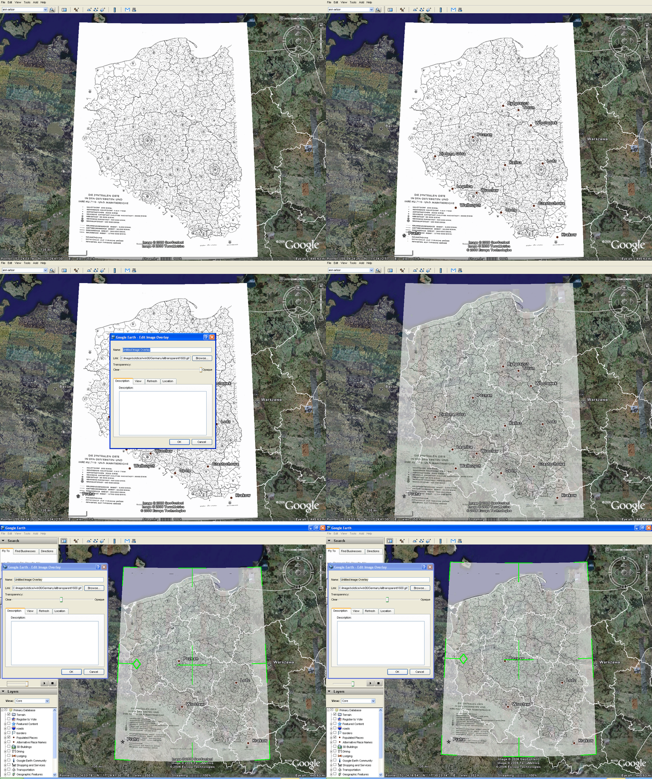
To illustrate his proposition, Christaller came up with this classic map showing the distribution of cities and villages in Eastern Europe, where circle indicates population size.

[click on the image to enlarge it]

Sometimes I wonder what those geniuses from the Old Times (like Christaller, Dalí, Paganini) would create if they had the technology we take for granted today. Well, if only Christaller had Google Earth at his time, I'm sure he would have done a much better job. And I think he would have liked to work with Sandra Lach Arlinghaus!

Sandra has done a really nice job overlaping Christaller's map on Google Earth using the exact location (part of what is today Poland). Here you can check her work and download the Google Earth files she's used. It looks much better if you have a big screen.


[Image Credit: Sandra Lach Arlinghaus]

Sunday, August 4, 2013

The Urban Observatory

The founders of ESRI and TED have created a new project called The Urban Observatory (I saw this via
Ariel Schwartz). It's an interactive platform that allows you to visualize and compare many world cities regarding some of their key statistics (population density, urban footprint, land use, senior population etc).


One strong point of this project is to use standardized comparative data. Besides, the platform is very easy to use. It's a great way to spend your time  if you have any  playing with maps. But that's it. The data displayed on the website are not available for download, at least up until now. Moreover, it looks there are still some MAUP issues to be addressed by the project team. I'm sure these limitations will be overcome as the project develops further.

Howsoever, it is a great initiative. You should take a look.

Monday, June 3, 2013

Geographies of world university rankings

Jöns, H, Hoyler, M (2013) Global geographies of higher education: The perspective of world university rankings, Geoforum, 46, 45-59.

Abstract:
This paper contributes to emerging debates about uneven global geographies of higher education through a critical analysis of world university rankings. Drawing on recent work in geography, international higher education and bibliometrics, the paper examines two of the major international ranking schemes [...]. Our analysis illustrates how the substantial variation in ranking criteria produces not only necessarily partial but also very specific global geographies of higher education. In comparison, these reveal a wider tension in the knowledge-based economy between established knowledge centers in Europe and the United States and emerging knowledge hubs in Asia Pacific. An analysis of individual ranking criteria, however, suggests that other measures and subject-specific perspectives would produce very different landscapes of higher education.

[Image Credit: Jöns and Hoyler, 2013)]

Thursday, April 4, 2013

Tuesday, March 5, 2013

Urban Primacy in Latin America

I have bumped into this chart showing the National GDP and Population share of large Latin American cities. It was published in a report by McKinsey Global Institute in 2011: 'Building globally competitive cities: The key to Latin American growth'. A nice way to visualize urban primacy.


Related Links:

Monday, January 14, 2013

Monday, November 26, 2012

The Richest Cities in the US in 1978 and Now

A study by McKinsey Global Institute showing the richest metros in the US in 1978 and now (via Jordan Weissmann).

[Click on the image to enlarge it]

Sunday, October 21, 2012

Quote of the day

"You tell me the size of any city in the United States and I can tell you with 80 to 90 percent accuracy almost everything about it. The scaling laws tell you that despite all of the efforts of planners, geographers, economists, architects, and politicians, and all of the local history, geography, and culture, somehow cities end up having to obey these scaling laws. We need to be aware of those forces when we design and redesign cities." (Geoffrey West)

Soundtrack for the weekend: Jazz for Cows

Monday, June 4, 2012

US Newspapers, 1690-2011

Growth of newspapers across the US  1690-2011 (via flowing data)


Data sources: Chronicling America collection, Library of Congress, Urban population estimates from NASA

Data visualization by the Rural West Initiative, Bill Lane Center for the American West, Stanford University
Credits: Dan Chang, Krissy Clark, Yuankai Ge, Geoff McGhee, Yinfeng Qin and Jason Wang

Monday, April 9, 2012

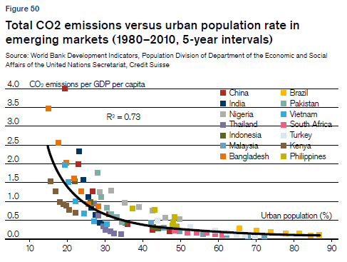
CO² emissions vs Urban Population Rate

An interesting graphic from the recent Credit Suisse report on global urbanization trends  (via Alex Tabarrok, via Gulzar).

[Image Credit: Credit Suisse report]

Tuesday, October 11, 2011

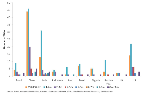
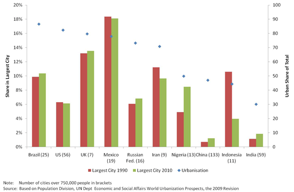
Urban Primacy

Another post inspired by Phil McDermott, now with some charts on Urban Primacy.

Urban Primacy indicates to what extent economic development is concentrated in a few cities (population, economic activities, services, etc.). It's all about Christaller's Central Place Theory and Agglomeration Economies!

Phil McDermott saysExcessive primacy may increase economic volatility because the contrast between a rich centre and poor periphery is politically destabilising. One centre dominating financial, human, and intellectual resources may also increase national vulnerability to structural decline.“ One should also note that excessive primacy can also mean excessive concentration of opportunities and public services. And that's a classic starting point for the debate over balanced urban networks and polycentrism.

Number of Cities by Size Category (2010)
[image credit: via Cities Matter]


Population Share of Largest City, Ten Nations, 1990 and 2010
[image credit: via Cities Matter]


Share of national GDP and Population of selected cities
Source: World Bank, 2007


*** And here you have peculiar way to visualize urban hierarchy in Brazil.


Soundtrack for this post: Clapton

Tuesday, June 28, 2011

Cities' Areas of Influence in Brazil

Since 1966, the Brazilian Institute of Geography and Statistics (IBGE) has been carrying on a research on the Brazilian network of cities. The project is called REGIC - Regiões de Influência de Cidades (which I would poorly translate as " Cities' Areas of Influence ").

They have recently made available the vector files (shape files) of the latest edition of the research (2007).

Brazilian network of cities (1966 - 2007)
how to make a gif(images credit: REGIC - IBGE)


The methodology used in this research has changed a lot from its first edition in 1966. The latest 2007 edition, however, is pretty much excellent. The authors address the Brazilian network and hierarchy of cities based on a massive data set. It incorporates all sort of spatial connections such as:

  • Federal public administration
  • Business management
  • Passengers transport (flight and Road connections)
  • Bank branches
  • Education institutions
  • Health services
  • Density of Internet domains
  • Television networks and even Destination of agricultural production (I bet I have forgotten something)


shameless self promotion moment: The Institute for Applied Economic Research (IPEA) has recently organized a book that provides some good insights on this issue. The book is entitled "Urban-Regional Dynamics - Urban Network and its Interfaces" (my poor translation again).

Wednesday, April 6, 2011

Assorted Links

Thursday, December 16, 2010

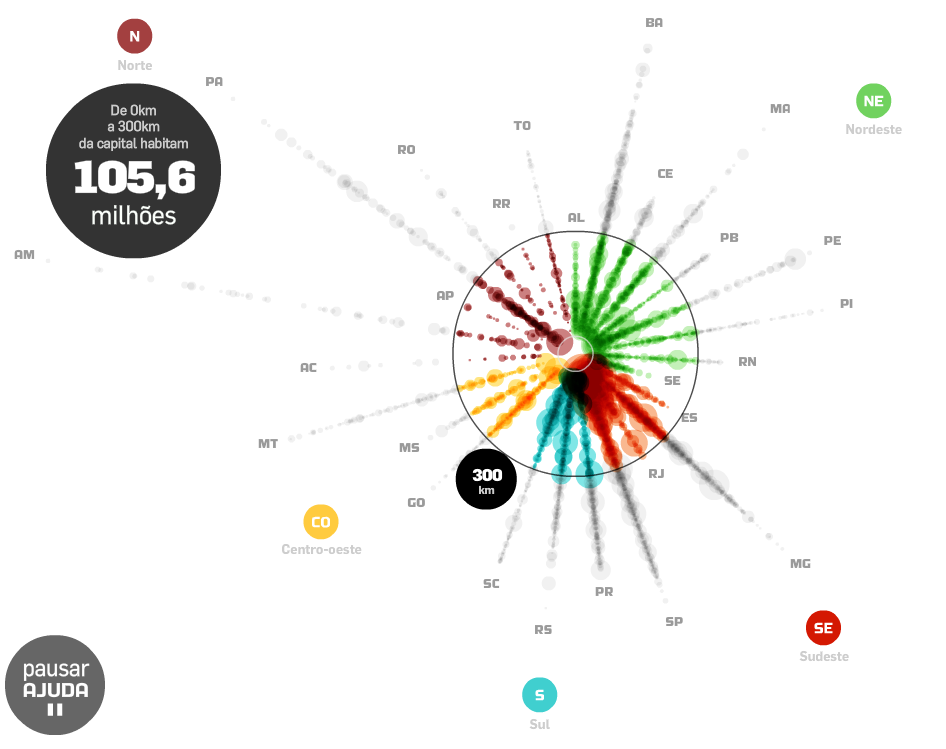
Population dispersion infographic

This infographic shows the municipalities population distribution in relation to the distance from the capitals of Brazilian states (preliminary data from Census 2010)*.

Move the mouse over the points /stantes/regions to explore them. You can also click and drag the outer circle to calculate how many live in a range of (i.g.) 300 km from the capitals.

Thanks Prof. Romulo Krafta for the tip.

*It's a peculiar way to visualize urban hierarchy as well.

(By Carlos Lemos via Estadão)