Showing posts with label Population Pyramid. Show all posts

Friday, April 26, 2019

The global population pyramid from 1950 to 2100

New piece by Max Roser in Our World in Data, showing how global demography has changed and what we can expect for the 21st century.

In this figure below, curves in blue to green show how the global population pyramid changed from 1950 to today, while shades of yellow show the UN projections for the change expected until 2100.

click on the image to see full size


Thursday, March 10, 2016

Japan's aging population in R

Here is a nice GIF showing the population aging of Japan, and here is the script to make this animated population pyramid in R using ggplot. 

Kudos to Kyle Walker, author of this code and who you should definitely follow on Twitter and GitHub if you're interested in R, spatial analysis, data visualization and demography.

Japan_pyramid
credit: Kyle Walker

Monday, December 7, 2015

India expected to overtake China′s population by 2026

Aron Strandberg has a great series of tweets on demographic trends.


Nigeria is also expected to overtake the US population at some point after 2050.

Tuesday, October 22, 2013

Demographic papers published on Science and Nature

It's not everyday you see demographers publishing on journals like Science and Nature. So here is a short list with some of the papers published since 2000.

ps. Massive presence of @IIASAVienna and @WiCVienna researchers!

and my two favorites:

[Image Credit: Lutz and KC, 2011]

Friday, July 8, 2011

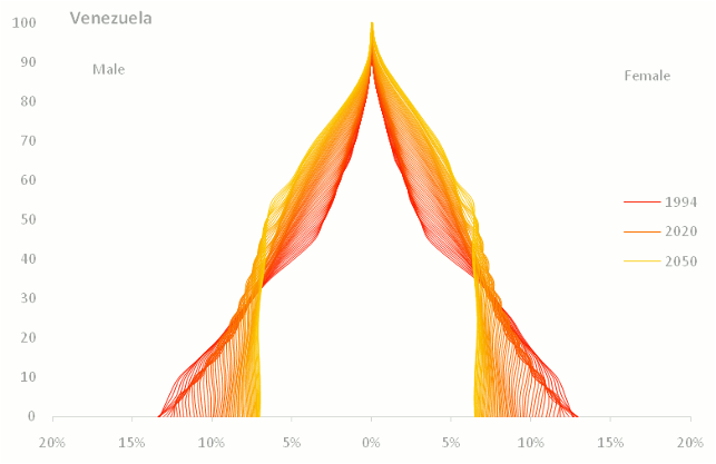
Evolving population pyramids

Jorge Camoes came up with this strange idea of an alternative way of representing population pyramids. Check it up!

Looking good!

[image credit: Jorge Camoes] (via Information Aesthetics)


I have tried something "similar". But it's not looking that good...

This chart shows the evolution of the population pyramid (Brazilian male engineers) from 2000 to 2020. Darker lines represent the earlier projection years*.

*That's the aging (and dying) process isolated. In a future post, I'll present the projection results including the trends in the number of graduated students every year.

Friday, March 11, 2011

Assorted links

Friday, July 30, 2010

Visualizing Our Aging World

GE released a set of interactive population pyramids that illustrates the population aging in the world. Here.

It allows you to compare the demographic statistics of 8 different industrialized countries (France, Germany, USA, Uniet Kingdom, South Korea and China. Unfortunately, Brazil is not included).

*And an important note related to that: A lot of countries are increasing retirement age (here).

Via Infosthetics