Have a guess. I can only say I was wrong by a lot :) Now select this back box to see how close your guess was. 109 billion There is a nice article by PRB on this question and how one arrived at this estimate. HT Sergei Soares.
Showing posts with label World Population. Show all posts
Showing posts with label World Population. Show all posts
Friday, October 11, 2019
Saturday, October 5, 2019
World population projected to reach 10.9 billion by 2100
The UN Population Division published this year its report World Population Prospects: The 2019 Revision with lots of goodies, including the latest world population projections. Here are the ten key findings of the report:
- The world’s population continues to increase, but growth rates vary greatly across regions
- Nine countries will make up more than half the projected population growth between now and 2050
- Rapid population growth presents challenges for sustainable development
- In some countries, growth of the working-age population is creating opportunities for economic growth
- Globally, women are having fewer babies, but fertility rates remain high in some parts of the world
- People are living longer, but those in the poorest countries still live 7 years less than the global average
- The world’s population is growing older, with persons over age 65 being the fastest-growing age group
- Falling proportions of working-age people are putting pressure on social protection systems
- A growing number of countries are experiencing a reduction in population size
- Migration has become a major component of population change in some countries
A neat visualization of population growth by region based on UN Population Division (2019) medium variant scenario projections. This chart was put together by Our World in Data, who have plenty more material on this and other topics.

Friday, April 26, 2019
The global population pyramid from 1950 to 2100
New piece by Max Roser in Our World in Data, showing how global demography has changed and what we can expect for the 21st century.
In this figure below, curves in blue to green show how the global population pyramid changed from 1950 to today, while shades of yellow show the UN projections for the change expected until 2100.

click on the image to see full size

Sunday, December 16, 2018
3D interactive map of population densities across the globe
A couple of years ago, I wrote a blog post showing where to find data on population estimates at high spatial resolution for the world. These are great sources of data if one wants to explore and visualize how population density varies across the globe, like in this neat interactive map created by Duncan Smith (CASA UCL).
I'm a big enthusiast of 3D density maps, as you might have noticed by so many of these posted on the blog before (such as this 1, this 2, this 3, this 4, this 5, ....). And apparently I'm not alone. A few days ago, Matt Daniels created a beautiful 3D interactive map of population densities and it went viral on the internet. You can procrastinate browse around the map and check your own region, but don't miss the story Matt published at The Pudding.


image credit: Matt Daniels (The Pudding)
Thursday, June 29, 2017
World population distribution by altitude
Another interesting chart by Bill Rankin, this one showing how the world population is distributed by altitude.
- 6% of the world's population leaves above 1.6 Kilometres (1 mile)
- 50% leaves below 165 meters of altitude
- 0.2% leaves below sea level
click on the image to enlarge it

Saturday, September 19, 2015
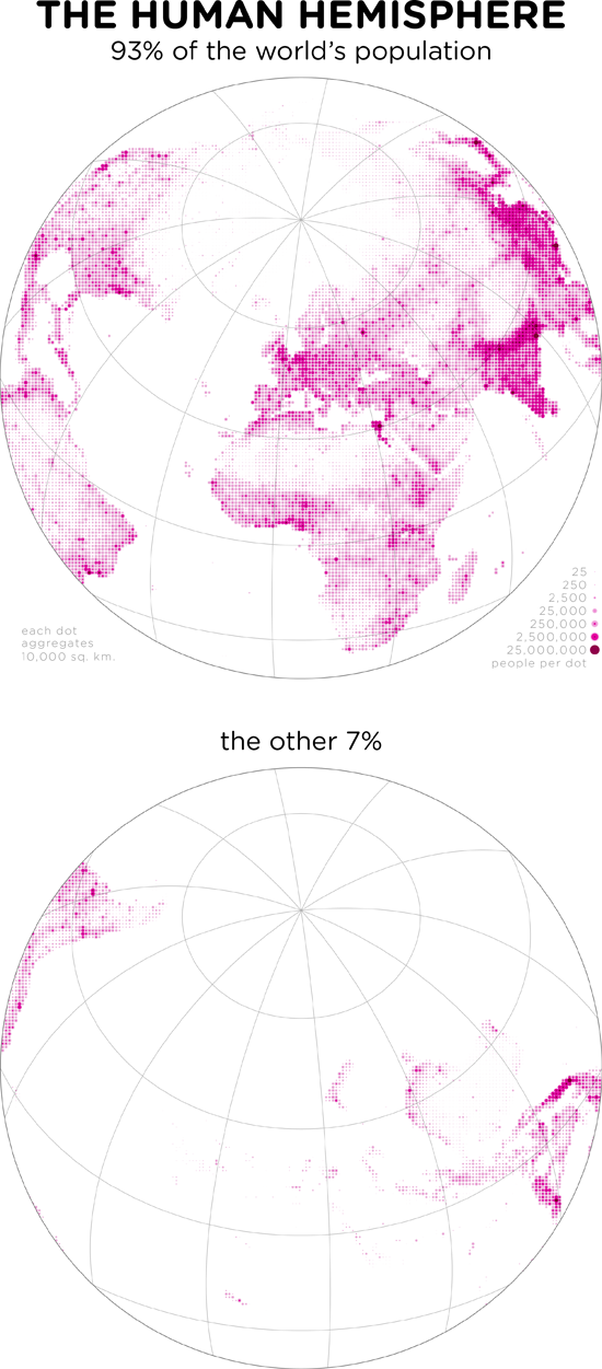
The Human Hemisphere
We have seen Bill Rankin's inventive map of the World Population Distribution by lat long. More recently Bill has come with other ways of thinking our hemispheres. Here is my favourite one.
ps. On a related topic, here is map showing how geographically unbalanced the distribution of the world population is.
Thursday, July 2, 2015
World Population Distributed by Latitude and Longitude
David Taylor and the team at CityMetric have recently posted a simple and effective chart to show that the population of Canada is not as north as we might think. This reminded me of a another map, that we posted almost five years ago ....

[image credit: David Taylor]

[image credit: Bill Rankin]
Thursday, December 4, 2014
Assorted links
- All papers published in Nature will be made free to read in screen-view format (ht Cheli Cresswell)
- The world's most beautiful metro stations in pictures
- Nature explores the most-cited research of all time
- Mind-blowing post "Visualizing Algorithms" (ht Andy Boneau)
- Louis Smith has written a great piece to celebrate the 100th anniversary Lina Bo Bardi, the Italian architect who designed MASP in Sao Paulo and the Bowl Chair
- Some common ways we're misled with charts
- Migrants account for 70% of the increase in working-age population in OECD area
- How big is #67P? Compare size of the comet with cities across Europe
- World population predictions keep getting upward revisions these days (ht Sander Wagner)
[click on the image to enlarge it]

[image credit: Scientific American]
Friday, September 19, 2014
Assorted Links
- The Dept. of Urban Studies and Planning at the MIT found a great way to visualize their faculty members
- Suprise in an Abandoned Bangkok Shopping Mall
- You will thank me for this: How much underwear to bring on a trip
- Prisons Are Facing Aging Populations, Too
- Call for Papers: New Directions in Geospatial Simulation
- Diver-less Cars With Adjustable Ethics Settings? via Karel Martens
- The world population will not stabilize this century, says a new report that Patrick Gerland et al. published yesterday in Science.
UN 2012 population projections by continent [click on the image to enlarge it]

[image credit: Patrick Gerland et al.]
Sunday, August 10, 2014
Chart of the Day
A new report by the World Bank brings this interesting chart on the Real GDP Per Capita and share of Global Population (via Timothy Taylor).
[click on the image to enlarge it]

Friday, July 11, 2014
Happy World Population Day
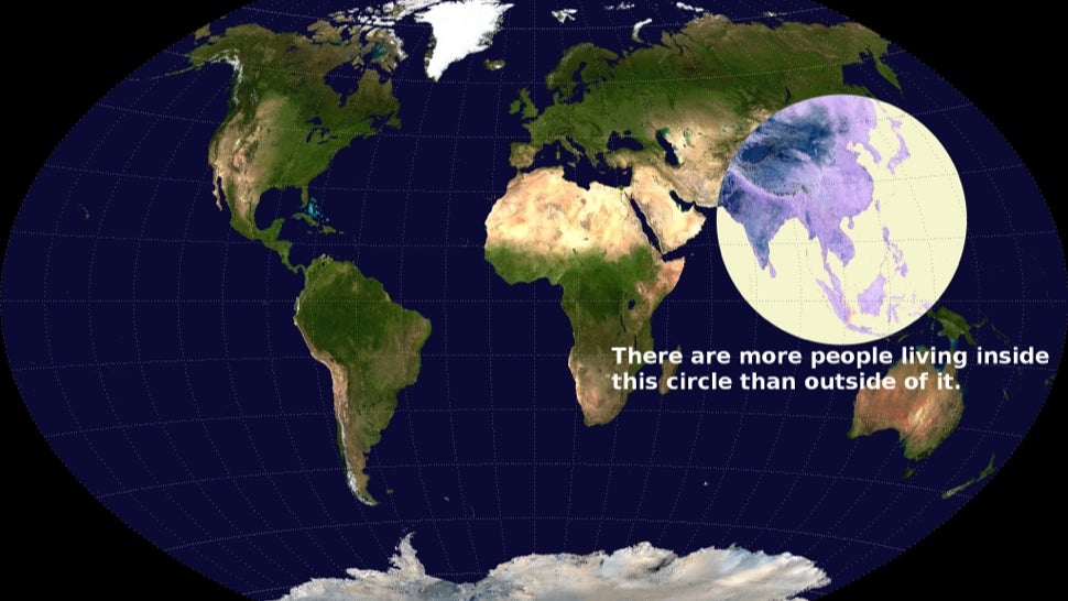
Half the world's population live in the six countries, via Conrad Hackett

And a related already 'old' map: More than half of humanity lives within this circle

ps. Looking at these two maps side by side, however, make me a bit suspicious about them...

And a related
Friday, May 16, 2014
Assorted Links
- Large cities are less green (via Araz Taeihagh). Disputable, but very interesting.
- Apparently, the entire human population could fit inside the Grand Canyon (via Alberto Jakob)
- Great video: 'Where time comes from'
- The Strange, Post-Soviet Architecture of Astana, Kazakhstan
- Looking at evictions in San Francisco since 1997. It would be great to have a similiar map showing the WorldCup evictions in Rio
- The scaling of human interactions with city size (via Annalee Newitz)
- The Easter Rocket War of Vrontados
- Fruits and Vegetables Under an MRI Scanner (via Rob Simons)
- Amazing project using Drones, Community Mapping and 3D printers to remap Lima (via Flora Roumpani)
Sunday, February 2, 2014
The City of 7 Billion
The City of 7 Billion is an ambitious research project on the impact of population growth and resource consumption at the global scale that reframes the entire world as a single urban entity: the city of 7 billion. The project is being conducted by Bimal Mendis and Joyce Hsiang of the Yale School of Architecture.
A visualization of population growth in cities around the world from 1990 to 2015
Sunday, December 22, 2013
2013 World Population Data Sheet
Here is the PRB's 2013 World Population Data Sheet. You may also take a look at their webinar or this interactive infographic highlighting some key population trends. More of the same
Tuesday, October 22, 2013
Demographic papers published on Science and Nature
It's not everyday you see demographers publishing on journals like Science and Nature. So here is a short list with some of the papers published since 2000.
ps. Massive presence of @IIASAVienna and @WiCVienna researchers!

ps. Massive presence of @IIASAVienna and @WiCVienna researchers!
- (2013) Pervasive Externalities at the Population, Consumption, and Environment Nexus, by Partha S. Dasgupta, Paul R. Ehrlich
- (2012) Demography's Role in Sustainable Development, Many authors
- (2011) China’s Demographic History and Future Challenges, by Xizhe Peng
- (2011) The Demography of Educational Attainment and Economic Growth, by Wolfgang Lutz, Jesus Crespo Cuaresma, Warren Sanderson
- (2011) 7 Billion and Counting, by David E. Bloom
- (2008) Health and Urban Living, by Christopher Dye
- (2008) The coming acceleration of global population ageing, by Wolfgang Lutz, Warren Sanderson, Sergei Scherbov
- (2006) The Demography of Growing European Identity, by Wolfgang Lutz, Sylvia Kritzinger, Vegard Skirbekk
- (2005) Average remaining lifetimes can increase as human populations age, by Warren C. Sanderson, Sergei Scherbov
- (2003) Europe's Population at a Turning Point, Wolfgang Lutz, Brian C. O'Neill, Sergei Scherbov
and my two favorites:
- (2010) Remeasuring Aging, by Warren C. Sanderson and Sergei Scherbov
- (2011) Global Human Capital: Integrating Education and Population, Wolfgang Lutz, Samir KC

[Image Credit: Lutz and KC, 2011]
Tuesday, August 27, 2013
Assorted links
- Unbelievable “nail houses” around the world
- PAA 2014 - call for papers
- Violent Crime Hotspots in London
- Undesirable trends in the labor force participation rate
- Life can't get any better than this
- Beijing Subway - morning rush hour
- What Brazilians mean when they say...
- Stratifying PISA scores by poverty rates
- The Africa-Driven Demographic Future of Earth
- New York City Transit System Morning Peak Flow, 1954 (via Transit Maps)
[click on the image to enlarge it]

Friday, May 10, 2013
Assorted Links
- How Many People Have Ever Lived on Earth? (via @blqueiroz)
- Openly available datasets about Amazon
- The 25 Least Visited Countries in the World (via Drunkeynesian)
- The Flynn effect vs. population aging (via MR)
- 3D Mapping in R
- An advice for young researchers
- Human Development Index of Mexico municipalities
- An excellent discussion on the The Challenge of Ageing (and a related essay competition)
- Length of the average dissertation (via Flowing Data)
- What if we replaced the moon with Jupiter or Saturn?
- Population density in select cities around the world

Monday, May 6, 2013

Thursday, April 11, 2013
Forecasting Migration
Andres Marroquin points to this chart showing long-term trends of net migration by continent. [By the way, the original report has many interesting charts that give a clear summary of global demographic trends]

When we hear the words “long-term migration” in the same sentence, it is impossible not to remember one prominent Achilles' heel in demographic studies: the inability to forecast long-term migration. Here is Willekens' opinion on this topic.
Why is it not possible to do long-term [migration] forecasts?
The data from statistical offices are not suitable for long-term migration forecasts. The reason is that these data document the outcome of migration flows – not the reasons behind them. Predictions on the basis of past behaviour are reliable when the system is stable, i.e. when conditions do not change and people respond to these conditions in the same way as people in the past. But conditions change, for instance when regulatory measures are taken to prevent migration flows, or events occur, like political changes in the country or natural disasters. (Frans Willekens)
Related Links:
- A new journal of Migration Studies, from Oxford University Press.
- Estimating global migration flow tables using place of birth data
- Changing Patterns and Determinants of Interprovincial Migration in China 1985–2000
- The Mystery of Declining Mobility in the USA
Monday, April 1, 2013
Subscribe to:
Posts (Atom)