Showing posts with label cartography. Show all posts

Saturday, October 26, 2019

The urban footprint of the largest urban areas of Brazil

All my procrastination energy led to me to create this nice little image comparing the footprint of the largest urban agglomeration in Brazil. I created this figure using R and geobr, a package that facilitates downloading official geospatial data of Brazil (a quick intro to geobr here). In our latest update, we included official data on the urban footprint of all Brazilian cities in 2005 and 2015.


[click on the image to enlarge]

Friday, January 18, 2019

Sunday, December 16, 2018

3D interactive map of population densities across the globe

A couple of years ago, I wrote a blog post showing where to find data on population estimates at high spatial resolution for the world. These are great sources of data if one wants to explore and visualize how population density varies across the globe, like in this neat interactive map created by Duncan Smith (CASA UCL).

I'm a big enthusiast of 3D density maps, as you might have noticed by so many of these posted on the blog before (such as this 1, this 2, this 3, this 4, this 5, ....). And apparently I'm not alone. A few days ago, Matt Daniels created a beautiful 3D interactive map of population densities and it went viral on the internet. You can procrastinate browse around the map and check your own region, but don't miss the story Matt published at The Pudding.


image credit: Matt Daniels (The Pudding)

Thursday, August 23, 2018

The geography of Manhattan distorted by travel-times

The figure below was created by Stefan Musch from Gradient Metrics (hat tip Jean Legrand). The figure was created using R and ggplot2 based on travel-time estimates from Google Maps API. There is a bit more info about the creation process in this post and perhaps Stefan will share his code at some point.... please? :)

Echoing the comments of others on Twitter.  The figure does a great job illustrating how it is much harder to cross Manhattan from east to west than from north to south. Finally,  it would be great to see how this shape has changed over the last decades using historical travel time estimates.


credit: Stefan Musch (Gradient Metrics)

Monday, July 23, 2018

Mapping the diversity of population ageing across Europe with a ternary colour scheme

Ilya Kashnitsky and Jonas Schöley have recently published this correspondence in The Lancet where they show a very clever way to visualize the spatial heterogeneity of population age structures using choropleth map with ternary colour scheme. The data wrangling was done in R, and the code to replicate get the data and replicate the figure is available on Github.

Needless to say that, if you're interested in demography, R and data, you should be following the work and twitter accounts of Ilya and Jonas.

click on to image to enlarge it

image credit: Ilya Kashnitsky and Jonas Schöley.

Tuesday, April 24, 2018

Map of the day: how many Switzerlands fit in Brazil


Quite a few, actually. You can  procrastinate  play around with your own map comparisons to  here.


Thursday, January 18, 2018

A challenge for your mental model of the world map

Here is a great exercise to test how accurate is your perception of the relative sizes of countries and continents. My score was 67% in my 1st try and 74% in my second try. Not good considering I'm doing a PhD in geography. sssh don't tell my university otherwise they might not give me my degree

This is part of a PhD research at Ghent University. ht Sebastian Meier‏


Sunday, September 24, 2017

Assorted Links

  1. The next time you have "a new idea no one's thought of before", read this list, be humble and go back to  Google  the library.

  2. This website helps you select a projection for your map (paper here)

  3. Mapping London’s “pseudo-public spaces,” spaces “that appear to be public but are... controlled by developers.” via Geoff Manaugh

  4. How One Brilliant Woman Mapped the Ocean Floor’s Secrets via Sabrina Lai, who is the creator/admin of a great group about Geographical analysis, urban modeling, spatial statistics on Facebook

  5. Infographic of the fascinating timeline of the far future via Tyler Cowen
    1. In a 100 million years from now: “Future archaeologists should be able to identify an ‘Urban Stratum’ of fossilized great coastal cities, mostly through the remains of underground infrastructure such as building foundations and utility tunnels.”.

  6. 100 greatest images of Saturn from its Cassini Mission

  7. Heads up for some great opportunities:
    1. University of California, Santa Barbara Department of Geography invites applications for a tenure-track position in spatial data science
    2. The Ohio State University, Department of Geography invites applications for a tenure track position with expertise in areas such as spatial-temporal data analytics, spatial simulation and modeling, cyberGIS and high performance computing, and/or geovisualization
    3. University of Texas St Antonio is hiring a tenure track/Associate demographer who works with big data

  8. Beautiful data visualization of music, by Nicholas Rougeux

    This is a data visualization of Vivaldi’s Four Seasons. You should read it read clockwise.
    Size = note length
    Distance from center = pitch
    Colors = instruments.

Thursday, July 20, 2017

Map of the day: the public transport network of Tokyo

Simon Kuestenmacher tweeted the other day this map that shows the public transport network of Tokyo metropolitan area (higher quality image in Japanese here). Tokyo is today the largest metro area with almost 38 million people. The amount of planning and daily work they put in their transport network overt the decades it just jaw dropping, as this maps can tell. 

Wednesday, April 26, 2017

Map of Population Density Lines in R

If you are familiar with this famous Joy Division cover, you might remember that last year we shared a link that shows you how to reproduce the cover using R ggplot2. If you are a big fan of Joy Division and R, you should know that there is an R package just for that (by @mikefc).


About three years ago in 2014, James Cheshire created the Population Lines Print, a stylized map using lines to show population density in the world. It uses roughly the same data visualization style used in the Joy Division cover. 

credit: James Cheshire


How can you create a nice-looking map like this? Ask no more. James has recently shared the R script and a bit of the history behind his mapHenrik Lindberg has also generously written a gist with a simple and reproducible code to create a map with the same style showing the distribution of the population density in Europe, using R and ggplot2.

and you get this:

credit: Henrik Lindberg

UPDATE: Carson Sievert‏ shows how you can add two (2!) more lines of code to make this map interactive.

Saturday, March 25, 2017

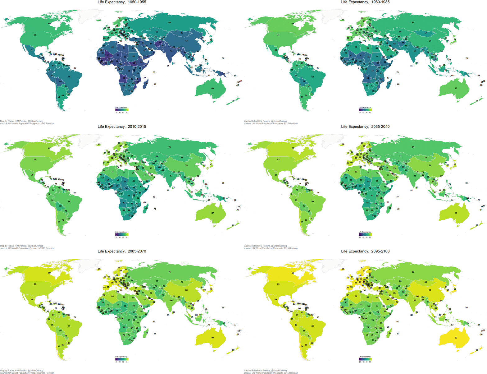
Creating an animated world map of life expectancy changes from 1950 to 2100 in R

I've created this map after a couple of hours  procrastinating  testing the gganimate package in R, which makes it ridiculously simple to create this type animation in .gif or .mp4 format.

The map shows how the life expectancy of each country has changed from 1950 to 2015 and how it is expected to increase up to 2100. It looks better in full screen, but it's still a bit clunky.


I've also created a gist that shows how you can create this map yourself:

Sunday, October 2, 2016

How Brazil compares to other countries in terms of area, population and human development

These maps were made by Roberto Rocco with data from 2008.

Area


Population


Human Development Index (HDI)