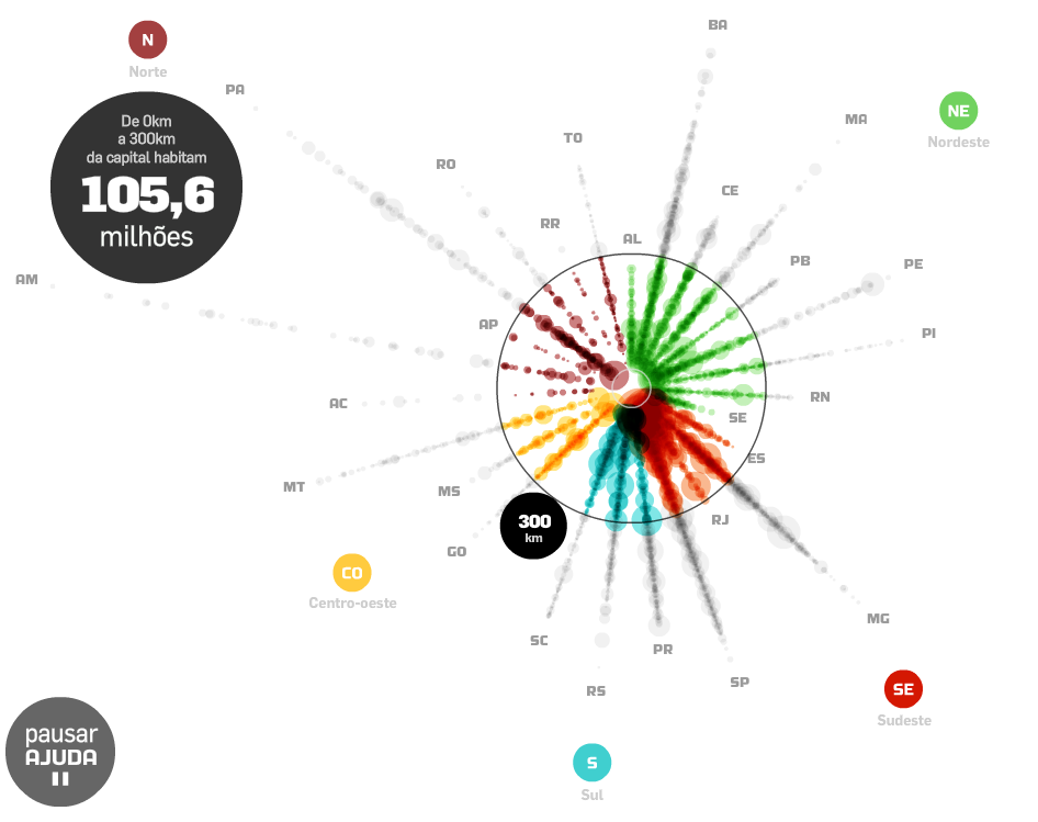
Move the mouse over the points /stantes/regions to explore them. You can also click and drag the outer circle to calculate how many live in a range of (i.g.) 300 km from the capitals.
Thanks Prof. Romulo Krafta for the tip.
*It's a peculiar way to visualize urban hierarchy as well.

(By Carlos Lemos via Estadão)