- The case for monitoring life-span inequality, via José Manuel Aburto
- Mortality from road crashes in 193 countries: a comparison with other leading causes of death, ht Romulo Krafta
- The slowing pace of life expectancy gains since 1950
- How life expectancy in U.S. counties compares to other countries via Simon Kuestenmacher
- R package: mortAAR, for archeological demography. It provides functions for the analysis of archaeological mortality data See Chamberlain (2006). There is a vignette on Lifetables and an Extended Discussion
- R package: MortalityLaws, for downloading data from the Human Mortality Database and building parametric mortality models and life tables, by Marius Pascariu
- R package: MortCast, for estimating and Projecting of age-specific mortality rates, by Hana Sevcikova, Nan Li and Patrick Gerland (paper here) - via Adrian Raftery
- Beautiful Lexis-surface plot showing age and period specific mortality ratios of females and males, by Jonas Schöley (interactive version at the Human Mortality Explorer)
Showing posts with label Life expectancy. Show all posts
Showing posts with label Life expectancy. Show all posts
Monday, December 3, 2018
Assorted Links on mortality


Tuesday, May 29, 2018
Assorted Links
- Using geolocated tweets and the Google Books datasets to map the Americanization of English in space and time, by Bruno Gonçalves et al.
- Sony World Photography Awards 2018
- Interactive maps with deforestation and reforestation of national parks at the border between Brazil and Argentina, between the 1950s and the 2010s, including some aerial and satellite pictures from US spy satellites from the 1960s. via Frederico Freitas
- Why the New Research on Mobility Matters - via Juan Pablo Chauvin
- Do peoples' judgments on hypothetical trolley dilemmas predict what they would do in a real-life trolley dilemma situation? via Dina Pomeranz
- Meaning of the colors in country flags. The explanation of the Brazilian flag hurts
- Life expectancy vs. health expenditure over time... needless to say the USA has a problem here. via Max Roser et al at Our World in Data

Saturday, August 26, 2017
Assorted Links
- You know that Pythagoras's theorem? It was in fact discovered by the Babylonians a 1000 years before Pythagoras was born
- How the Layout of Urban "Cells" Affects The Function and Success of Neighborhoods
- China has passed the mark of 100 cities above 1 million people and this is good
- Interesting paper showing that long commutes undermine school performance of students
- Great title for a paper: "Lost in transportation: Information measures and cognitive limits in multilayer navigation"
- In case you lost the chance to see the solar eclipse last week, don’t despair. This interactive globe shows when the next eclipse in your country will happen
- Scientists Used CRISPR to Put a GIF Inside a Living Organism’s DNA
- Future life expectancy in 35 industrialised countries: projections with a Bayesian model ensemble
Posterior distribution of projected change in life expectancy at birth from 2010 to 2030

Wednesday, May 31, 2017
Visualizing the concept of prospective aging with R
In two great papers published in Science and Nature, W. Sanderson and S. Scherbov proposed a new way to understand population aging. Instead of focusing on the time people have lived, the authors take a prospective look at the number of years people are still expected to live.
"The underlying idea is really simple – age is not static: a person aged 65 (the conventional border deliminating elderly population) today is in many aspects not the same as a person ages 65 half a century ago. Health and lifespan improved a lot in the last decades, meaning that today people generally have much more remaining years of life at the moment of being recognized as elderly by the conventional standards. Thus, Sanderson and Scherbov proposed to define elderly population based on the estimation of the expected remaining length of life rather than years lived. Such a refined view of population ageing disqualifies the alarmist claims of the approaching demographic collapse."
If you're interested in the topic, I would highly recommend reading the whole post (and the papers, of course). Ilya brings not only a nice summary of the concept, he also presents some R scripts to create animated population pyramids to visualize prospective aging.
Ilya Kashnitsky writes a great blog and twitter about demographic research and R more broadly, and I would highly recommend following his work online.

Related Links:
Ilya Kashnitsky writes a great blog and twitter about demographic research and R more broadly, and I would highly recommend following his work online.

Related Links:
Saturday, March 25, 2017
Creating an animated world map of life expectancy changes from 1950 to 2100 in R
I've created this map after a couple of hours procrastinating testing the gganimate package in R, which makes it ridiculously simple to create this type animation in .gif or .mp4 format.
The map shows how the life expectancy of each country has changed from 1950 to 2015 and how it is expected to increase up to 2100. It looks better in full screen, but it's still a bit clunky.
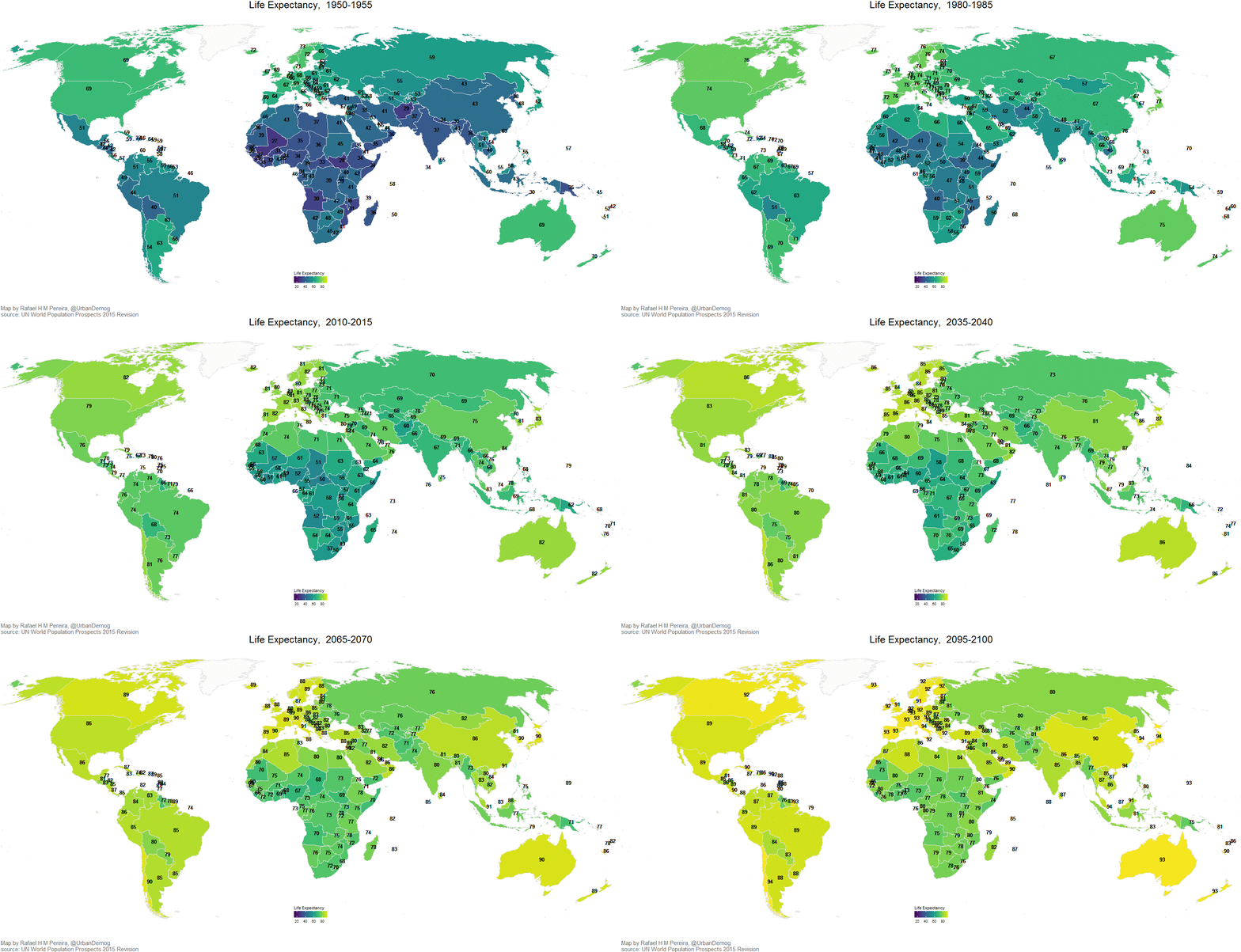
I've also created a gist that shows how you can create this map yourself:
Friday, June 3, 2016
Assorted Links
- [new paper] Mortality differentials by education in Brazil: Life expectancy was 6.27 years longer for men with a complete university degree than for those with less than primary education in 2010. The paper is in Portuguese
- A nice summary of 10 major data science methods
- Beautiful photos of 1908 Japan
- 40% of the buildings in Manhattan could not be built today under current zoning rules
- Will autonomous vehicles be safer then conventional cars ? Here is why answering this question is far from simple via Tyler Cowen
- Lisa Charlotte Rost has gone through the painful task of creating the same chart with 12 different tools and libraries. This gives me more reasons to stick to R and ggplot2 :)
- Road intersections as art
- Making explicit the network behind air transport: by Martin Grandjean

Friday, March 4, 2016
Assorted Links
- The gap in life expectancy between the rich and the poor in the US is expanding
- Using maths and maps to figure out the identity of the world's most famous anonymous artist. Here is the paper
- Refugee camps from above, and here
- Using a 3D projection of the globe in QGIS
- Now you can rent Van Gogh’s Famous Bedroom on Airbnb in Chicago
- New SEDAC Hazards Mapper lets users estimate population in proximity to hazards, and assess exposure
- Mesmerizing ceilings of Mosques
- Nice chart showing how deadly is Ebola compared to other infectious diseases
- The average cost of a house at every London Underground stop
click on the image to enlarge it

Thursday, September 10, 2015
Assorted Links
- The changing gap between male and female life expectancy in the UK
- Till Nagel is starting a collection of bike visualizations (maps, flows, timelines…)
- Great piece at The Economist on the role of land in modern economies and the role of housing wealth in rising inequality ht Leo Monasterio
- A real-time map of cyber attacks via @flowingdata
- Nice interactive version of Schelling's Segregation Model in JavaScript
- London's historic road network from Roman Times to today
- Other things I'd rather be doing
- A new tool from Google can estimate the total sunlight a rooftop receives throughout the year
- Visualizing usage patterns of the bike sharing scheme in Philadelphia, by Randal Olson

Friday, June 19, 2015
Assorted links
- Google is starting a new company to improve cities
- paper - Why the racial gap in life expectancy is declining in the United States
- Research Questions in Urban Ecological Sustainability
- Einstein on Socialism (ht Pedro Souza)
- The anatomy of urban social networks (ht Anna Hushlak)
- What is the origin of the word ‘posh’?
-
- Nathan Yau has done a great job in recreating the 1874 Statistical Atlas of the United States using the 2010 Census data
- A great interactive data visualization of urban expansion in Las Vegas

[image credit: ProPublica]
Monday, July 14, 2014
Assorted links
- The daily routines of creative people
- 15 Super Thin Buildings
- Data-driven insights to optimize the use of public transport, by Urban Engines
- Heterogeneity in Expected Longevities
- Why are teen births down in the US? Answer: Postponement
- Tokyo's massive flood prevention system
- Things I would rather be doing
- 10 things statistics taught us about big data analysis

[image credit: Simply Statistics]
Tuesday, February 25, 2014
A Pyramid of Life Expectancies
Marcelo Duhalde came up with this interesting way to visualize and compare the Life Expectancy at Birth of different countries (via John Metcalfe).
[click on the image to enlarge it]

[image credit: Marcelo Duhalde]
Related Links:
Thursday, January 16, 2014

Tuesday, October 22, 2013
Demographic papers published on Science and Nature
It's not everyday you see demographers publishing on journals like Science and Nature. So here is a short list with some of the papers published since 2000.
ps. Massive presence of @IIASAVienna and @WiCVienna researchers!

ps. Massive presence of @IIASAVienna and @WiCVienna researchers!
- (2013) Pervasive Externalities at the Population, Consumption, and Environment Nexus, by Partha S. Dasgupta, Paul R. Ehrlich
- (2012) Demography's Role in Sustainable Development, Many authors
- (2011) China’s Demographic History and Future Challenges, by Xizhe Peng
- (2011) The Demography of Educational Attainment and Economic Growth, by Wolfgang Lutz, Jesus Crespo Cuaresma, Warren Sanderson
- (2011) 7 Billion and Counting, by David E. Bloom
- (2008) Health and Urban Living, by Christopher Dye
- (2008) The coming acceleration of global population ageing, by Wolfgang Lutz, Warren Sanderson, Sergei Scherbov
- (2006) The Demography of Growing European Identity, by Wolfgang Lutz, Sylvia Kritzinger, Vegard Skirbekk
- (2005) Average remaining lifetimes can increase as human populations age, by Warren C. Sanderson, Sergei Scherbov
- (2003) Europe's Population at a Turning Point, Wolfgang Lutz, Brian C. O'Neill, Sergei Scherbov
and my two favorites:
- (2010) Remeasuring Aging, by Warren C. Sanderson and Sergei Scherbov
- (2011) Global Human Capital: Integrating Education and Population, Wolfgang Lutz, Samir KC

[Image Credit: Lutz and KC, 2011]
Tuesday, September 10, 2013
Chart of the Day
A nice chart showing the change in life expectancy for 190 countries over the last 20 years (via Thomson Reuters).

Friday, July 12, 2013
Health conditions in the United States
An interactive visualization of health conditions in the United States by the Washington Post (via Alberto Cairo, whoe runsa great blog by the way).


Related Links:
Thursday, May 23, 2013
Assorted Links (overloaded edition)
- Darkened Shanghai
- One of the new big question marks for economic demographers
- Latin America has more mobile phones than people, seriously!?
- Observations on US Urbanization: 1920-2010
- How much do teachers cost? (via Drunkeynesian)
- Two Research Fellowship positions in Demography at Oxford
- Self-recommending - Tracking the Wider Impacts of the São Paulo Subway System
- Call of dutty, or how far can a coutry go to promote fertility
- An excellent advice for young researchers
- Compare Global Cities on your iPad
- U.S. Life Expectancy Map: The Gender Gap (via @Demografia_CSIC)

Thursday, January 31, 2013
Assorted Links
- 180 Current trends in inequality in Britain and Worldwide
- Forget the Placebo Effect: It’s the ‘Care Effect’ That Matters (via Patricia Morita)
- New Head of UN Population Division
- Dangers of artificial intelligence: Watson couldn't distinguish between polite language and profanity
- Lectureships in Human Geography – University of Bristol
- Top 5 city destroyers of all time - of course Godzilla couldn't be out of this list!
- Don’t come to Britain posters (via MR)
- Jerven on Measuring African Poverty and Progress
- The effect of Air Pollution Control on Life Expectancy in the United States
- Rainfall Deficit as a predictor of U.S.-Bound Migration from Rural Mexico
- Does Human Capital Tend to Cluster in Center Cities or the Suburbs?

[Image Credit: Michelle Hopgood]
Thursday, January 17, 2013
Chart of the Day
The sum of human experience.
"By the end of this century [...] the world's population will have stabilised at just over 10 billion and those people will have accumulated 430 billion years of human experience between them."

Monday, November 5, 2012
Assorted Links on Mortality and Life Expectancy
- Impact of Road Traffic Deaths on Expected Years of Life Lost and Reduction in Life Expectancy in Brazil
- Smoothing and projecting age-specific probabilities of death by TOPALS
- An Ecological Spatial Analysis of Infant Mortality in South Africa – Distribution, Associations and Policy Implications, 2007
- Historical Changes in Causes of Death
- Educational differences in chronic conditions and their role in the educational differences in overall mortality
- Deadly Cities? Spatial Inequalities in Mortality in sub-Saharan Africa
- Mortality statistics: every cause of death in England and Wales, visualised
- Health disparities are associated with low life expectancy (via Gelman)

Monday, September 24, 2012
Shrinking life expectancies in the USA
The average life expectancy of least-educated whites in the U.S. is shrinking. (via MR and GS)


[image credit: NYT]
"The reasons for the decline remain unclear, but researchers offered possible explanations, including a spike in prescription drug overdoses among young whites, higher rates of smoking among less educated white women, rising obesity, and a steady increase in the number of the least educated Americans who lack health insurance."In case you want to read the published paper.
Subscribe to:
Posts (Atom)