Monday, December 29, 2014

Urban Picture

Golden Gate Bridge in San Francisco, by the great Cameron BoothMore pictures from other photographers here.


[image credit: Cameron Booth@Chaos_Boy]

Thursday, December 25, 2014

Merry Isaac Newton's Birthday

A couple of centuries ago, a man was born who changed the course of history. Merry Isaac Newton's Birthday!

[image credit: ? via Matt Dawson]

In the spirit of Christmas, I have a gift to share with my hundreds of thousands of readers out there:

Daughter: NPR Music Tiny Desk Concert

Monday, December 22, 2014

Fieldwork in Rio + Urban Picture

I've been a little absent lately stuck in traffic for many hours doing some exploratory fieldwork in Rio de Janeiro. One day, it took me 4,5 hours to travel 29 km by car. This is 3 times as estimated by Google Maps without traffic. Google's estimate for for the same journey using public transport is 2h41m without traffic. 

The problem is: 'no traffic' is not a reasonable assumption great urban areas like Rio. Under such congested contexts, GTFS data is hardly accurate and that's when real-time data (e.g. GPS) becomes necessary for more reliable analysis.

Rio has the worst traffic conditions in Brazil and many other problems, and yet it is impossible not to love this city.

[image credit: ? ]

ps. Dear readers, I miss you too.

Soundtrack:


Thursday, December 11, 2014

A debate with D.Harvey and Ed.Glaeser

The team at Caos Planejado (a very good Brazilian blog focused on urban economics) points out to a recent event where David Harvey and Edward Glaeser discussed the 'Economics of the Creative Economy'.

It is certainly not every day that we have this kind of debate. David Harvey is one of the most influential critical geographers with a great academic history and his writings have shaped a lot of the Marxist readings on cities. On the other corner of the ring Edward Glaeser is among the greatest urban economists nowadays and has a brilliant list of publications on a variety of issues related to urban development.


Despite ideological divergences, both are highly qualified scholars. They are also extremely polite, to a point that their disagreements always come in a gentle  sometimes even subtle way. I confess I was expecting some more blood.

My two highlights. Harvey and Glaser disagree on two particular questions that caught my attention: the connection between affordability issues and the idea of successful cities (29'-37'), and their different (normative) understandings of how property should be organized (1:04'-1:08'). Their disagreement on these two topics reflect markedly different positions in political philosophy more generally. More deeply, it shows rather different understandings of what justice means, and what should be the role of governments and markets in the pursuit for justice. 

I will stop here before you fall asleep with this post. Hope you enjoy the video.

ps. Glaser's body language reaction at 1:05' is hilarious.

Wednesday, December 10, 2014

How much space do we dedicate to cars?

Chris Bruntlett points out to this great drawing by Karl Jilg depicting 'the sad state of walking in our cities'. It's a nice way to illustrate how much public space is dedicated to cars in our cities and its health risk implications.

[image credit: Karl Jilg/Swedish Road Administration]


It is a well known and old stylized fact that cars occupy a disproportional amount of road space. Artistic expressions a aside and despite the effort of a few good researchers, no one really knows how much road space we actually dedicate to cars compared to other transport modes. This is not a trivial question to answer. There are many variables involved (including vehicle occupancy rates, vehicle speeds, the amount of road and parking spaces, fleet composition, etc), these variables change drastically across different parts of the city and different times of the day and such data is hardly available.

In the 'time of big data' with very profound and rapid changes in data collection, there are huge opportunities to advance this research agenda using computational modelling and I've been really tempted to work on this topic during my PhD. Would someone like join me? ;)

Monday, December 8, 2014

The Rise and Fall of Manhattan’s Density (updated)

Alexander McQuilkin has written a very nice piece on the rise and fall of Manhattan’s density over the past 200 years. It's certainly worth a read.
"Between 1800 and 1910, density in urban Manhattan tripled from 200 to 600 people per hectare. Neighborhoods like Chinatown, the Lower East Side, and the East Village were significantly denser than the average, approaching 1,600 people per hectare." [This is about 4 times the population density of these neighborhoods as observed today !]
This is an interesting and not so new  map showing the 'de-densification of Manhattan', by Shlomo Angel and Patrick Lamson-Hall.

[image credit: Shlomo Angel and Patrick Lamson-Hall]


Updated: If you liked this post, you might like this interactive tool called Urban Layers that tracks Manhattan's rise, block by block, since 1765.

[image credit: @morphocode]


Sunday, December 7, 2014

Saturday, December 6, 2014

Urban Picture

Cesar A. Hidalgo has pointed me to this picture showing an amazing contrast in the urban fabric of a city in Venezuela (I think this is Caracas but I'm not quite sure).


Friday, December 5, 2014

One Day on Waze

'One Day on Waze' is a series of data visualization videos showing 24 hours worth of data on Waze. The cities include: Boston, Jakarta, Los Angeles, Miami, New York, Rio de Janeiro, San José, and Tel Aviv.


This is the video of Rio, where it's possible to spot some ugly red bottlenecks.

Tuesday, December 2, 2014

Finding time for academic writing

#truestory


[#FAIL image credit: ? ]

Sunday, November 30, 2014

Mobile Lives

A good idea for Xmas gift.


[image credit: Liam Walsh/The New Yorker, via Arthur Charpentier]


Related quote of the day.

Thursday, November 27, 2014

The remains of a ghost town 28 years after Chernobyl

Danny Cooke has used a drone to give a bird's eye view of Pripyat (Ukraine), a beautiful and sad footage of the remains of a ghost town 28 years after the Chernobyl nuclear disaster, which happened in 1986. A great piece of work.


***Soundtrack 'Promise land' by Hannah Miller


Wednesday, November 26, 2014

Real-time map of 202 transit systems worldwide

The team at geOps have used GTFS feeds to create an incredible real-time map of 202 transit systems around the world (mostly USA and Europe but there are a few cities in Mexico, Australia and Israel). If you zoom in enough you can see the vehicles moving, click on stops and vehicles to get information etc  (via @BrendnCasey).

You can check the map here and read some more information here, in German.


Related Links:

Monday, November 24, 2014

What a neuroscientist is doing at Uber


Some of San Francisco’s Uber Networks
[image credit: Bradley Voytek]


*By now, you should have heard about Uber. If you haven't, I would recommend you to check this Freakonomics episode where they talk about Uber, what it is, its promises to the future of urban transport and some of its controversies. 

Sunday, November 23, 2014

Quote of the Day


Soundtrack for the weekend:

Saturday, November 22, 2014

Incorporating Cognitively Perceived Urban Space in Economic Models

Furtado, B. A. (2011). Neighbourhoods in urban economics: incorporating cognitively perceived urban space in economic models. Urban Studies, doi:10.1177/0042098010391288.
Abstract:
This paper proposes that urban economic analysis would benefit from the use of cognitively perceived neighbourhoods, which are discussed within urban studies. Georeferenced data should be aggregated by spatially bounded units that are identifiable by citizens in order to enrich one-dimensional distance as the sole variable to bring urban complexity into economic models. Multivariate analysis is applied to data from Belo Horizonte, Brazil, to formulate four indices, ranked by neighbourhoods that together represent a spatially complex, non-linear influence on urban real estate markets. The results of the indices by neighbourhood are then tested against a traditional specification in an econometrics exercise that does not include the concepts and indices put forward. The definition of neighbourhood used and the empirical results provide a thorough description of urban fabric that can fully and more accurately represent urban influence in economics while avoiding abstract distance measurement.

Friday, November 21, 2014

Urban Picture


[image credit: ?]

Soundtrack:

Sunday, November 16, 2014

Modeling Transport accessibility with GTFS, OpenStreetMap and OpenTripPlanner Analyst

David Levinson points out to this great presentation by Kevin Webb talking about Modeling Transport accessibility with open data. Kevin and his team at Conveyal combine GTFS data, OpenStreetMap and OpenTripPlanner Analyst to make simple and yet sophisticated analysis of transport accessibility.

I feel very enthusiastic about Kevin's presentation because part of my PhD thesis will be closely connected to some of the questions he raised. In one of my papers, I will analyze the distributional aspects of how the addition of new transport infrastructure/services in Rio de Janeiro (particularity related to mega events) will impact urban accessibility across the metropolitan area. I'll post some updates about my PhD research in the near future as I suffer to make some progress on it.


There are dozens of other thoughts, papers and Links on GTFS and transport accessibility I would like to share here (including the research conducted by Andrew Owen, D. Levinson and other researchers), but I'm sure we will have many more posts to do this in the near future.


Related Links:

[image credit: Andrew Byrd and OpenTripPlanner Team]

Tuesday, November 11, 2014

The Evolution of Commute Times in Brazilian Metropolitan Areas (1992-2013)

 shameless self-promotion alert  Tim Schwanen and I published a working paper in 2013 where we analyzed how commute times have evolved in Brazil between 1992 and 2008, with special attention to differences between metropolitan areas, income levels and gender (Portuguese version here). 

The Brazilian newspaper O Globo took our study and made a great work of data visualization a couple of days ago, when they published a much improved and interactive version of Chart #2 in our study. This is their static version of the chart, comparing the evolution of average commute time across Brazilian metropolitan areas between 1992 and 2013. Click here for the interactive version (or here).

[click on the image to enlarge it]
[image credit: Daniel Lima with data from Pereira and Schwanen, 2013]


I would love to make some comments on these findings since we have a marked contrast between different areas, both in terms of trends and levels. I will spare you from reading my typos here, though. In case you are interested, you may read the original publication, here.


Related Links:

Friday, November 7, 2014

What is the city, according to Shakespeare

Other ways to follow Urban Demographics

You may want to follow us on Twitter! There are many more interesting things going on there than I could possibly post here.


You may subscribe to the blog on a reader using our RSS feed.  Feedly is by far the best alternative to Google Reader so far.
Subscribe in a reader


You can also get our updates on Facebook:

Thursday, November 6, 2014

Monday, November 3, 2014

Public incentives to private transportation in Brazil

Brazil fact of the day:

The amount of governmental subsidies to private transportation in Brazil totaled R$ 19.38 billion in 2013. This figure is larger than all transport investments for the World Cup (R$ 14.38 billion) and it is almost twice the investments made in public transport in the whole country in the same year (R$ 10.2 billion).

This is from a nice piece published yesterday by Cassia Almeida and her team in O Globo, one the the biggest Brazilian newspapers . You may read the story [in Portuguese] here.

Sunday, November 2, 2014

Urban Picture

Great picture by Chris Hadfield (NASA) showing the bright lights of Cairo and hundreds of smaller cities along the Nile river. The lights on the northeast show of Gaza, Tel-Aviv and Jerusalem.

[click on the image to enlarge it]
[image credit: Chris Hadfield/NASA via Leo Mirani]

Wednesday, October 29, 2014

Manhattan Inside the Grand Canyon

Gus Petro has an amazing artwork to illustrate what it would look like if you dropped Manhattan into the Grand Canyon (via Mark Byrnes). 

[image credit: Gus Petro]


[image credit: Gus Petro]


Petro has another amazing work putting London by the sea. You should check it out and consider this as a Christmas Gift for someone like me. #justsaying

[image credit: Gus Petro]

Monday, October 27, 2014

World population and human capital (webcast)

Heads up:

Prof. Wolfgang Lutz (IIASA / Wittgenstein Center) will deliver a public lecture on 'world population and human capital in the 21st century', next week (November 3, 2014 17:00 GMT). This event is also being live webcast on here. The event is organized by the the Oxford Martin School and will be followed by a panel discussion with other demography professors from Oxford.

Prof. Lutz and his team are in the forefront of incorporating educational attainment in population projections and have many influential papers in Nature, Science, PDR, etc.  Highly recommended event! 


[Image Credit: Lutz and KC, 2011]

Saturday, October 25, 2014

Which cities have least affordable housing?

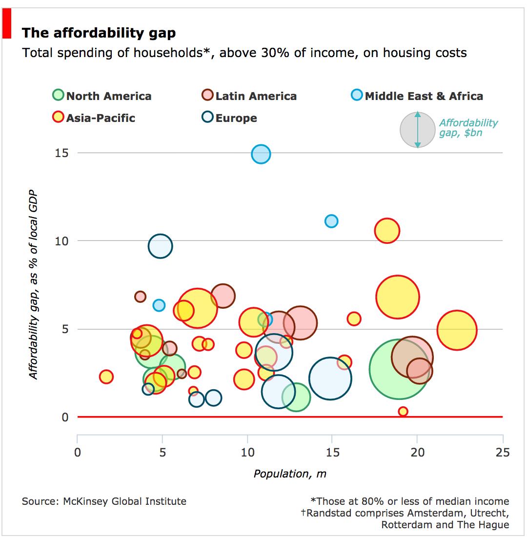
A new report by McKinsey Global Inst. compares housing affordability across 100 cities. HT/ the Daily Charts team at The Economist, who came up with a nice interactive chart.


[image credit: The Economist]


Tuesday, October 14, 2014

Global Ph.D.s Gender Gap (2010)

Scientific American has recently published an interesting chart showing the gender gap in Ph.D.s across different countries. It's amazing how the distribution varies so much between different fields of study. You should check the interactive version here.


Spatial income inequality in Brazil, 1872–2000

Reis, E. (2014). Spatial income inequality in Brazil, 1872–2000Economia,15(2), 119-140. 

*Thanks Leo Monasterio for the tip.


Abstract:
The paper provides historical perspectives on spatial economic inequalities in Brazil making use of a database on Brazilian municipalities from 1872 to 2000. A suit of maps and graphs describe the geographic factors shaping the historical development of the Brazilian economy highlighting the role of transport costs and its consequences for the spatial dynamics of income per capita and labor productivity. The remaining of the paper estimates econometric models of growth convergence for municipal income per capita and labor productivity. From 1920 onwards analyses are refined, firstly, by disaggregating the models for urban and rural activities; secondly, by assuming spatial correlation among variables of the model; and, thirdly, by enlarging the model to take account of the long run determinants of spatial growth convergence. Empirical results endorse the historical preeminence of geographic factors – in particular accessibility and transport conditions – as opposed to institutional conditions. The conclusion summarizes the results and proposes research extensions.

Sunday, October 12, 2014

DeadLine, personal note

Always keep it in mind and you won't need to kill yourself for it.

[image credit: by Don Motta]


My working soundtrack:

Wednesday, October 8, 2014

Urban Picture

Rio de Janeiro, Brazil

[image credit: Antonello]


Soundtrack:

Saturday, October 4, 2014

São Paulo from above (and its parking reform)

If you're interested in parking policies and urban planning, check this post by Paul Barter on the parking reform that is going on in São Paulo.

Even if you're not interested in this topic, I'm sure you'll like this picture (which I saw in Paul's post).


[image credit: NASA/Paolo Nespoli]


Soundtrack for the weekend:

Brazilian Elections

Big day for Brazil tomorrow with the elections. It's hard to say we don't have a solid democracy.


Thursday, October 2, 2014

How to make your pie chart less terrible

The team at Darkhorse Analytics have already shared a nice tip for how to make tables less terrible. Now it is time to 'improve' your pie charts!


Thursday, September 25, 2014

Average Commute Time Worldwide

This chart was taken from this study here. In general, commute times are relatively long in Brazilian metropolitan areas, especially when their wealth/population size is taken into account.

Obs.1: If you know of data sources (preferably household surveys) with commute time information for other metropolitan areas across the globe, I would to receive a message from you.

Obs.2: If you spot a name in the chart you've never heard of, it's probably a Brazilian metropolitan area.  


Related Link:

Wednesday, September 24, 2014

The Timing of Urbanization: a global analysis

Motamed, M.J. et al. (2014) Agriculture, transportation and the timing of urbanization: Global analysis at the grid cell level. Journal of Economic Growth, v.19,issue 3. 
(thanks Leo Monasterio for the tip) 

Abstract:

This paper addresses the timing of a location’s historical transition from rural to urban activity. We test whether urbanization occurs sooner in places with higher agricultural potential and comparatively lower transport costs, using worldwide data that divide the earth’s surface at half-degree intervals into 62,290 cells. From an independent estimate of each cell’s rural and urban population history over the last 2,000 years, we identify the date at which each cell achieves various thresholds of urbanization. Controlling for unobserved heterogeneity across countries through fixed effects and using a variety of spatial econometric techniques, we find a robust association between earlier urbanization and agro-climatic suitability for cultivation, having seasonal frosts, better access to the ocean or navigable rivers, and lower elevation. These geographic correlations become smaller in magnitude as urbanization proceeds, and there is some variation in the effects across continents. Aggregating cells into countries, we show that an earlier urbanization date is associated with higher per capita income today.

Related Links:


Tuesday, September 23, 2014

Solving a problem as a PhD student


[Credit: Kostas Siozios ht Franzie]

I started my PhD almost one year ago. I think this is going better than I expected in many ways, although quite often I feel like this.