Showing posts with label Network. Show all posts

Sunday, March 8, 2020

Call for papers: Advances in Spatial and Transport Network Analysis

The Int Journal of Geo-information has opened a call for papers for special issue on "Advances in Spatial and Transport Network Analysis". This issue is edited by Henrikki Tenkanen, Elsa Arcaute, Marta C. Gonzalez and myself. This is a great opportunity to create a dialogue between network and social scientists, transport geographers, engineers etc working on transport and mobility networks. This dialogue raises new challenges, though, as discussed in this thoughtful recent paper by Tim Schwanen.

Here is a short snippet of the cfp:
"This Special Issue is dedicated to papers focusing on recent advances in the development of new measures and methodologies to evaluate and analyze the performance of transportation networks. These measures might include, but are not limited to, environmental costs or exposures (e.g., CO2 , noise, pollution); monetary costs (the price of access), complexity, and resilience of multimodal transportation networks; or focus on qualitative aspects of travel, where travel might be seen as a gain instead of cost (such as exposure to aesthetic or green environments). Methodologically, we welcome works using novel ways to measure transport network connectivity, performance, and accessibility, including recent advances in machine learning and AI. Special attention will be paid to papers studying transport-related questions with interdisciplinary approaches."

Thursday, August 23, 2018

The geography of Manhattan distorted by travel-times

The figure below was created by Stefan Musch from Gradient Metrics (hat tip Jean Legrand). The figure was created using R and ggplot2 based on travel-time estimates from Google Maps API. There is a bit more info about the creation process in this post and perhaps Stefan will share his code at some point.... please? :)

Echoing the comments of others on Twitter.  The figure does a great job illustrating how it is much harder to cross Manhattan from east to west than from north to south. Finally,  it would be great to see how this shape has changed over the last decades using historical travel time estimates.


credit: Stefan Musch (Gradient Metrics)

Tuesday, May 8, 2018

Visualizing space-time networks

I've said this on Twitter before but I should say it here as well. Craig Taylor and the Ito World team have some of the best data visualizations of geospatial data related to cities and transport networks.

Just a few days ago, Craig tweeted some of his latest work with neat visualizations of drive-time network for catchment area analysis. Here is a video comparing different cities in the UK and a brief explanation on how to read the dataviz.
"30 minute drive time analysis from major UK cities visualised as 3d coral geometry. 
The thickness of artery is proportional to the number of networks connected to it indicating busier routes. The falloff in height is linked to the proximity to the centre. 
Corals aren’t normalised in scale as the purpose of this is visualising the form and pattern the networks create. Animation is a boomerang motion scaling from 0 to 30 min and back again. Congestion/traffic not accounted for."

click at the bottom of the video to watch it in full screen and high definition


Yep, there are some obvious parallels here with Time Geography and in particular with the representation of space-time prisms. The static version of the space-time trees gives a sharper visualization of the data.

The space-time tree, or 3d coral geometry as Craig said.

and the inverted original dataviz, "the drive time web"

Wednesday, April 11, 2018

Assorted links

  1. Automation and AI will increase spatial/regional inequalities. Paper by Morgan Frank and colleagues

  2. Explore, select and download data of the global population projections by age, sex and education, a great collaborative work of researchers from the Wittgenstein Centre for Demography and Global Human Capital

  3. Greyhound: a powerful platform to interactively explore and analyze massive point clouds with Trillions of points in the browser, via Howard Butler


  4. The dynamical structure of political corruption networks. A paper by Haroldo RibeiroLuis Alves et al., analyzing 27 years of political corruption scandals in Brazil

  5. Citywide effects of high-occupancy vehicle restrictions: Evidence from “three-in-one” in Jakarta, by Rema Hanna et al.

  6. Want to find statistically significant hierarchical modules in weighted networks? paper here and code here, by Tiago Peixoto, who is the author of the graph-tool Python library


Friday, December 22, 2017

The impact of international long-distance flights on the spatial allocation of economic activity and inequality

Very interesting paper on the intersection of economic geography, development and transport economics. From a quick glance at the paper, I believe it could probably bring some interesting insights into network science as well.


Campante, F., & Yanagizawa-Drott, D. (n.d.). Long-Range Growth: Economic Development in the Global Network of Air Links. The Quarterly Journal of Economics. doi:10.1093/qje/qjx050

Abstract
We study the impact of international long-distance flights on the global spatial allocation of economic activity. To identify causal effects, we exploit variation due to regulatory and technological constraints which give rise to a discontinuity in connectedness between cities at a distance of 6,000 miles. We show that improving an airport’s position in the network of air links has a positive effect on local economic activity, as captured by satellite-measured night lights. We find that air links increase business links, showing that the movement of people fosters the movement of capital. In particular, this is driven mostly by capital flowing from high-income to middle-income (but not low-income) countries. Taken together, our results suggest that increasing interconnectedness induces links between businesses and generates economic activity at the local level, but also gives rise to increased spatial inequality locally, and potentially globally.

ps. The authors are also on Twitter in case you would like to follow their work more closely. Campante, F., & Yanagizawa-Drott


credit: Campante & Yanagizawa-Drott, 2017

Friday, October 27, 2017

Converting GTFS data into an igraph for network analysis in R

It is becoming ever more common for local transport authorities to publish their data on public transport networks in GTFS format. Two of the advantages of so many agencies using a standardized data format is that it makes it easier for us (1) to apply the same research methods to different cities and do comparative studies, and (2) to share our scripts, get feedback and learn from others. 

While working on my PhD on transportation equity in Rio de Janeiro, I have written a script in R that converts GTFS data into an igraph so I can run some network analysis. I shared this script on GitHub yesterday and it got the attention of a few people on Twitter, so I thought some of you might be interested as well. Get in touch if you would like to share any feedback or do some collaboration. :)


Tuesday, April 7, 2015

Dynamic population mapping using mobile phone data

An interesting study by Pierre Deville showing that it is possible to use data from mobile phone networks to analyze population spatial distribution while guaranteeing phone users’ privacy (via Tim Wallace).

Deville, P., et al. (2014). Dynamic population mapping using mobile phone data.Proceedings of the National Academy of Sciences, 111(45), 15888-15893.


Abstract
During the past few decades, technologies such as remote sensing, geographical information systems, and global positioning systems have transformed the way the distribution of human population is studied and modeled in space and time. However, the mapping of populations remains constrained by the logistics of censuses and surveys. Consequently, spatially detailed changes across scales of days, weeks, or months, or even year to year, are difficult to assess and limit the application of human population maps in situations in which timely information is required, such as disasters, conflicts, or epidemics. Mobile phones (MPs) now have an extremely high penetration rate across the globe, and analyzing the spatiotemporal distribution of MP calls geolocated to the tower level may overcome many limitations of census-based approaches, provided that the use of MP data is properly assessed and calibrated. Using datasets of more than 1 billion MP call records from Portugal and France, we show how spatially and temporarily explicit estimations of population densities can be produced at national scales, and how these estimates compare with outputs produced using alternative human population mapping methods. We also demonstrate how maps of human population changes can be produced over multiple timescales while preserving the anonymity of MP users. With similar data being collected every day by MP network providers across the world, the prospect of being able to map contemporary and changing human population distributions over relatively short intervals exists, paving the way for new applications and a near real-time understanding of patterns and processes in human geography.

Seasonal changes in population distribution in Portugal and France

Monday, November 24, 2014

What a neuroscientist is doing at Uber


Some of San Francisco’s Uber Networks
[image credit: Bradley Voytek]


*By now, you should have heard about Uber. If you haven't, I would recommend you to check this Freakonomics episode where they talk about Uber, what it is, its promises to the future of urban transport and some of its controversies. 

Monday, July 7, 2014

How we move in cities

A short post about a few great visualizations of how we move in cities*:

Mark Byrnes writes about the iPhone app Human, that has already tracked 7.5 million miles traveled by their users using different transport modes in 30 different cities.


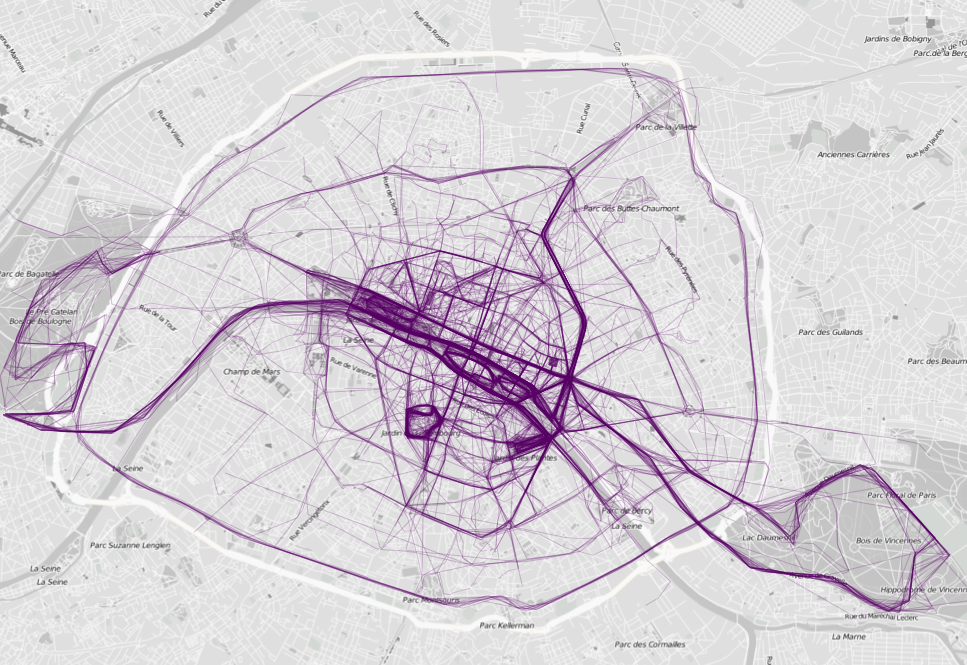
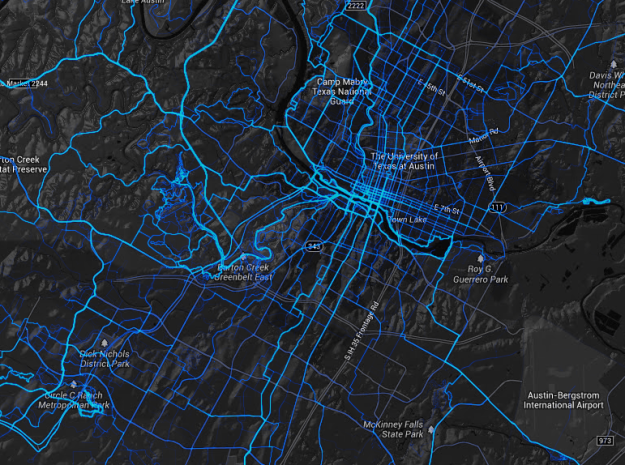
Nathan Yau also point out to two mobile apps that collect data about where people run and bike in major cities: RunKeeper  and Strava.


* There are many other projects dedicated to capture human mobility patterns in our cities using a wide variety of data sources and visualization techniques. It would be barely impossible to cover all of them. Here is a list with some of the projects I have crossed with: 

Thursday, June 26, 2014

Looking for Human Mobility Patterns through Internet services

Here is an interesting approach to estimate the number of international visitors going to Brazil during World Cup: Check-Ins on Facebook! I couldn't find who is the author of this video.

But when it comes to using the Internet to identify human mobility patterns though, I think Emilio Zagheni is a great academic reference. In this blog, we have already mentioned one of Zagheni's work, where he uses e-mail data to estimate global migration rates. He has also developed similar studies using Twitter Data and IP Geolocation.

There is also a whole different group of studies using Internet services to identify mobility patterns at the city scale. If you're more interested in this scale of analysis, this post might work as a starting point `A day in the life of a city`, but you should not forget the research of Cesar Hidalgo and colleagues using mobile phone data to study human mobility (and this one).

Tuesday, April 1, 2014

Worldwide linguistic landscape in Twitter

Conrad Hackett points out to this interesting paper published by A. BaronchelliB. Gonçalves and colleagues. If you are interested in social networks, big data, spatial analysis, etc, you should take a look at their work.

Paper: The Twitter of Babel: Mapping World Languages through Microblogging Platforms. PLoS One.

Abstract:
[...] we survey worldwide linguistic indicators and trends through the analysis of a large-scale dataset of microblogging posts. We show that available data allow for the study of language geography at scales ranging from country-level aggregation to specific city neighborhoods. The high resolution and coverage of the data allows us to investigate different indicators such as the linguistic homogeneity of different countries, the touristic seasonal patterns within countries and the geographical distribution of different languages in multilingual regions. This work highlights the potential of geolocalized studies of open data sources to improve current analysis and develop indicators for major social phenomena in specific communities.

Twitter users per capita


[image credit: Mocanu et al 2013]


Multiscale view of the geolocated Twitter signal

[image credit: Mocanu et al 2013]

Saturday, January 4, 2014

Delineating Geographical Regions with telephone call networks

An interesting paper discussing the delimitation of geographical regions and community boundaries, by Michael Szell and colleagues. This study can bring useful insights to the debate on functional urban areas and on the definition of metropolitan boundaries.


Sobolevsky S et al. (2013) Delineating Geographical Regions with Networks of Human Interactions in an Extensive Set of Countries. PLoS ONE 8(12): e81707. doi:10.1371/journal.pone.0081707

Abstract:


Large-scale networks of human interaction, in particular country-wide telephone call networks, can be used to redraw geographical maps by applying algorithms of topological community detection. The geographic projections of the emerging areas in a few recent studies on single regions have been suggested to share two distinct properties: first, they are cohesive, and second, they tend to closely follow socio-economic boundaries and are similar to existing political regions in size and number. Here we use an extended set of countries and clustering indices to quantify overlaps, providing ample additional evidence for these observations using phone data from countries of various scales across Europe, Asia, and Africa: France, the UK, Italy, Belgium, Portugal, Saudi Arabia, and Ivory Coast. In our analysis we use the known approach of partitioning country-wide networks, and an additional iterative partitioning of each of the first level communities into sub-communities, revealing that cohesiveness and matching of official regions can also be observed on a second level if spatial resolution of the data is high enough. The method has possible policy implications on the definition of the borderlines and sizes of administrative regions.


[image credit: Sobolevsky S et al., 2013]