Friday, December 23, 2016

A history of global living conditions: a big picture of human development in 6 charts

It is hard not to be a pessimist these days. As 2016 comes to an end, it leaves us with that bitter feeling of "WTF world!". In gloomy days like these, having a long term perspective on human development can help us alleviate this feeling.

The image below brings 6 charts that give a historical perspective on human development (detailed and interactive charts here). They show the big picture of some of the remarkable improvements we have seen in the world in the last 200 years, with less poverty and tyranny and with more education and better health conditions.

This image comes from Our World in Data (OWID), a fantastic online publication that shows how living conditions are changing in the world with the best available on wide range of topics including health, food, energy, institutions, culture, education, technology, war and peace, etc. I am proud that OWID is produced at the University of Oxford. It was created by  Max RoserEsteban Ortiz Ospina and Jaiden Mispy

The OWID website is a great source of information, particularly if you're feeling too pessimistic about the world  or if you feel like procrastinating a bit, like me 

"One reason why we do not see progress is that we are unaware of how bad the past was." (Roser et al, OWID)

Wednesday, December 21, 2016

Cyber-attacks and the vulnerability of smart cities

A few weeks ago, anonymous hackers attacked the computers that run the public transport system of San Francisco, which wouldn't take any payments from passengers. The hackers demanded a ransom of 100 Bitcoin (about $73,000) but didn't get any money. Full story here, by Jack Stewart.

If I'm not mistaken, this is the first case a cyber-attack targets a public transport system. Certainly, this will not be the last one. This kind of event is likely to become more common as cities adopt 'smart' strategies of urban management that increasingly connect public services to integrated systems and the 'internet of things'.

Perhaps a good topic for a PhD project, if anyone is interested.

R Links

  1. A new R package establishes an interface between R and QGIS - RQGIS , and a video tutorial showing the new ArcGIS interface for R

  2. PISA 2015 – how to read/process/plot PISA data with R

  3. bayesPop, the package for Bayesian population projections used by the UN, by Adrian Raftery via Bernardo L Queiroz. Here is the paper

  4. Improving R animated GIFs with tweenr,by Leonard Kiefer

  5. Simple and interactive R Graph Catalog

  6. An interactive color chooser for #rstats

  7. Creating tilted and stacked maps in R using ggplot2

  8. Urška Demšar et al have written an script in R to visualize Stacked Space-Time Densities around trajectories. The related paper is here

credit: Urška Demšar

Tuesday, December 20, 2016

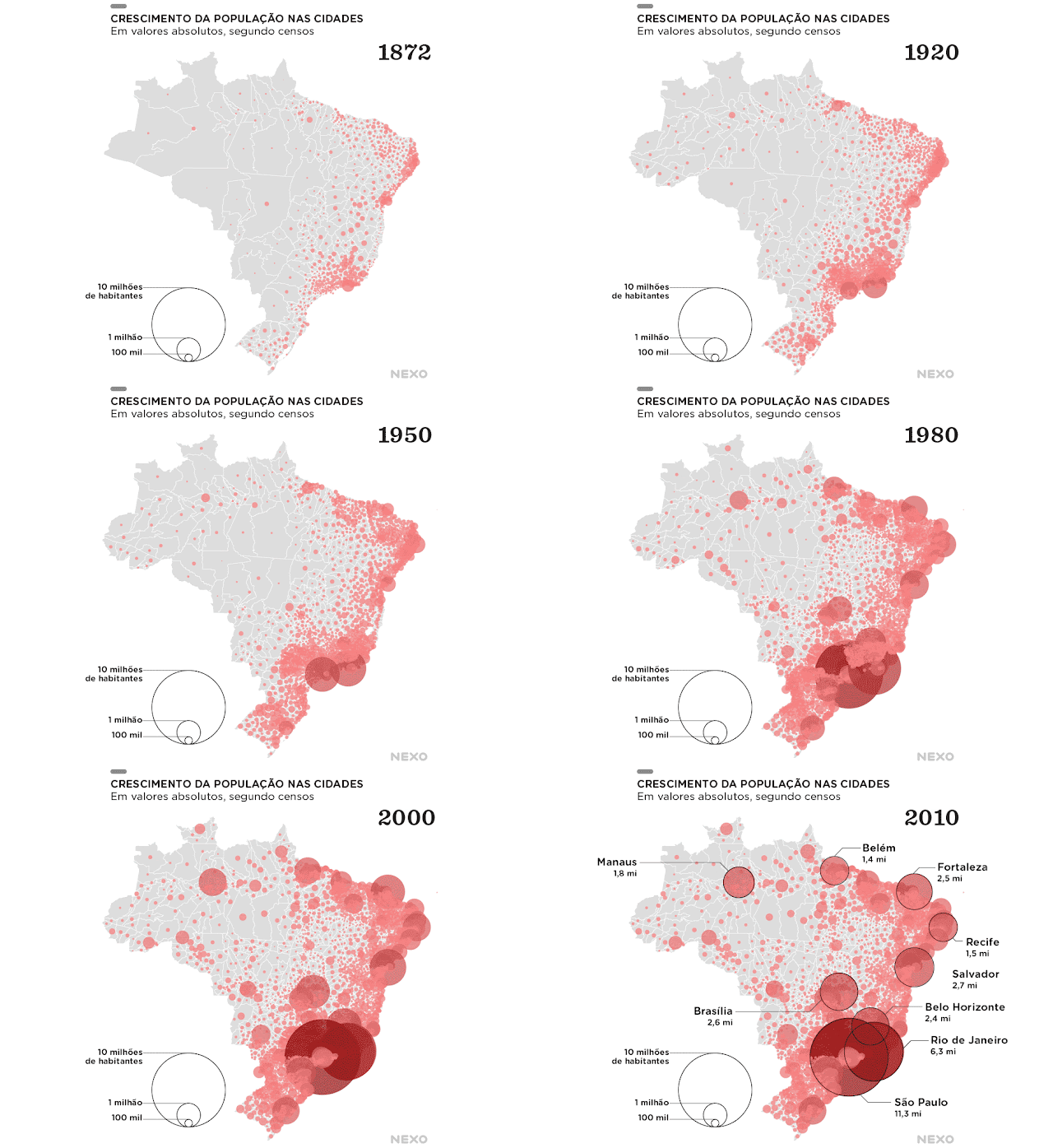
Mapped history of population expansion in Brazil

Early this month we shared an animation created by Nathan Yau mapping the history of population expansion in the US.

Here is a relatively simpler but still a nice animation of population growth in Brazilian municipalities between 1872 and 2010. This gif is based on population census data and it was created by a data visualization team at Nexo, which is one of the best news websites in Brazil.


credit: Nexo


Here is a similar animation but distorting land mass according to population size, like in those maps that got popularised by Ben Benjamin.

credit: Nexo

Saturday, December 17, 2016

Urban Picture

Truly sad pictures of the Syria's civil war back in 2014, and recent pictures here and here. Since then, the situation has gotten depressingly worse in the country.

Damascus, Syria, January-2014


This picture taken the United Nations Relief and Works Agency for Palestine Refugees in the Near East (UNRWA) shows residents of the besieged Palestinian camp of Yarmouk, queuing to receive food supplies, in Damascus, Syria, on January 31, 2014.

If you would like to help, consider donating to organizations with the greatest capacity to make a difference amid this devastation.

Wednesday, December 14, 2016

Open Research position at the Transport Studies Unit, Oxford University

Please spread the word:

The Transport Studies Unit (TSU) and the School of Geography and the Environment at Oxford University are advertising a 5-year post of Research Lecturer in Transport Studies. Applications deadline: 30 January 2017. Full details can be found here.

As some of you will know, I am in my 4th year of my PhD at TSU, under the supervision of Tim Schwanen and David Banister. I have to say this has been a fantastic and humbling experience and I feel extremely privileged to be part of this institution, which I would highly recommend to prospective students and researchers. TSU is a relatively small research group with some extremely smart researchers in an incredibly vibrant department at one of the top universities in the world. 

ps. the city of Oxford is also lovely but the the weather is not exactly what you would find in Hawaii.


Sunday, December 11, 2016

Comparing house price trends worldwide

Leonard Kiefer has a new post where he presents some interesting analysis of global house price trends. Lonards has used data from the international house price database, organized by the Dallas Federal Reserve Bank.

The analysis is written in R and the code is available at the bottom of his post. Thanks Leonard!

ps. don't forget to check the related links at the bottom of this post.

credit: Leonard Kiefer


Related Links:

Saturday, December 10, 2016

Navigation Before Google Maps


Wednesday, December 7, 2016

summary: Distributive justice and equity in transportation

Hi all, the 1st paper of my thesis is now published \o/. You can download it here. If you cannot access the PDF, just let me know and I'll send it to you. Here is a summary of the paper:

Pereira, R. H. M., Schwanen, T., Banister, D. (2017). Distributive justice and equity in transportation. Transport Reviews, 37(2), doi:10.1080/01441647.2016.1257660


What's it about?

As I've mentioned before in the blog, this is a review paper on distributive justice in transportation, particularly focused on transport accessibility and social exclusion. While transport planning has been traditionally concerned with improving the efficiency of transport systems, this paper argues why policy makers and researchers should take issues of equity more seriously and it discusses how justice could be considered in evaluating the distributional aspects of who benefits from transport policies and investments.

In short, the paper:
  • reviews how issues of equity and social exclusion have been covered in the transport and mobilities literatures 
  • reviews five key theories of justice (utilitarianism, libertarianism, intuitionism, Rawls’ egalitarianism, and Capability Approaches) and critically evaluates the insights they generate when applied to transport 
  • proposes a distributive justice framework for policy evaluation, with a focus on transport accessibility and social exclusion

Core ideas of the paper

In the final part of the paper, we build a dialogue between Rawls’ egalitarianism and the Capabilities Approach to propose that distributive justice concerns over transport disadvantage and social exclusion should focus primarily on accessibility as a human capability. This means that, in policy evaluation, a detailed analysis of the distributional effects of transport policies should take account of the setting of minimum standards of accessibility to key destinations and the extent to which these policies respect individuals’ rights and prioritise disadvantaged groups, reduce inequalities of opportunities, and mitigate transport externalities. A full account of justice in transportation requires a more complete understanding of accessibility than traditional approaches have been able to deliver to date.

As you will have noticed, there are five key points developed in the paper. I should try to unpacked them in another post in the future.
  1. Focus on accessibility as a human capability
  2. Minimum standards of accessibility to key destinations 
  3. Respect for individuals’ rights 
  4. Prioritization of disadvantaged groups and reduction of inequalities of opportunities
  5. Mitigation of transport externalities

Practical implications

For now, I close this post with some of the practical implications of the ideas proposed in the paper:

  • "Some of the practical implications of this perspective can be illustrated with issues that commonly arise in cities with investments in public transport (e.g. metro and bus rapid transit developments) and cycling/walking. These types of investments can be good ways to prioritise transport modes which are more widely used by low-income classes. To be considered fair, however, these investments should not override the social rights of families threatened with eviction due to the infrastructure projects. The distributional effects of such investments should be evaluated in terms of the extent to which they reduce inequalities in transport accessibility, particularly by improving the accessibility levels of low-income public transport-dependent groups to key destinations such as employment opportunities, healthcare, and education services. According to this approach, the design of those transport projects (including the design of vehicles, stations, cycle paths, etc.) must be inclusive towards social groups such as the elderly and disabled in order to minimise the impact that non-chosen disadvantages have on people’s capacity to access activities. Moreover, this perspective also calls for complementary policies that discourage car use (e.g. congestion/parking charge and fuel tax) in highly congested and polluted areas to mitigate the negative externalities imposed by drivers on everyone else, particularly on vulnerable populations" p.15-16
I will be glad if some of you have read this far without falling asleep. 

Tuesday, December 6, 2016

Mapped history of population expansion in the US

Great data visualization created by Nathan Yau using R and NHGIS data. Nathan's website Flowing Data is one of my all time favorite websites and I strongly recommend you check it out.


Friday, December 2, 2016

Brasilia, 32 years of urban expansion

Google Earth Engine has released new data for their project Timelapse, which combines over 5 million satellite images acquired over the past three decades and allows for a zoomable video of land transformations at a global scale. You can play around  procrastinate  on their website zooming in different areas. I find Dubai and Las Vegas particularly interesting. There is a good playlist on Youtube!

This is the timelapse of Brasilia (Federal District), my hometown. During this period between 1984 and 2016, the population of Brasilia went from approx. 1.2 million to 2.9 million. The video shows some very interesting transformations including the expansion of poor settlements largely undeserved by urban infra-structure in the south and southwest of the city, but also some illegal occupations of protected areas by middle- and high-income gated communities in the east and north-east parts of the city.