A 'very good' (exclamation mark) chart that "reveals exactly how positively and negatively the population perceives various descriptions to be." (ht Simon Kuestenmacher). This chart was created by Matthew Smith, and it was inspired in this older chart below on Perceptions of Probability and Numbers, by Zoni Nation.
Structured Procrastination on Cities, Transport Policy, Spatial Analysis, Demography, R
Showing posts with label statistics. Show all posts
Tuesday, October 9, 2018
Saturday, December 9, 2017
Assorted Links
-
-
-
-
-
- Alex Singleton, Seth Spielman and David Folch have a new book called Urban Analytics. The book looks really promising! I haven't had the chance to read it
need to work on my phd thesisand it is packed with GitHub resources that you can access here -
-
- The transition from more than 6 to fewer than 3 children per woman took the UK almost a century. This change took 26 years to happen in Brazil, and only 11 years in China - Max Roser (ht Leo Monasterio)
Marcadores:
Assorted links,
big data,
cartography,
dataviz,
Fertility,
gender,
History,
race,
statistics
Monday, October 9, 2017
Why you should always visualize your data
In 1973, the statistician Francis Anscombe published a paper demonstrating the importance of plotting the data before analyzing it. That paper introduced what latter became known as the Anscombe's Quartet, which comprises four datasets that have almost identical descriptive statistics including means, variances and correlation and yet look completely different when you plot them.
This year, this idea has been taken to a whole new level. A couple of researchers took this idea very seriously and they developed a method to relocate the points in a scatterplot towards a given shape and still keep descriptive summaries seemingly identical. The authors published the method here. They've also developed an R library {datasauRus} so you can procrastinate the whole afternoon learn more about statistics.
Marcadores:
R,
statistics
Wednesday, June 21, 2017
Difference-in-differences for spatial data
It just came to my knowledge today that Raymond Florax passed away a couple of months ago (in memorian). Prof. Florax was very influential in the field of spatial econometrics. In one his latest papers, he co-authored with Delgado and proposed a difference-in-differences method for spatial data, controlling for spatial dependence. Here is the paper.
Delgado, M. S., & Florax, R. J. (2015). Difference-in-differences techniques for spatial data: Local autocorrelation and spatial interaction. Economics Letters, 137, 123-126.
Abstract:
We consider treatment effect estimation via a difference-in-difference approach for spatial data with local spatial interaction such that the potential outcome of observed units depends on their own treatment as well as on the treatment status of proximate neighbors. We show that under standard assumptions (common trend and ignorability) a straightforward spatially explicit version of the benchmark difference-in-differences regression is capable of identifying both direct and indirect treatment effects. We demonstrate the finite sample performance of our spatial estimator via Monte Carlo simulations.
Marcadores:
statistics
Wednesday, May 17, 2017
Assorted Links
- Isoscope: work by Flavio Gortana (Twitter), showing how isochrones by car vary across space and time
- Tutorial: Spatial Datasets and Urban Applications (code, slides + data)
- Beautiful photographs of Forgotten Places, via Darran Anderson
- Five tools that help you master map projections
- The unfinished cities of Spain via Urban Living Lab
- 15 years of urban growth in China, via Lazaro Gamio
- Surnames and ancestry in Brazil, by Leo Monasterio
- "Seeing Theory – A visual introduction to probability and statistics.”
- paper: Combining satellite imagery and machine learning to predict poverty, by Neal Jean et al [code]
Marcadores:
Assorted links,
cartography,
GIS,
History,
Machine Learning,
satellite data,
statistics,
travel time,
Urban Evolution
Monday, May 1, 2017
Monday, February 13, 2017
On the specification of spatial models
One of best sentences I've read in an academic paper in years:
I've only started reading more about spatial models recently. Here are four papers I would recommend to get started on the topic.
This paper is particularly relevant to problem raised in the quote above:
"Without divine intervention it is generally difficult to know with certainty which (if either) of the two above cases are true"This is from Fotheringham et al (1998) on the specification of spatial models. I find this quite amusing but I must say this is one of the most well written and accessible articles on spatial econometric models I've come across so far. It's not by chance this paper has become a great reference on the topic with more than 500 citations.
I've only started reading more about spatial models recently. Here are four papers I would recommend to get started on the topic.
- Anselin, L. (2002). Under the hood Issues in the specification and interpretation of spatial regression models. Agricultural Economics, 27(3), 247–267.
- Fotheringham, A. S., Charlton, M. E., & Brunsdon, C. (1998). Geographically Weighted Regression: A Natural Evolution of the Expansion Method for Spatial Data Analysis. Environment and Planning A, 30(11), 1905–1927.
- Florax, R. J. G. M., Folmer, H., & Rey, S. J. (2003). Specification searches in spatial econometrics: the relevance of Hendry’s methodology. Regional Science and Urban Economics, 33(5), 557–579. [thanks Leo Monasterio for the recommendation]
- Páez, A., & Scott, D. M. (2005). Spatial statistics for urban analysis: A review of techniques with examples. GeoJournal, 61(1), 53–67.
This paper is particularly relevant to problem raised in the quote above:
- Gibbons, S., & Overman, H. G. (2012). Mostly Pointless Spatial Econometrics?*. Journal of Regional Science, 52(2), 172–191
I just happened to like this plot.
Marcadores:
statistics
Friday, February 3, 2017
Intro to Spatial Data Science
Seven recorded lectures on Spatial Data Science by Luc Anselin at the University of Chicago (October 2016). It might be of interest to some readers of this blog as well.
By the way, the Center for Spatial Data Science is also on Twitter.
Marcadores:
Online Courses,
statistics
Saturday, January 21, 2017
Assorted Links
- Challenge: try to guess how family income affects children’s college chances
- Twenty rules for good graphics , by Rob Hyndman
- David Levinson on 'On why bike lanes might appear underutilized'. Not eaxctly a new post, but really good
- The Carbon Map
- Global Talent Flows: the migration patterns of inventors, via Amine Ouazad
- Moore’s Law might be coming to and end soon … or maybe it just need to be reformulated, again
- A great interactive explanation of Ordinary Least Squares Regression, by Victor and Lewis
- Google Street View gets you inside the quads of many Colleges at Oxford University

credit: Rick Noak, WP
Marcadores:
Assorted links,
Cycling,
dataviz,
Education,
Inequality,
Migration,
Oxford,
statistics
Monday, August 15, 2016
Don't trust summary statistics
Always visualize your data! Wise words, by Alberto Cairo
Don't trust summary statistics. Always visualize your data first https://t.co/63RxirsTuY pic.twitter.com/5j94Dw9UAf— Alberto Cairo (@albertocairo) 15 August 2016
Marcadores:
dataviz,
statistics
Tuesday, May 10, 2016
Detecting Spatial Clusters of Flow Data
Tao, R. and Thill, J.-C. (2016), Spatial Cluster Detection in Spatial Flow Data. Geographical Analysis. doi: 10.1111/gean.12100
Abstract:
Abstract:
As a typical form of geographical phenomena, spatial flow events have been widely studied in contexts like migration, daily commuting, and information exchange through telecommunication. Studying the spatial pattern of spatial flow data serves to reveal essential information about the underlying process generating the phenomena. Most methods of global clustering pattern detection and local clusters detection analysis are focused on single-location spatial events or fail to preserve the integrity of spatial flow events. In this research a new spatial statistical approach of detecting clustering (clusters) of flow data that extends the classical local K-function, while maintaining the integrity of flow data was introduced. Through the appropriate measurement of spatial proximity relationships between entire flows, the new method successfully upgraded the classical hot spot detection method to the stage of “hot flow” detection. Spatial proximity of flows was measured by a four-dimensional distance. Several specific aspects of the method were discussed to provide evidence of its robustness and expandability, such as the multiscale issue, relative importance control and adaptive scale detection, using a real dataset of vehicle theft and recovery location pairs in Charlotte, NC.
image credit: Tao, R., & Thill (2016)
Marcadores:
dataviz,
spatiotemporal,
statistics
Thursday, February 25, 2016
Sunday, November 1, 2015
Assorted Links
- Fordlandia: The Failure Of Ford's Jungle Utopia ht Pablo Astudillo
- The most highly educated group of immigrants to the US are those from Africa (via William Easterly)
- The German radical Left Party wishes to deregulate walking
- Interactive map showing movement of refugees migrants to Europe since 2012 (via Population Europe)
- This Is What Happens When You Photoshop All The Men Out Of Politics
- Hack Your Way To Scientific Glory, or hot to manipulate your p-values to become publishable
- An incredibly detailed map of London in 1746
- Other things I'd rather be doing
- Welcome to Planet Voronoi, a Capital Place
Marcadores:
Assorted links,
Migration,
statistics
Monday, April 20, 2015
Assorted links
- 4 instant cities that are still empty
- Hans Rosling delivers his Ignorance on international development
- How urban highways have changed cities' landscapes in the US (ht Oxford Urban)
- India has spent $74 million to put a satellite into Mars orbit. If you consider the cost per kilometer travelled, it is cheaper than an auto ride in Delhi (via Tyler Cowen)
- 10 things statistics taught us about big data analysis
- What happens when governments try to help poor people move to better neighborhoods?
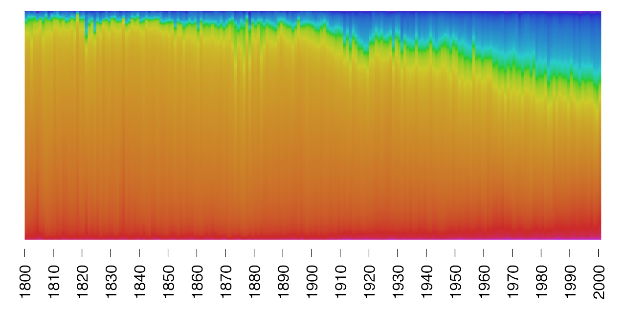
- The rise of Blue. Using R to visualize the change in colors of paintings over the last 200 years (via Nicholas Christakis)
Marcadores:
Assorted links,
Development,
Housing,
R,
statistics,
Urban Planning
Monday, January 19, 2015
The Big Data trap
Tim Harford's talk on the perils of big data at the Royal Statistical Society (RSS):
Here is a short summary of one of the main arguments:
Hidden biases in data are a problem. Even the largest of datasets have bits of information missing. Quoting Microsoft researcher Kate Crawford, Harford said one might think they have all the data, but there will always be people missing from any dataset.
To illustrate this, Harford pointed to the City of Boston's Street Bump smartphone app - a clever idea to tackle the problem of potholes. Bostonians were encouraged to download the app and set it running when out in their cars so that when their vehicles hit a pothole, the bump would be recorded by the phone's accelerometer and location data sent to the city's public works department. What happened, of course, was that most of the potholes that were identified and fixed were those in young, affluent areas - areas where people owned smartphones and could download the app.
City officials might have thought they had found a way to record every pothole, but that wasn't the case. As Harford concluded: "Some might think we are now able to measure everything; that we can turn everything into numbers. But we need to be wise enough to know that is always an illusion."
Marcadores:
statistics,
Video
Thursday, October 30, 2014
Assorted Links
- Where on earth is the Berlin wall? Full story here
- You could fit all the planets of the Solar System within the distance between the Earth and the Moon
- The gradparents of smartcars via MR
- A Visual Survey of Text Visualization Techniques
- A Globe-Spanning Accent Map for the Word 'Potato'
- OECD report: How was life? Global well-being since 1820 via Leo Monasterio
- Varian on Big Data: New Tricks for Econometrics via Gary King
- The Twitter map of the Brazilian Elections
Marcadores:
Assorted links,
Economics,
GIS,
History,
statistics,
visualizing complexity
Tuesday, August 12, 2014
R Links
- Robin Lovelace will be teaching a practical introduction to spatial microsimulation in R, Cambridge/UK Sept 18 - 19th
- Free e-book on Data Science with R
- Rob Hyndman talks about how to do Forecasting, Backcasting and Coherent population forecasting using R
- Computational Actuarial Science with R
- Exploring the United Nations population projections with rCharts, by Kyle Walker
- There are many useful tips in the Applied Demography Toolbox
- Behold the R meme generator! Your life will never be the same after this.
Marcadores:
Projections,
R,
statistics
Monday, July 14, 2014
Assorted links
- The daily routines of creative people
- 15 Super Thin Buildings
- Data-driven insights to optimize the use of public transport, by Urban Engines
- Heterogeneity in Expected Longevities
- Why are teen births down in the US? Answer: Postponement
- Tokyo's massive flood prevention system
- Things I would rather be doing
- 10 things statistics taught us about big data analysis
[image credit: Simply Statistics]
Marcadores:
Assorted links,
Fertility,
Life expectancy,
statistics
Monday, July 7, 2014
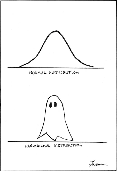
Normal and Paranormal distributions
Isn't it a brilliant paper?
Freeman, M. (2006). A visual comparison of normal and paranormal distributions. Journal of Epidemiology and Community Health, 60(1), 6.
Marcadores:
Academic writing,
Cartoons,
statistics
Wednesday, July 2, 2014
Assorted links
- LSE Report - Cities and Energy: Urban Morphology and Heat Energy Demand
- Experimental evidence of massive-scale emotional contagion through Facebook (via MR)
- 18th-century London paintings meet Google Street View
- Did General Motors lead an automotive conspiracy to undermine streetcar lines in the US? Apparently not
- The 10 world cities with the highest murder rates
- Are UK migrating to the US and becoming lawyers in Illinois? This and other spurious correlations.
- Free Statistical Software, SAS University Edition (thanks Bernardo Queiroz for the tip)
- The first ever government census of schools in Mexico: “The Theft of the Century”
- Range of average lengths of PhD dissertations across the disciplines
[click on the image to enlarge it]
[image credit: Marcus Beck]
Marcadores:
Academic writing,
Art,
Assorted links,
Education,
History,
Morphology,
Mortality,
statistics,
Transport
Subscribe to:
Posts (Atom)