- Learn about handling character data in R with this free e-book
- International population pyramids with ggplot2, by Kyle Walker
- Beautiful mistakes in R
- An interactive simulation model of Ebola, via Robin Lovelace
- Interactive maps in R
- Series of youtube tutorials for R users and developers, by Google Developers
- List of R packages related to networks, graphs, Bayesian models, and flow diagrams
- Interactive Circular Migration Flow Plots in R (by Nikola Sander and Guy Abel)
Monday, December 15, 2014
R Links

Thursday, December 11, 2014
A debate with D.Harvey and Ed.Glaeser
The team at Caos Planejado (a very good Brazilian blog focused on urban economics) points out to a recent event where David Harvey and Edward Glaeser discussed the 'Economics of the Creative Economy'.
It is certainly not every day that we have this kind of debate. David Harvey is one of the most influential critical geographers with a great academic history and his writings have shaped a lot of the Marxist readings on cities. On the other corner of the ring Edward Glaeser is among the greatest urban economists nowadays and has a brilliant list of publications on a variety of issues related to urban development.
Despite ideological divergences, both are highly qualified scholars. They are also extremely polite, to a point that their disagreements always come in a gentle sometimes even subtle way. I confess I was expecting some more blood.
My two highlights. Harvey and Glaser disagree on two particular questions that caught my attention: the connection between affordability issues and the idea of successful cities (29'-37'), and their different (normative) understandings of how property should be organized (1:04'-1:08'). Their disagreement on these two topics reflect markedly different positions in political philosophy more generally. More deeply, it shows rather different understandings of what justice means, and what should be the role of governments and markets in the pursuit for justice.
I will stop here before you fall asleep with this post. Hope you enjoy the video.
ps. Glaser's body language reaction at 1:05' is hilarious.
Wednesday, December 10, 2014
How much space do we dedicate to cars?
Chris Bruntlett points out to this great drawing by Karl Jilg depicting 'the sad state of walking in our cities'. It's a nice way to illustrate how much public space is dedicated to cars in our cities and its health risk implications.
/cdn0.vox-cdn.com/uploads/chorus_asset/file/2466040/3206.0.jpg)
[image credit: Karl Jilg/Swedish Road Administration]
It is a well known and old stylized fact that cars occupy a disproportional amount of road space. Artistic expressions a aside and despite the effort of a few good researchers, no one really knows how much road space we actually dedicate to cars compared to other transport modes. This is not a trivial question to answer. There are many variables involved (including vehicle occupancy rates, vehicle speeds, the amount of road and parking spaces, fleet composition, etc), these variables change drastically across different parts of the city and different times of the day and such data is hardly available.
In the 'time of big data' with very profound and rapid changes in data collection, there are huge opportunities to advance this research agenda using computational modelling and I've been really tempted to work on this topic during my PhD. Would someone like join me? ;)
Tuesday, December 9, 2014
The Shortest bike lane ever
Shortest bike lane ever. Amazing. pic.twitter.com/nTUusAiBzr
— Justin S (@urban_future) December 9, 2014
Related Links:
- Real time mapping of bikeshare schemes around the world by Oliver O'Brien
- The size of bike-sharing systems Worldwide
- Bicycles access and school enrollment
- The world leader in bike-sharing is… China
- Google Maps now features elevation profiles for some bike routes
- The Impact of the Built Environment on Bicycle Commuting: Evidence from Beijing
Monday, December 8, 2014
The Rise and Fall of Manhattan’s Density (updated)
Alexander McQuilkin has written a very nice piece on the rise and fall of Manhattan’s density over the past 200 years. It's certainly worth a read.
"Between 1800 and 1910, density in urban Manhattan tripled from 200 to 600 people per hectare. Neighborhoods like Chinatown, the Lower East Side, and the East Village were significantly denser than the average, approaching 1,600 people per hectare." [This is about 4 times the population density of these neighborhoods as observed today !]
This is an interesting and not so new map showing the 'de-densification of Manhattan', by Shlomo Angel and Patrick Lamson-Hall.

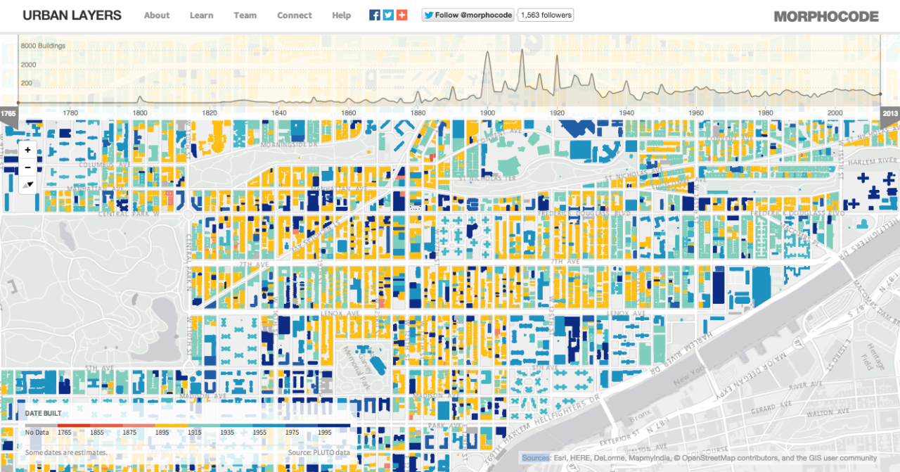
Updated: If you liked this post, you might like this interactive tool called Urban Layers that tracks Manhattan's rise, block by block, since 1765.

[image credit: Shlomo Angel and Patrick Lamson-Hall]
Updated: If you liked this post, you might like this interactive tool called Urban Layers that tracks Manhattan's rise, block by block, since 1765.
[image credit: @morphocode]
Sunday, December 7, 2014
The invisible patterns of air travel
James Cheshire (who has one of the greatest blogs about spatial analysis and R) points out to this incredible visualization of the invisible patterns of air travel in the UK.
Related Links:
Saturday, December 6, 2014
Urban Picture
Cesar A. Hidalgo has pointed me to this picture showing an amazing contrast in the urban fabric of a city in Venezuela (I think this is Caracas but I'm not quite sure).
Urban contrast in Venezuela. Another example of how cities reflect society. @UrbDemogrphics @MITdusp @MITCities pic.twitter.com/g6Qj4zDfQg
— Cesar A. Hidalgo (@cesifoti) December 6, 2014
Friday, December 5, 2014
One Day on Waze
'One Day on Waze' is a series of data visualization videos showing 24 hours worth of data on Waze. The cities include: Boston, Jakarta, Los Angeles, Miami, New York, Rio de Janeiro, San José, and Tel Aviv.
Related Links:
This is the video of Rio, where it's possible to spot some ugly red bottlenecks.
Related Links:
Thursday, December 4, 2014
Assorted links
- All papers published in Nature will be made free to read in screen-view format (ht Cheli Cresswell)
- The world's most beautiful metro stations in pictures
- Nature explores the most-cited research of all time
- Mind-blowing post "Visualizing Algorithms" (ht Andy Boneau)
- Louis Smith has written a great piece to celebrate the 100th anniversary Lina Bo Bardi, the Italian architect who designed MASP in Sao Paulo and the Bowl Chair
- Some common ways we're misled with charts
- Migrants account for 70% of the increase in working-age population in OECD area
- How big is #67P? Compare size of the comet with cities across Europe
- World population predictions keep getting upward revisions these days (ht Sander Wagner)
[click on the image to enlarge it]

[image credit: Scientific American]
Tuesday, December 2, 2014

Subscribe to:
Posts (Atom)