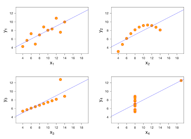
In 1973, the statistician Francis Anscombe published a paper demonstrating the importance of plotting the data before analyzing it. That paper introduced what latter became known as the Anscombe's Quartet, which comprises four datasets that have almost identical descriptive statistics including means, variances and correlation and yet look completely different when you plot them.
This year, this idea has been taken to a whole new level. A couple of researchers took this idea very seriously and they developed a method to relocate the points in a scatterplot towards a given shape and still keep descriptive summaries seemingly identical. The authors published the method here. They've also developed an R library {datasauRus} so you can procrastinate the whole afternoon learn more about statistics.

