A couple of weeks ago, I wrote a post about the new UN annual report on forced migration and refugees and how the guys at the NYT (S.Peçanha and T.Wallace) did a great job in visualizing the data from the report. As a short update to that post, I would like to point out how the same dataset can be visualized in quite different ways. I highlight here only two other data visualization projects based on the same data set and which could be inspiring to other people working with flows data.
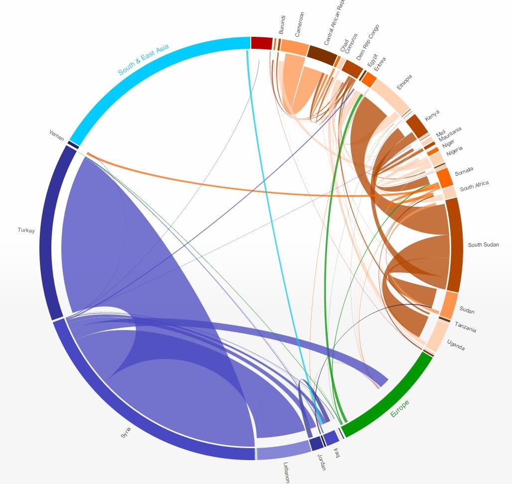
The first project is the Global Flows of Refugees, where Nikola Sander and Ramon Bauer have used interactive circular plots to explore refugee flows between countries, regions, etc. The plot is quite effective in showing how flow sizes and origin-destinations change from 2013 to 2014.
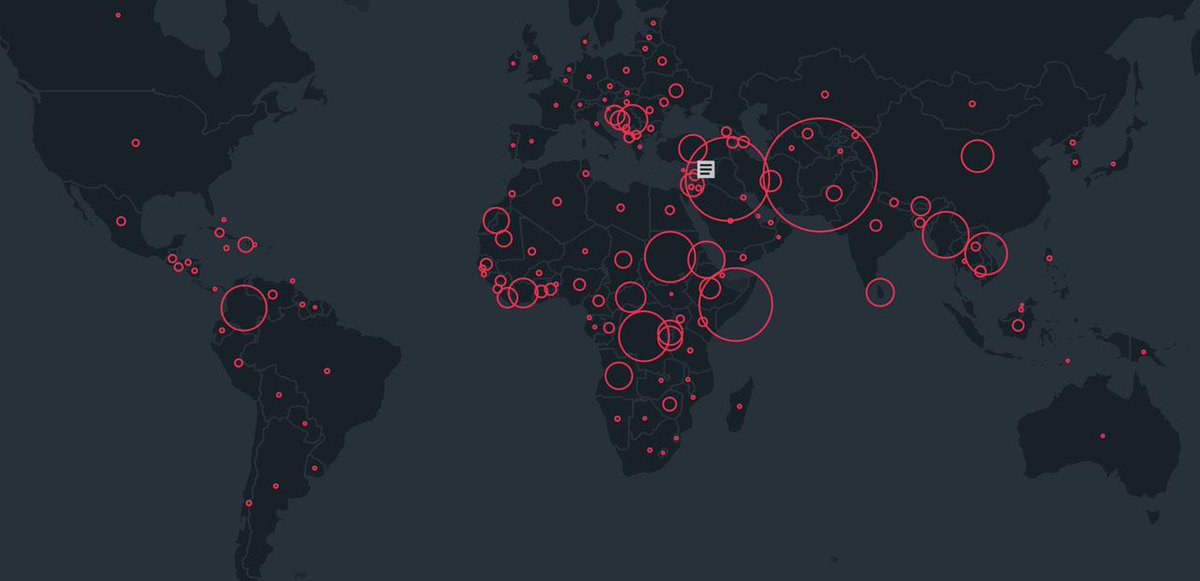
The second dataviz comes form the Refugee Project, which brings some geographical context and more historical information on forced migration year by year since 1975. It was designed by Ekene Ijeoma and the team at Hyperakt.