Showing posts with label Density. Show all posts

Sunday, December 16, 2018

3D interactive map of population densities across the globe

A couple of years ago, I wrote a blog post showing where to find data on population estimates at high spatial resolution for the world. These are great sources of data if one wants to explore and visualize how population density varies across the globe, like in this neat interactive map created by Duncan Smith (CASA UCL).

I'm a big enthusiast of 3D density maps, as you might have noticed by so many of these posted on the blog before (such as this 1, this 2, this 3, this 4, this 5, ....). And apparently I'm not alone. A few days ago, Matt Daniels created a beautiful 3D interactive map of population densities and it went viral on the internet. You can procrastinate browse around the map and check your own region, but don't miss the story Matt published at The Pudding.


image credit: Matt Daniels (The Pudding)

Sunday, August 19, 2018

The urban landscape of Hong Kong

Johnny Harris (Vox) has filmed a great series of short-videos that helps us understand the urban landscape of Hong Kong. In one of these videos, Johnny talks about how one of the most unaffordable housing markets in the world is driven by government's land-use regulations. The videos also cover the decline of Hong Kong's neon nightscape and even how feng shui shapes the city skyline. There is also a very informative one about the changing relationship between Hong Kong and China. You can check the list of videos below.


Friday, December 15, 2017

Population density across Europe

Nice little geogif created by Alasdair Rae.


Wednesday, April 26, 2017

Map of Population Density Lines in R

If you are familiar with this famous Joy Division cover, you might remember that last year we shared a link that shows you how to reproduce the cover using R ggplot2. If you are a big fan of Joy Division and R, you should know that there is an R package just for that (by @mikefc).


About three years ago in 2014, James Cheshire created the Population Lines Print, a stylized map using lines to show population density in the world. It uses roughly the same data visualization style used in the Joy Division cover. 

credit: James Cheshire


How can you create a nice-looking map like this? Ask no more. James has recently shared the R script and a bit of the history behind his map. Henrik Lindberg has also generously written a gist with a simple and reproducible code to create a map with the same style showing the distribution of the population density in Europe, using R and ggplot2.

and you get this:

credit: Henrik Lindberg

UPDATE: Carson Sievert‏ shows how you can add two (2!) more lines of code to make this map interactive.

Monday, March 13, 2017

The world's tallest and most densely populated slums

A short video about Tower of David, possibly the tallest slum today, located in Caracas, Venezuelza. (Thanks Telmo Ribeiro and Lucas Mation for the pointer)


And a short video about Kowloon Walled City of Hong Kong, which was of the most densely populated slums in the world until being demolished in 1994.

Monday, June 1, 2015

Glaeser on Cities, Development, and Density

The NYU Stern Urbanization Project has been organizing a number of great seminars that cover interesting speakers at the intersection of urban planning and economics (Check their YouTube channel here). In December last year, they had Edward Glaeser talking about Cities, Development, and Density.


In case you want a more academic reference, much of Glaeser's presentation is present in his recent paper on 'the causes and consequences of urbanization in poorer countries'.

Friday, February 20, 2015

An Agent-Based Simulation of the Urban Growth in Latin American cities

Barros, Joana (2012). Exploring urban dynamics in Latin American cities using an agent-based simulation approach. In Agent-based models of geographical systems (pp. 571-589). Springer Netherlands. [Ungated version here, and PhD Thesis here]

Abstract:
This paper focuses on a specific kind of urban growth that happens in Latin American cities, called 'Peripherisation'. This is characterised by the formation of low-income residential areas in the peripheral ring of the city and a perpetuation of a dynamic core-periphery spatial pattern. The dynamics of growth and change in Latin American cities are explored using agent-based simulation. The objective is to increase the understanding of urban spatial phenomena in Latin American cities, which is essential to providing a basis for future planning actions and policies. Simulation exercises were used to revisit assumptions about urbanisation issues in Latin American cities and investigate important aspects of growth and change in these cities. These exercises allowed the problem of urban growth in Latin American cities to be unfolded through their dynamics, relating these dynamics to urban morphology, and thus presenting a new and important perspective on the phenomenon.

Monday, December 8, 2014

The Rise and Fall of Manhattan’s Density (updated)

Alexander McQuilkin has written a very nice piece on the rise and fall of Manhattan’s density over the past 200 years. It's certainly worth a read.
"Between 1800 and 1910, density in urban Manhattan tripled from 200 to 600 people per hectare. Neighborhoods like Chinatown, the Lower East Side, and the East Village were significantly denser than the average, approaching 1,600 people per hectare." [This is about 4 times the population density of these neighborhoods as observed today !]
This is an interesting and not so new  map showing the 'de-densification of Manhattan', by Shlomo Angel and Patrick Lamson-Hall.

[image credit: Shlomo Angel and Patrick Lamson-Hall]


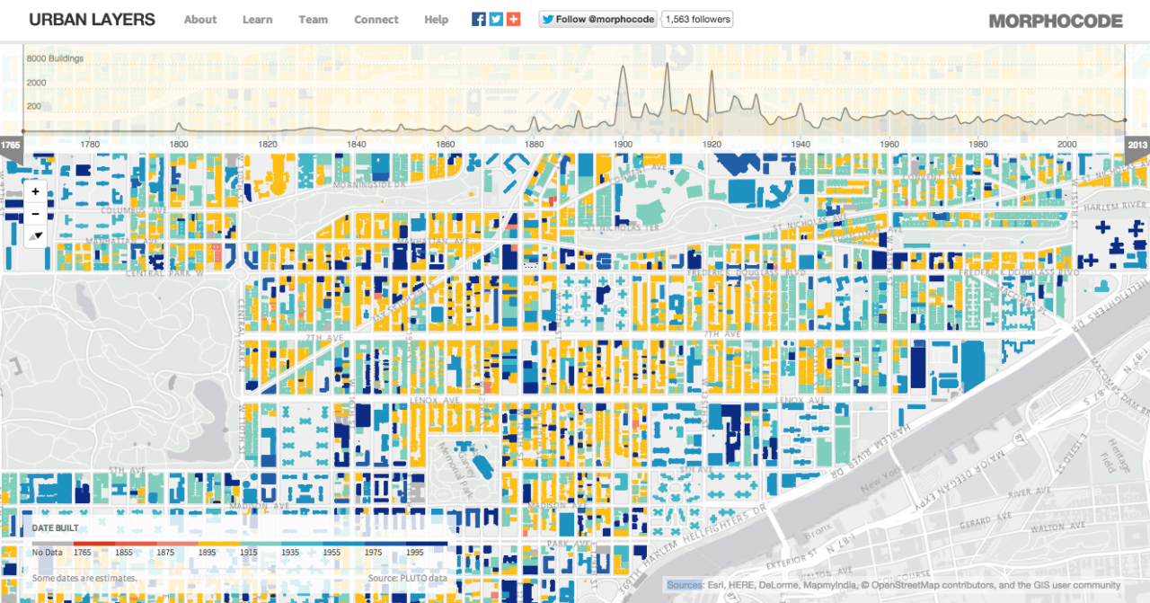
Updated: If you liked this post, you might like this interactive tool called Urban Layers that tracks Manhattan's rise, block by block, since 1765.

[image credit: @morphocode]


Thursday, July 24, 2014

Population distribution in European capitals


The map shows a fine-scale spatial population distribution in selected European capitals. The high resolution map is here, and it comes from this paper:


Batista e Silva, F., Gallego, J., Lavalle C. (2013). A high-resolution population grid map for Europe. Journal of Maps 9(1):16-28.

Abstract:
Population figures are usually collected by national statistical institutes at small enumeration units (e.g. census tracts or building units). However, still for many countries in Europe, data are distributed at coarser geographical units like municipalities. This level of resolution is insufficient for analysis in many fields. In addition, the heterogeneity of the size of the geographical units causes great distortions in analysis, i.e. the Modifiable Areal Unit Problem (MAUP). Dasymetric mapping techniques have long been applied world-wide to derive finer (and MAUP-free) depictions of the population distribution. These techniques disaggregate population figures reported at coarse source zones into a finer set of zones using ancillary geographical data. ... In this article, we test new geographical datasets to produce an updated and improved European population grid map. ... As final outcome of this cartographic exercise, a European population grid map for the reference year of 2006, with a spatial resolution of 100 × 100 meters, is presented and validated against reference data. Resident population reported at commune level, a refined version of CLC and information on the soil sealing degree are used as the main inputs to produce the final map.


Related Paper and data:

Friday, May 2, 2014

Urban Density Patterns in 9 Global Cities

Here is a nice 'chart' comparing population density patterns across nine global cites. The chart is part of a broader analysis by the LSE Cities programme and their not so new  project Urban Age.


[Click on the image to enlarge it]
[image credit: LSE Cities]


Related Links:

Tuesday, October 29, 2013

Urban Picture

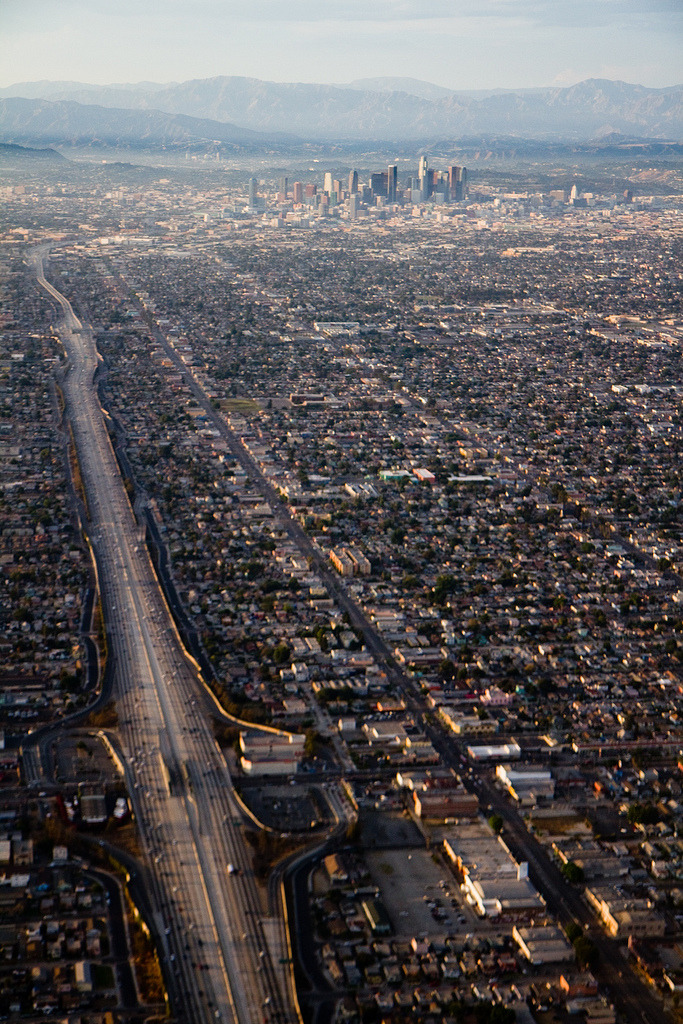
Would you call this urban sprawl? (via Human Scale Cities, a great blog by the way).
Los Angeles
[Image Credit: ?]

Soundtrack:

Friday, June 7, 2013

Growth and change in metropolitan form

The City Form Lab (SUTD/MIT) has a research project on measuring urban expansion, particularly focused in East Asia. They have recently published the 'Progress report on urban form and land use measures'. After scanning the report, I'm definitely adding it to my reading list.


[Image Credit: SUTD City Form Lab]