Showing posts with label R. Show all posts
Showing posts with label R. Show all posts
Thursday, March 19, 2020
Sunday, January 5, 2020
Plotting the metropolitan areas of Brazil in R
Here is a simple R script to download the shape files of Brazilian metropolitan areas by year and plot them in R.
obs. It's important to note that, since the 1988, metro areas are created by state governments. As a rule, this is done with absolutely no transparency nor any technical criteria. It is this legal issue, rather than the urbanization process in the country itself, that led to such an inflated increase in the number of metro areas in the country over the past two decades.
Number of metro areas in Brazil:
1970: 9
2001: 24
2018: 77

Tuesday, December 3, 2019
geobr v1.1 is on CRAN

The geobr package in R is probably the easiest and fastest way to download shapefiles and official spatial data sets of Brazil. The package includes a wide range of geospatial data available at various geographic scales and for various years with harmonized attributes, projection and topology.
You can find a simple tutorial on how to use the package here.
You can find a simple tutorial on how to use the package here.
The new release of geobr v1.1 includes 19 data sets:
- country
- region
- state
- meso region
- micro region
- intermediate region
- immediate region
- municipality
- weighting area
- census tract
- statistical grid
- urban areas
- health facilities
- indigenous land
- conservation units
- biomes
- legal Amazon
- semiarid
- disaster risk areas
Thursday, September 5, 2019
Monday, August 12, 2019
geobr: easy access to official spatial data sets of Brazil

I'm glad to annouce that geobr is now officially available on CRAN. Here and here are quick intros on how to use geobr to get easy and quick access to shape files and other official spatial data sets of Brazil. The package currently includes several data sets for various years such as states, regions, municipalities, census tracts, statistical grid and others. The github repository is this, in case you want to keep track of the latest developments.
The package was developed by my team and I at the Institute for Applied Economic Research (Ipea). We are constantly working to expand and improve the package, so if you have any suggestions/contributions, please feel free to open an issue on Github.
Monday, July 1, 2019
geobr: shapefiles and official spatial data sets of Brazil in R
In 2012, I published here a blog post about where to find shapefiles of Brazil. Since then, this has become one of the most popular posts in 9 years of the blog. However, the links to the original data sets change every now and then, and it gets a bit tricky to find the most up to date data. My team and I at the Institute for Applied Economic Research (Ipea) have created geobr, an R package that allows users to easily access shapefiles of the Brazilian Institute of Geography and Statistics (IBGE) and other official spatial data sets of Brazil.
The geobr package currently includes a variety of data sets, such as the shapefiles of municipalities and states (from 1872 to 2018), census weighting areas, a spatial grid with population count at a resolution of 200 x 200 meters, a geolocated database of health facilities in the country etc. All the data sets are read into R as sf data. We will gradually add other databases to the package, but feel free to make specific requests and suggestions by opening new issues on the GitHub page of geobr or tweeting the hashtag #geobr.
The advantage of geobr: Intuitive syntax that provides easy and quick access to a wide variety shapefiles and official spatial data sets with updated geometries for various years using harmonazied attributes and geographic projections across geographies and years.


Sunday, June 30, 2019
Interactive visualization of large-scale spatial data sets in R
In the beginning, there were only static maps. Over the past years we have seen the creation of new packages like mapview and mapedit that allow one to interactively visualize and edit spatial data in R. Despite these developments, it was still a bit tricky to visualize large spatial data sets in R. Not anymore.
Two packages that are pushing our capabilities to interactively visualize large-scale spatial data sets in R:
Hats off to these two!


- leafgl, by Tim Salabim (the main person behind mapview and mapedit)
- mapdeck, by David Cooley from Symbolix (who is also behind googleway and spatialwidget)
Hats off to these two!
leafgl

mapdeck


Friday, May 3, 2019
R Links
- The ipumsr package helps import census and survey data from around the world integrated across time and space. I've mentioned IPUMS in the blog before. This is certainly among the most important, ambitious and succeeded open data projects in the world
- A rather comphrensive comparison between data.table and dplyr syntaxes and funcitonalities ht via Mara Averick. I have to say I a strong preference for data.table because of computational performance. I also generally find the data.table syntax more easily readable than dplyr. There, I said.
- Free Book with code: “Spatio-Temporal Statistics with R,” by Christopher K. Wikle, Andrew Zammit-Mangion, and Noel Cressie
- brickr: a package to Build 3D LEGO models in R, by Ryan Timpe
- trackeR: a package for handling running and cycling data from GPS-enabled tracking devices, by Hannah Frick
- A Cheat Sheet on how to use the Reticulate package for interoperability between Python and R
- How to create a gif of a spinning globe using R, by James Cheshire
- The R package traveltime allows one to retrieve travel-time information from the Traveltime Platform API to create isochrone maps like these below. Great work by Thomas Russo.

image credit: Thomas Russo
Sunday, March 24, 2019
GTFS rotuer in R
For those interested in public transport research and planning, there is a new R package to do public transport routing using GTFS data. The gtfs-router package uses the power of C++ and it is quite efficient. This is only the release version of the package (0.01), though. There is a lot of room for improvements but I hope gtfs-router becomes a strong competitor to OpenTripPlanner in a couple of years.
The package was created by Mark Padgham (twitter), who is the author of/contributor to various other transport-related packages such as dodgr, bikedata and osmdata. Kudos to Mark!
ps. The capabilities of R for transport research and planning are greater than never. There is a very vibrant and active community with dozens of other packages. Perhaps this should be the topic for a future post.


Friday, March 15, 2019
Creating a simple world map of cities in R
Mike (from cool but useless) asked on twitter if there is any package in R with with lats/longs of lots of cities. In fact there is. Here is a simple code to create a world map of cities with population larger than 40K in R using maps::world.cities and ggplot2.
ps. These population data in the maps package refers to 2016 estimates. If you want city population data from previous years, you might remember that we have previously posted about this open dataset with 6,000 years of global urbanization.
Thursday, December 20, 2018
Assorted Links
- Paper: "exposure to socioeconomic inequality in an everyday setting negatively affects willingness to publicly support a redistributive economic policy" by Melissa Sands
- Peak Artificial Intelligence
- Interactive historic map of every UK railway line that's ever existed, via Tim Dunn
- Oxford DEMIG databases with unprecedented coverage of migration & migration policy data now available for free download, via Hein de Haas
- Using machine learning in R to predict Automobile Collision and Bike Share Demand and subsidy via Ken Steif
- Awful AI: a curated list to track current scary usages of AI - hoping to raise awareness, HT Will Geary
- The software used to create the black hole in the movie 'Interstellar' is a full implementation of Einstein's equations in 40,000 lines of C++, and rendered thousands of 23-megapixel IMAX frames on a 32,000-core render farm at about 20 core-hours per frame via John Arundel
- What to consider when choosing colors for data visualization, by Lisa Rost

credit: Lisa Rost
Monday, December 3, 2018
Assorted Links on mortality
- The case for monitoring life-span inequality, via José Manuel Aburto
- Mortality from road crashes in 193 countries: a comparison with other leading causes of death, ht Romulo Krafta
- The slowing pace of life expectancy gains since 1950
- How life expectancy in U.S. counties compares to other countries via Simon Kuestenmacher
- R package: mortAAR, for archeological demography. It provides functions for the analysis of archaeological mortality data See Chamberlain (2006). There is a vignette on Lifetables and an Extended Discussion
- R package: MortalityLaws, for downloading data from the Human Mortality Database and building parametric mortality models and life tables, by Marius Pascariu
- R package: MortCast, for estimating and Projecting of age-specific mortality rates, by Hana Sevcikova, Nan Li and Patrick Gerland (paper here) - via Adrian Raftery
- Beautiful Lexis-surface plot showing age and period specific mortality ratios of females and males, by Jonas Schöley (interactive version at the Human Mortality Explorer)

Tuesday, November 27, 2018
Using GIFs to explain what various causal inference methods
Nick Huntington-Klein (CSU Fullerton) has created a series of excellent gifs to illustrate what various causal inference methods do to data and how they work. The whole thread on Twitter is worthwhile, specially because learning these econometric methods becomes much easier once we have a solid understanding of the concepts and intuitions behind them. (Thanks Bernardo Furtado for the tip).
obs. Nick created these gifs in R using the gganimate package and the code is available here.
Here's the gif that shows the intuition behind difference-in-differences

Thursday, August 23, 2018
The geography of Manhattan distorted by travel-times
The figure below was created by Stefan Musch from Gradient Metrics (hat tip Jean Legrand). The figure was created using R and ggplot2 based on travel-time estimates from Google Maps API. There is a bit more info about the creation process in this post and perhaps Stefan will share his code at some point.... please? :)
Echoing the comments of others on Twitter. The figure does a great job illustrating how it is much harder to cross Manhattan from east to west than from north to south. Finally, it would be great to see how this shape has changed over the last decades using historical travel time estimates.

credit: Stefan Musch (Gradient Metrics)
Saturday, August 11, 2018
Assorted R Packages for Spatial Analysis
- RgeoProfile is an R package for carrying out geographic profiling - a technique derived from criminology that uses the spatial locations of linked crimes to infer the home location (or locations) from which the criminal is operating, by Steve LeComber
- rayshader is a package for producing hillshaded maps of elevation matrices with raytracing and spherical texture mapping, by Tyler Mogan.


- dodgr: fast calculations of pairwise distances on directed graphs in R, by Mark Padgham
- rmapshaper: a simple way to simplify shape files, by Andy Teucher
- rpostgis: Linking R with a PostGIS Spatial Database, by David Bucklin and Mathieu Basille
- osrmr: a wrapper around the OSRM API, a super fast routing engine for OpenStreetMaps, by Adrian Stämpfli-Schmid
- stplanr is a package providing various functions and data access for transport research, by Robin Lovelace. This is the core package underneath The Propensity to Cycle Tool


Monday, July 23, 2018
Mapping the diversity of population ageing across Europe with a ternary colour scheme
Ilya Kashnitsky and Jonas Schöley have recently published this correspondence in The Lancet where they show a very clever way to visualize the spatial heterogeneity of population age structures using choropleth map with ternary colour scheme. The data wrangling was done in R, and the code to replicate get the data and replicate the figure is available on Github.
click on to image to enlarge it

image credit: Ilya Kashnitsky and Jonas Schöley.
Thursday, March 29, 2018
R Links
- Text Mining with R
- A great Shiny app to deal with the Traveling Salesman problem

- Nice color palettes based on Wes Anderson movies, by Karthik Ram
- Rstudio Gallery of examples using TensorFlow and R for deep learning
- Cohort analysis: Retention Rate Visualization with R
- Network analysis of Game of Thrones by Shirin Glander, via Mara Averick
- Creating interactive plots in R with plotly
- How to create a smooth transition between chloropleth and cartogram in R


credit: Yan Holts
Thursday, March 15, 2018
Using R to Predict Route Preferences in Bike Sharing
Daniel Patterson has written a really great post/tutorial on how to use R to identify what routes are most frequently used by cyclists in the bike sharing program of the Twin Cities area of Minnesota. It's a good and quick read, you should check it out.
Daniel's analysis was conducted using stplanr, an R package for sustainable transport planning. This package was developed by Robin Lovelace, who is a great enthusiast for active transport and one of the most important developers for spatial and transport analysis in R.

credit: Daniel Patterson
Friday, October 27, 2017
Converting GTFS data into an igraph for network analysis in R
It is becoming ever more common for local transport authorities to publish their data on public transport networks in GTFS format. Two of the advantages of so many agencies using a standardized data format is that it makes it easier for us (1) to apply the same research methods to different cities and do comparative studies, and (2) to share our scripts, get feedback and learn from others.
While working on my PhD on transportation equity in Rio de Janeiro, I have written a script in R that converts GTFS data into an igraph so I can run some network analysis. I shared this script on GitHub yesterday and it got the attention of a few people on Twitter, so I thought some of you might be interested as well. Get in touch if you would like to share any feedback or do some collaboration. :)

Monday, October 9, 2017
Why you should always visualize your data
In 1973, the statistician Francis Anscombe published a paper demonstrating the importance of plotting the data before analyzing it. That paper introduced what latter became known as the Anscombe's Quartet, which comprises four datasets that have almost identical descriptive statistics including means, variances and correlation and yet look completely different when you plot them.
This is how the Anscombe's Quartet look like. 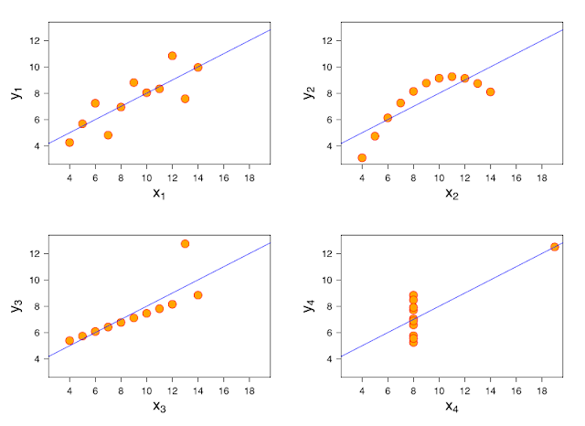

This year, this idea has been taken to a whole new level. A couple of researchers took this idea very seriously and they developed a method to relocate the points in a scatterplot towards a given shape and still keep descriptive summaries seemingly identical. The authors published the method here. They've also developed an R library {datasauRus} so you can procrastinate the whole afternoon learn more about statistics.

Subscribe to:
Posts (Atom)