Showing posts with label Python. Show all posts

Wednesday, November 27, 2019

An open-source framework for segregation measures


New paper by Renan Cortes and the Python Spatial Analysis Library (PySAL) team, giving a great contribution to the study of segregation. Eli Knap, one of the co-authors of the paper, has a great blog post summarizing some of the key contributions of the package.


Cortes, R. X., Rey, S., Knaap, E., & Wolf, L. J. (2019). An open-source framework for non-spatial and spatial segregation measures: the PySAL segregation module. Journal of Computational Social Science, 1-32.

Abstract:
In human geography and the urban social sciences, the segregation literature typically engages with five conceptual dimensions along which a given society may be considered segregated: evenness, isolation, clustering, concentration and centralization (all of which can incorporate or omit spatial context). Over the last several decades, dozens of segregation indices have been proposed and studied in the literature, each of which is designed to focus on the nuances of a particular dimension, or correct an oversight in earlier work. Despite their increasing proliferation, however, few of these indices remain used in practice beyond their original conception, due in part to complex formulae and data requirements, particularly for indices that incorporate spatial context. Furthermore, existing segregation software typically fails to provide inferential frameworks for either single-value or comparative hypothesis testing. To fill this gap, we develop an open-source Python package designed as a submodule for the Python Spatial Analysis Library, PySAL. This new module tackles the problem of segregation point estimation for a wide variety of spatial and aspatial segregation indices, while providing a computationally based hypothesis testing framework that relies on simulations under the null hypothesis. We illustrate the use of this new library using tract-level census data in two American cities.

image credit: Cortes et al 2019

Saturday, August 12, 2017

An R library to analyze and map John Snow's 1854 Cholera data

As many of you will know, an English physician called John Snow mapped the cholera outbreak in the Soho district of London in 1854. That map would later be a key element in the discovery that cholera was caused by contaminated water, not air. It's fair to say this map somehow changed history not only because of the lives it helped save, but perhaps more importantly because of the ways it opened human imagination to the role of spatial analysis in science and human development. Steven Johnson has written a book about the story of this map and its influence on modern science and cities. If you are short in time, there is a great 9-minute video summary of the book here.

All this introduction to say that now there is an R library that allows you to analyze and map John Snow's 1854 Cholera data yourself. Thanks Bob Rudis for calling attention to this library on twitter. Dani Arribas-Bel also pointed out to this chapter / online notebook that presents the documented code for a reproducible spatial analysis of John Snow’s map using mostly Python. This is great material for teaching.

update 16 Aug 2017: RJ Andrews has also pointed me to this paper analyzing the mortality rates and the space-time patterns of John Snow’s cholera epidemic map.


Friday, August 7, 2015

Mapping NYC Taxi Data with python

The government of New York City has published a number of datasets with records of all taxi trips completed in NYC in 2014 and select months of 2015. The datasets are in CSV format and you can download them here (I thank Chris Whong for the pointer).


[image credit: Daniel Forsyth]

Tuesday, September 9, 2014

Chart of the Day

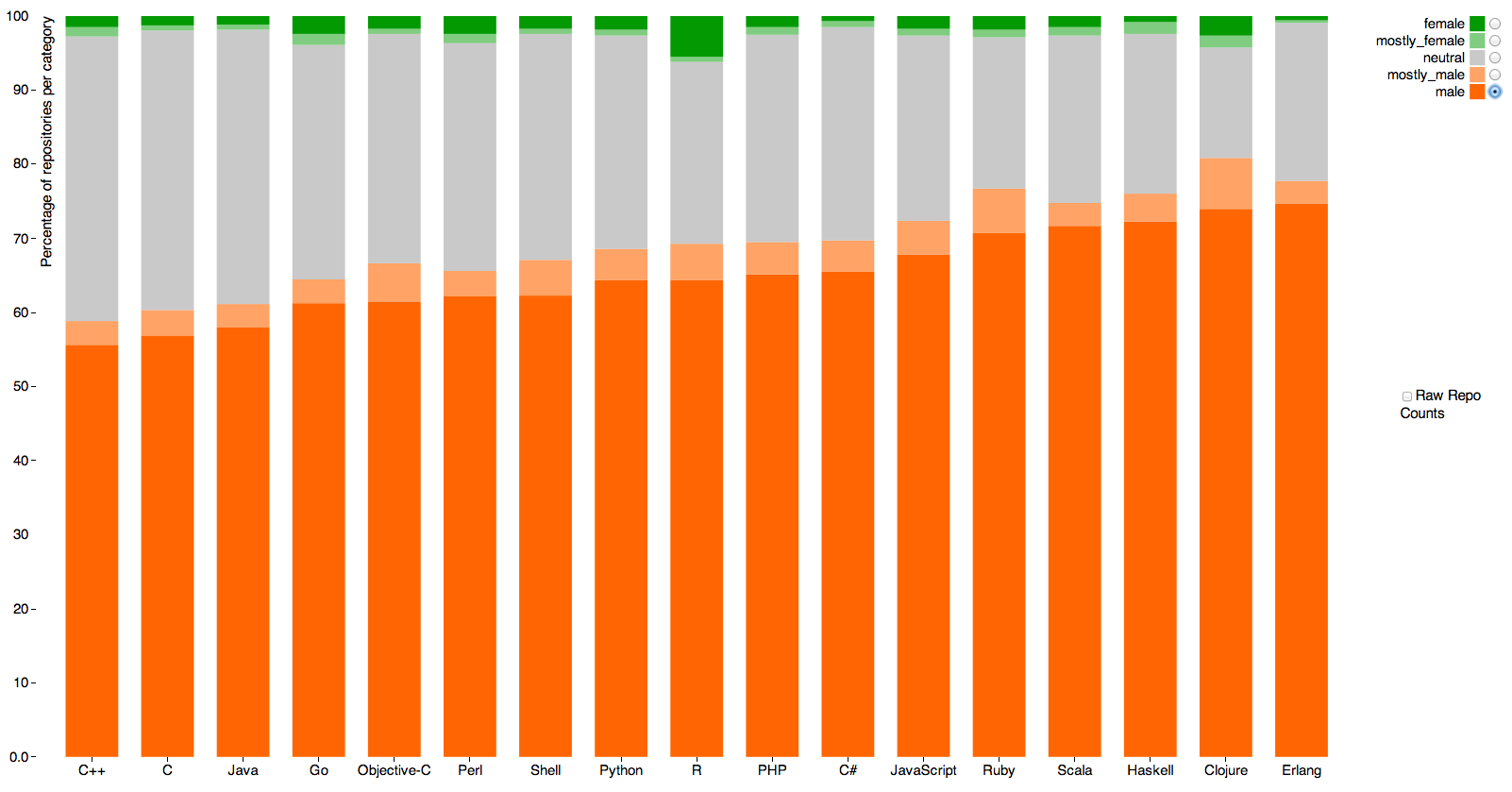
Nice data visualization on gender differences in GitHub repository ownership, by Alyssa Frazee. The green colors represent the share of GitHub repositories owned by (most likely) women in each programming language. 

The interactive version is here!

click on the image to enlarge it


[image credit: Alyssa Frazee]

Friday, August 29, 2014

Every Device Connected to the Internet

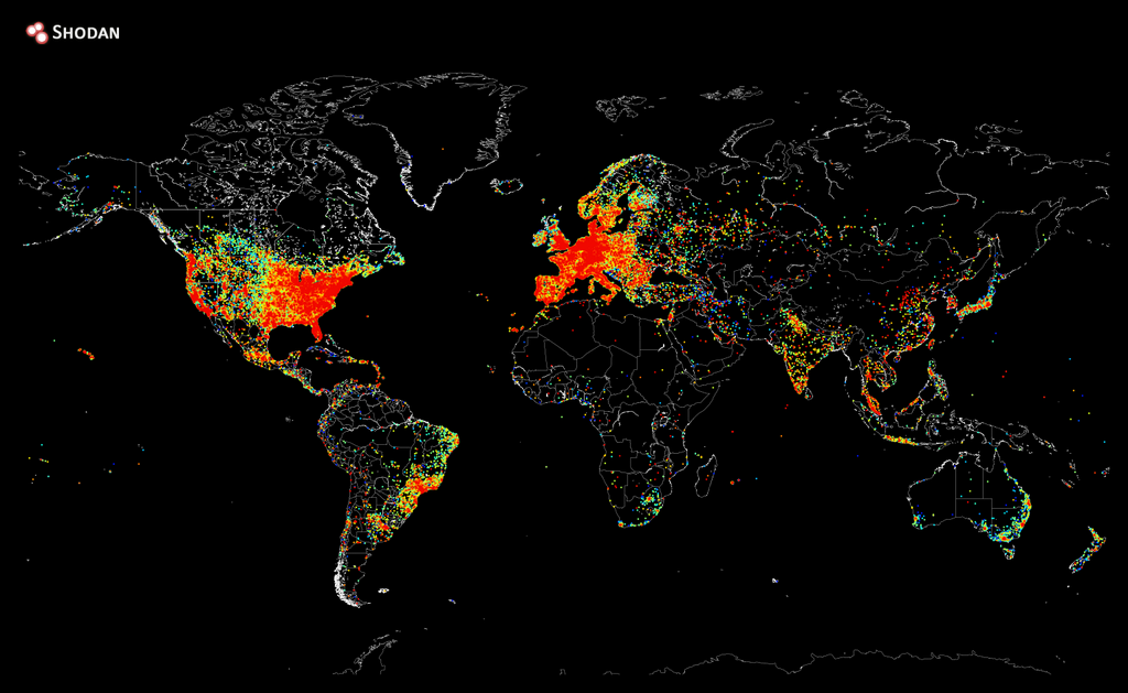
Quick post since I haven't had much time to procrastinate lately about this lovely map showing Every Device in the Worlds that is Connected to the Internet (via Harvey Miller).

The maps was created by John Matherly using matplotlib, a plotting library for Python.

[click on the image to enlarge it]

[image credit: John Matherly via Gizmodo]

Monday, June 2, 2014

Visualizing Disabled Freedom Pass trips on the London Underground

Gareth Simons has done an amazing work visualizing Disabled Freedom Pass trips on the London Underground. More details on his website.

obs. @transportforall has also produce nice map showing how the Tube network looks like if you can’t use stairs. Simple map with strong message.