Showing posts with label Subways. Show all posts

Thursday, July 20, 2017

Map of the day: the public transport network of Tokyo

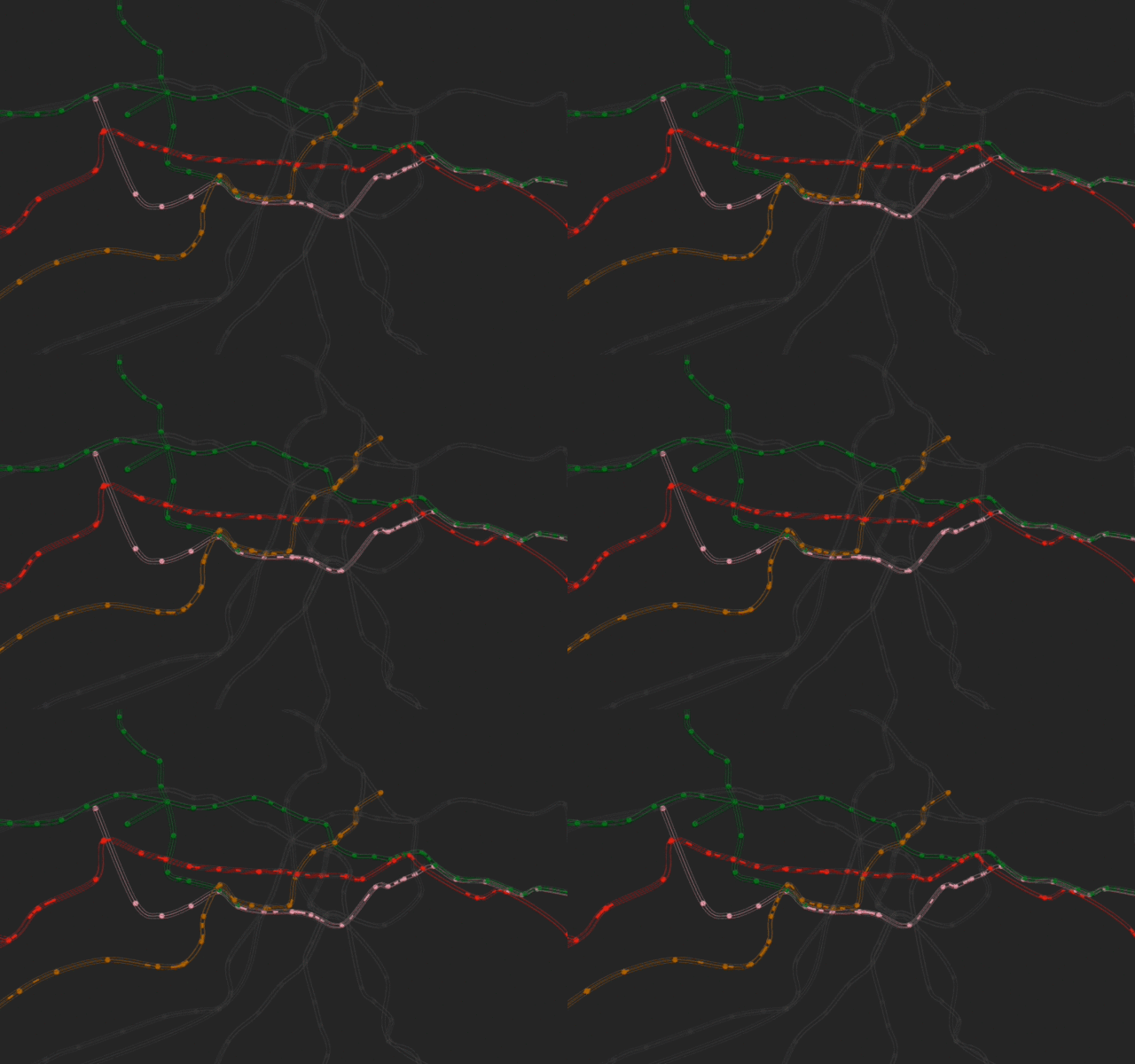
Simon Kuestenmacher tweeted the other day this map that shows the public transport network of Tokyo metropolitan area (higher quality image in Japanese here). Tokyo is today the largest metro area with almost 38 million people. The amount of planning and daily work they put in their transport network overt the decades it just jaw dropping, as this maps can tell. 

Sunday, May 21, 2017

The impressive expansion of subway systems in China

I have posted in the past a GIF that compares the expansion of the subway systems of Rio and Shanghai between 1979 and 2014. This is a bit embarrassing for Rio, for sure, but let's be honest. Pretty much any developing country and even the USA in their efforts to develop mass transport infrastructure pales in comparison to China. Needless to say that massive expansion of infrastructure like this usually comes at high social and environmental costs that should not be neglected.

Peter Dovak (twitter) has created a new GIF that shows the expansion of subway systems in China between 1990 and 2020, giving a glimpse of the Chinese urban powerhouse. Peter has other great projects you might want to check out, including the Mini Metro Maps of the world.


ps. I saw this on the Transportation Planning and Analysis Facebook group, via Gonçalo Correia. 

Monday, November 16, 2015

Walking Tube map, or the most important map when you are in London

Map of the  last  week: Transport for London (TFL) has recently published new map that shows how long it takes to walk between stations on the London Tube (a.k.a. underground or subway).


Thursday, October 8, 2015

Compare the subway systems of Rio and Shanghai between 1979 and 2014

A nice GIF comparing the expansion of the subway systems in Rio de Janeiro and Shanghai between 1979 and 2014.

[image credit: ? via Lucas Gaspar on FB]

We've seen this before, but I couldn't resist posting this GIF (it covers a wider time span, it is quite straightforward and I love gifs

Wednesday, September 16, 2015

Transport disruptions, big data and travel behavior

A new discussion paper shows how a strike in the underground system of London could actually improve general welfare and make individuals' travel behavior more efficient. (via Tyler Cowen).

Larcomy, S., Rauch, F., Willems, T. The benefits of forced experimentation: striking evidence from the London underground network. University of Oxford. Department of Economics Discussion Paper Series (Ref: 755 )
Abstract: We estimate that a significant fraction of commuters on the London underground do not travel their optimal route. Consequently, a tube strike (which forced many commuters to experiment with new routes) taught commuters about the existence of superior journeys -- bringing about lasting changes in behaviour. This effect is stronger for commuters who live in areas where the tube map is more distorted, thereby pointing towards the importance of informational imperfections. We argue that the information produced by the strike improved network-efficiency. Search costs are unlikely to explain the suboptimal behaviour. Instead, individuals seem to under-experiment in normal times, as a result of which constraints can be welfare-improving.

The researchers examined 20 days' worth of anonymised Oyster card data, containing more than 200 million data points, in order to see how individual tube journeys changed during the London tube strike in February 2014.


Soundtrack:

Tuesday, September 15, 2015

The shifting patterns of how Londoners live and work

Here is an interesting piece about passenger trends in London’s Underground system since 2001 and how this piece of information helps us better understand how the city's economy is changing (I saw this via Iain Docherty).

One obvious change in passenger patterns captured by this chart shows the notion of 'peak time' has widened over the past fifteen years or so. As the article suggest, this is likely a reflex of some of the changes observed both in the labor market (with the increase in the number of workers that are self-employed and have more flexible time shifts) and in the housing market, where the prohibitive housings costs of London are pushing people farther from the city.


Thursday, June 18, 2015

NYC Subway From Above

Cameron Booth (who runs the great blog Transit Maps) points out to this beautiful map of the New York city subway as seen from above.

[image credit: Arnorian]

Soundtrack:

Wednesday, June 10, 2015

The London Underground In 3-D

Bruno Imbrizi is a  Brazilian web developer and programmer that moved to London three years ago. Using publicly available data from Transport For London, Bruno has created and awesome interactive 3D map of the London Tube that I think some of the millions of readers of this blog might find interesting.

Sophie Weiner has written a nice piece on Bruno's work and you can check it here. You can also check some other cool dataviz of London underground in the Related Links, below.


[image credit: Bruno Imbrizi]

Related Links:

Monday, June 2, 2014

Visualizing Disabled Freedom Pass trips on the London Underground

Gareth Simons has done an amazing work visualizing Disabled Freedom Pass trips on the London Underground. More details on his website.

obs. @transportforall has also produce nice map showing how the Tube network looks like if you can’t use stairs. Simple map with strong message.

Thursday, February 6, 2014

Monday, August 26, 2013

Global Innovation and Diffusion in Public Transport

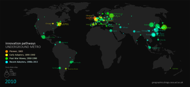
Duncan A Smith has created some great animations of 'Global Innovation Diffusion in Public Transport'. Here is the video showing the diffusion of BRT systems. Neat work! You should check it out the other videos.

Animating Global Innovation Diffusion- Bus Rapid Transit from Duncan A Smith on Vimeo.


[Image Credit: Duncan A Smith]