- The case for monitoring life-span inequality, via José Manuel Aburto
- Mortality from road crashes in 193 countries: a comparison with other leading causes of death, ht Romulo Krafta
- The slowing pace of life expectancy gains since 1950
- How life expectancy in U.S. counties compares to other countries via Simon Kuestenmacher
- R package: mortAAR, for archeological demography. It provides functions for the analysis of archaeological mortality data See Chamberlain (2006). There is a vignette on Lifetables and an Extended Discussion
- R package: MortalityLaws, for downloading data from the Human Mortality Database and building parametric mortality models and life tables, by Marius Pascariu
- R package: MortCast, for estimating and Projecting of age-specific mortality rates, by Hana Sevcikova, Nan Li and Patrick Gerland (paper here) - via Adrian Raftery
- Beautiful Lexis-surface plot showing age and period specific mortality ratios of females and males, by Jonas Schöley (interactive version at the Human Mortality Explorer)
Showing posts with label Mortality. Show all posts
Showing posts with label Mortality. Show all posts
Monday, December 3, 2018
Assorted Links on mortality


Monday, January 15, 2018
Assorted Links
- Post-doctoral position at Lund University to work on sustainable urban mobility and accessibility with a focus on economics and transportation equity, HT Jean Ryan
- Rainbows make horrible colour maps... let's stop using them
- paper : Rich do not rise early: spatio-temporal patterns in the mobility networks of different socio-economic classes
- The Internet of Things in unexpected things
- An Open Letter from 1,470 Economists on Immigration
- There is an app to crowdsource data on shootings in Rio. Great initiative by Cecilia Olliveira
- A Catalog of Civic Data Use Cases, via Igor Calzada
- An interactive global overview of the magnitude, disparities and trend of infant mortality in the world between 1950 and 2011, by Ramon Martinez

Tuesday, December 26, 2017
Assorted Links
- paper: carpooling options from companies like Uber and Lyft could reduce the number of vehicles on the road by a factor of three without significantly impacting travel time
- Istanbul Urban Database: digitizing the historic urban archives of Istanbul , via @geog.an.mod
- "Bussed Out: How America moves its homeless"
- The effect of population age structure on innovation. In short, younger societies are more innovative. Via Tyler Cowen
- Loud orgies of Mexican fish could deafen dolphins, say scientists.
- Place matters: A longitudinal study estimating the influence of neighbourhood walkability on walking behaviour in across different life-stages via Ahmed el Geneidy
- The science myths that will not die. The `population bomb` myth is included in the list
- Carl Schmertmann pointed out on Twitter to a new open access book "Visualizing Mortality Dynamics in the Lexis Diagram". You might also like this really great interactive interface to explore how mortality patterns change over time and across countries , developed by Jonas Schöley

Wednesday, November 8, 2017
How Pollution Compares With Other Causes Of Global Deaths
The Lancet Commission on pollution and health has recently published a report that calls attention to the fact that pollution kills 3 times more than AIDS, tuberculosis and malaria combined. There is a good summary of the report in this piece, by NPR.
This chart below was created by Brittany Mayes and Matthew Zhang for the NPR piece, and it is based on data from the Global Health Data Exchange. Thanks Linsey Marr for the pointer on Twitter.

[click on the image to enlarge it]

Saturday, August 12, 2017
An R library to analyze and map John Snow's 1854 Cholera data
As many of you will know, an English physician called John Snow mapped the cholera outbreak in the Soho district of London in 1854. That map would later be a key element in the discovery that cholera was caused by contaminated water, not air. It's fair to say this map somehow changed history not only because of the lives it helped save, but perhaps more importantly because of the ways it opened human imagination to the role of spatial analysis in science and human development. Steven Johnson has written a book about the story of this map and its influence on modern science and cities. If you are short in time, there is a great 9-minute video summary of the book here.
All this introduction to say that now there is an R library that allows you to analyze and map John Snow's 1854 Cholera data yourself. Thanks Bob Rudis for calling attention to this library on twitter. Dani Arribas-Bel also pointed out to this chapter / online notebook that presents the documented code for a reproducible spatial analysis of John Snow’s map using mostly Python. This is great material for teaching.
update 16 Aug 2017: RJ Andrews has also pointed me to this paper analyzing the mortality rates and the space-time patterns of John Snow’s cholera epidemic map.
update 16 Aug 2017: RJ Andrews has also pointed me to this paper analyzing the mortality rates and the space-time patterns of John Snow’s cholera epidemic map.


 |
Sunday, November 13, 2016
The world’s most violent cities
For the most part, the most violent cities are either in deep economic crisis (or long economic stagnation), with high levels of inequality or involved with drug gangs. via The Economist. You can follow their daily charts on twitter here.


Friday, June 3, 2016
Assorted Links
- [new paper] Mortality differentials by education in Brazil: Life expectancy was 6.27 years longer for men with a complete university degree than for those with less than primary education in 2010. The paper is in Portuguese
- A nice summary of 10 major data science methods
- Beautiful photos of 1908 Japan
- 40% of the buildings in Manhattan could not be built today under current zoning rules
- Will autonomous vehicles be safer then conventional cars ? Here is why answering this question is far from simple via Tyler Cowen
- Lisa Charlotte Rost has gone through the painful task of creating the same chart with 12 different tools and libraries. This gives me more reasons to stick to R and ggplot2 :)
- Road intersections as art
- Making explicit the network behind air transport: by Martin Grandjean

Friday, March 4, 2016
Assorted Links
- The gap in life expectancy between the rich and the poor in the US is expanding
- Using maths and maps to figure out the identity of the world's most famous anonymous artist. Here is the paper
- Refugee camps from above, and here
- Using a 3D projection of the globe in QGIS
- Now you can rent Van Gogh’s Famous Bedroom on Airbnb in Chicago
- New SEDAC Hazards Mapper lets users estimate population in proximity to hazards, and assess exposure
- Mesmerizing ceilings of Mosques
- Nice chart showing how deadly is Ebola compared to other infectious diseases
- The average cost of a house at every London Underground stop
click on the image to enlarge it

Wednesday, February 3, 2016
Pedestrian fatality risk as function of car impact speed
quick post today: Mikefc has created a very nice interactive chart showing pedestrian fatality risk as function of car impact speed using multiple risk models. Some of you might find it useful, specially for those involved in discussions/studies on road speed limits.

Thursday, October 8, 2015
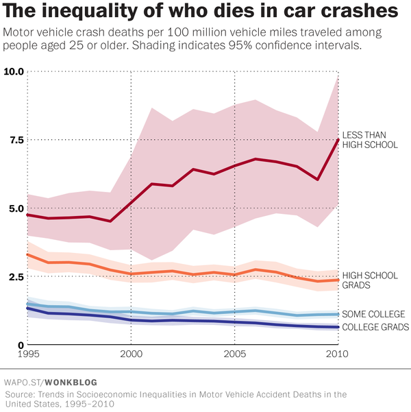
The hidden inequality of who dies in car crashes
Emily Badger has written an interesting piece on The Washington Post covering a recent study that discuss socioeconomic inequalities in car crashes in the US between 1995 and 2010.
Sunday, September 27, 2015
Assorted Links
- Taking Data Visualization From Eye Candy to Efficiency
- Fuck Nuance, a manifesto for more bold social theories, by Kieran Healy (via Analise Real)
- Machine Learning Classes at Oxford (videos, presentation and code)
- 2015 Ig Nobel prizes: a study shows that nearly all mammals take the same amount of time to urinate (about 21 seconds)
- There is a Space Syntax Toolkit for QGIS (ht Renato Saboya, who runs a great blog about urbanism written in Portuguese: Urbanidades)
- 10 things you need to know about the Magna Carta
- Slum tourism and its discontents. Not exactly a new article but a good summary of arguments (ht Fabiana Freitas, my lovely partner)
- The Value of Democracy: Evidence from Road Building in Kenya [unagated paper]
-

Monday, August 10, 2015
Which US states have the deadliest roads?
The Economist came up with this interactive chart showing which US states have the deadliest roads. Here is a map version of the problem, covering about 370,000 road-related deaths from 2001 through 2009.

Related Links:
- What is the safest time to drive in Australia?
- Mapping the Severity of Road Accidents in France
- A map of every death on the road in Great Britain

Wednesday, April 29, 2015
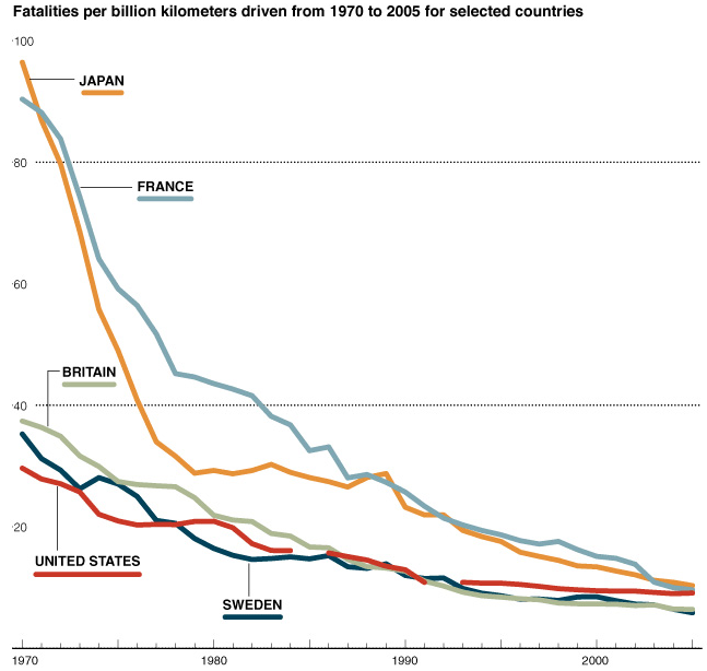
Fatalities from car accidents per billion kilometers
Interesting study from the University of Michigan analyzing how deaths per miles driven have plummeted around the developed world over the past five decades (via Max Roser).
On a related topic, I highly recommend the book of Tom Vanderbilt, Traffic: Why We Drive the Way We Do (and What It Says About Us)

Wednesday, July 2, 2014
Assorted links
- LSE Report - Cities and Energy: Urban Morphology and Heat Energy Demand
- Experimental evidence of massive-scale emotional contagion through Facebook (via MR)
- 18th-century London paintings meet Google Street View
- Did General Motors lead an automotive conspiracy to undermine streetcar lines in the US? Apparently not
- The 10 world cities with the highest murder rates
- Are UK migrating to the US and becoming lawyers in Illinois? This and other spurious correlations.
- Free Statistical Software, SAS University Edition (thanks Bernardo Queiroz for the tip)
- The first ever government census of schools in Mexico: “The Theft of the Century”
- Range of average lengths of PhD dissertations across the disciplines
[click on the image to enlarge it]

[image credit: Marcus Beck]
Thursday, January 16, 2014

Tuesday, December 17, 2013
Assorted links
- A webpage to help you Convert #Words to #Pages
- Urban density and climate change: a STIRPAT analysis using city-level data
- Using R to analyze Human Mortality and Fertility databases? (via Emilio Zagheni)
- The NSA is Coming to Town
- First Detailed Map of Global Deforestation [paper, interactive map]
- The Day Google Became Skynet
- Diversity of aging across the tree of life -A 46-Species Comparison (via BL Queiroz)
[Click on the image to enlarge it]

[Image Credit: Jones et al. at Nature, 2013]
Saturday, December 7, 2013
Wednesday, August 14, 2013
Assorted links
- OECD Health Data 2013
- The infrastructure behind Dutch cycling (via MR)
- How people get to work across England and Wales?
- Red Bull Illume Photo Contest 2013
- Many transit visualizations in one place (via David Levinson)
- INDEPTH launches a repository of (longitudinal) demographic and health data for low/middle-inc.countries (via Emilio Zagheni)
- A century of jittery oil production and prices
- Effect of a conditional cash transfer programme on childhood mortality in Brazil (via @HansRosling)
- Chinese Food and Population Density by Neighborhood in NYC

Saturday, June 22, 2013
Fertility and Mortality estimates for small areas in Brazil
It is really nice to see an increasing number of good studies/publications written by/with Brazilian demographers. Here are two recent papers that might be of interest for some readers.
A few more papers:
- Queiroz, BL; Lima, EC; Freire, FH; Gonzaga, MR. Adult mortality estimates for small areas in Brazil, 1980—2010: a methodological approach. The Lancet. 2013.
- Schmertmann, CP; Cavenaghi, SM; Assunção, RM; Potter, JE. Bayes plus Brass: Estimating total fertility for many small areas from sparse census data. Population Studies. 2013. Project Website.
A few more papers:
- Spatial Demography: an opportunity to improve policy making at diverse decision levels
- The Changing Impact of Family Size on Adolescents’ Schooling: Assessing the Exogenous Variation in Fertility Using Twins in Brazil
- Changes in test scores distribution for students of the fourth grade in Brazil: A relative distribution analysis for the years 1997–2005
- Age, education, and earnings in the course of Brazilian development: Does composition matter?
Friday, April 26, 2013
Latin American Human Mortality Database
Some of you have probably heard about the Human Mortality Database. Now, Prof. B. Piedad Urdinola (National University of Colombia) and Prof. Bernardo Lanza Queiroz (Cedeplar/UFMG, Brazil) have recently started a new project with a similar idea but covering Latin American countries. It's the Latin American Human Mortality Database.
It brings tons of information and it's really well organized with easy navigation.

"At present the database contains detailed information on mortality for five countries in Latin America: Argentina, Brazil, Colombia, Mexico and Peru. All information is broken down by age, sex, region and cause of death. Additionally there is information on the academic literature on the study of mortality for these same countries."
Long live the project!
Subscribe to:
Posts (Atom)