Showing posts with label GIS. Show all posts

Sunday, March 8, 2020

Call for papers: Advances in Spatial and Transport Network Analysis

The Int Journal of Geo-information has opened a call for papers for special issue on "Advances in Spatial and Transport Network Analysis". This issue is edited by Henrikki Tenkanen, Elsa Arcaute, Marta C. Gonzalez and myself. This is a great opportunity to create a dialogue between network and social scientists, transport geographers, engineers etc working on transport and mobility networks. This dialogue raises new challenges, though, as discussed in this thoughtful recent paper by Tim Schwanen.

Here is a short snippet of the cfp:
"This Special Issue is dedicated to papers focusing on recent advances in the development of new measures and methodologies to evaluate and analyze the performance of transportation networks. These measures might include, but are not limited to, environmental costs or exposures (e.g., CO2 , noise, pollution); monetary costs (the price of access), complexity, and resilience of multimodal transportation networks; or focus on qualitative aspects of travel, where travel might be seen as a gain instead of cost (such as exposure to aesthetic or green environments). Methodologically, we welcome works using novel ways to measure transport network connectivity, performance, and accessibility, including recent advances in machine learning and AI. Special attention will be paid to papers studying transport-related questions with interdisciplinary approaches."

Thursday, December 28, 2017

Making a geogif with QGIS

In case you would like to make geogifs using QGIS, Alasdair Rae has recently created a really good tutorial.  Topi Tjukanov has also written a post showing the step-by-step process of how you can use QGIS Time Manager to create a stunning geogif like this one below. 

obs. Alasdair and Topi have worked in many other great projects and they are extremely generous, often sharing their data and code openly. These two are definitely worth following on Twitter.

5 hours of train GPS points in Finland
credit: Topi Tjukanov 

Tuesday, December 12, 2017

High-resolution data sets on global man-made impervious surfaces and urban extents

In 2012, we posted about a big research project on global forecasts of urban expansion and its environmental impacts, by Karen C. Seto and her lab at Yale. On a related topic, SEDAC (a NASA data center hosted at CIESIN in Columbia University) has released two new high-resolution data sets that some of you might find useful for your own research:

  1. Global Human Built-up And Settlement Extent for the target year 2010, derived from global 30m Landsat satellite data

  2. Global Man-made Impervious Surface for the target year 2010, derived from global 30m Landsat satellite data

Tuesday, June 20, 2017

Assorted links

  1. Personal details of ~200 million US citizens exposed. A 1.1 terabyte data set with names, home addresses, phone numbers, political views etc. This is approx. 2/3 of the american population. Probably the largest data leak in history  thus far 


  2. I've recently found out that the principal scientist at Amazon‘s Modeling and Optimization team is Renato Werneck, a Brazilian researcher who is also one of the authors of Raptor, the Round-Based Public Transit Routing algorithm


  3. In the USA, both Democrats and Republicans agree there is a lot of discrimination against certain social groups. They just disagree which groups are discriminated against


  4. Health Effects of Overweight and Obesity in 195 Countries over 25 Years. Since 1980, obesity rates doubled in more than 70 countries and continuously increased in other countries

Prevalence of Obesity at the Global Level, According to Sociodemographic Index (SDI)

[click on the image to enlarge it]


Wednesday, April 5, 2017

Two new libraries for working with Spatial data in R

A quick heads up for those interested in using R for spatial analysis and mapping data. There are two relatively new libraries you might want to check out:

  • The first one is the ggspatial library, created by Dewey Dunnington. ggspatial is a great package that makes it super simple to create maps using ggplot. It uses a single geom_spatial() for all types of spatial objects (polygons, lines, dots, etc.) and it dispenses the use fortify(), making things much faster.


  • Another library some of you might find useful is sf (as in simple features), created by Edzer Pebesma. This library makes it much faster to conduct several spatial operations, like reading/writing data, intersecting spatial objects, computing shortest distance matrices etc. The sf library is integrated with ggplot2 for creating maps with geom_sf() and it also makes it easy to connect to spatial data bases. This promises to be a real game changer for spatial analysis in R.

Wednesday, December 21, 2016

Tuesday, August 18, 2015

A Cheat Sheet for Raster analysis in R

Etienne Racine has written a great Cheat Sheet for Raster analysis in R. Some of you might find it useful as well.


Tuesday, April 7, 2015

Dynamic population mapping using mobile phone data

An interesting study by Pierre Deville showing that it is possible to use data from mobile phone networks to analyze population spatial distribution while guaranteeing phone users’ privacy (via Tim Wallace).

Deville, P., et al. (2014). Dynamic population mapping using mobile phone data.Proceedings of the National Academy of Sciences, 111(45), 15888-15893.


Abstract
During the past few decades, technologies such as remote sensing, geographical information systems, and global positioning systems have transformed the way the distribution of human population is studied and modeled in space and time. However, the mapping of populations remains constrained by the logistics of censuses and surveys. Consequently, spatially detailed changes across scales of days, weeks, or months, or even year to year, are difficult to assess and limit the application of human population maps in situations in which timely information is required, such as disasters, conflicts, or epidemics. Mobile phones (MPs) now have an extremely high penetration rate across the globe, and analyzing the spatiotemporal distribution of MP calls geolocated to the tower level may overcome many limitations of census-based approaches, provided that the use of MP data is properly assessed and calibrated. Using datasets of more than 1 billion MP call records from Portugal and France, we show how spatially and temporarily explicit estimations of population densities can be produced at national scales, and how these estimates compare with outputs produced using alternative human population mapping methods. We also demonstrate how maps of human population changes can be produced over multiple timescales while preserving the anonymity of MP users. With similar data being collected every day by MP network providers across the world, the prospect of being able to map contemporary and changing human population distributions over relatively short intervals exists, paving the way for new applications and a near real-time understanding of patterns and processes in human geography.

Seasonal changes in population distribution in Portugal and France

Monday, January 26, 2015

Thursday, January 22, 2015

Street art + Satellite pictures

Street art + Satellite pictures = the world's largest GIF, by INSA

[image credit: BALLANTINES]

More info here:


Monday, January 12, 2015

Assorted links


  1. The Best Satellite Images of 2014

  2. Extrapolating the backgrounds of famous art with machine learning

  3. We've Been Incorrectly Predicting Peak Oil For Over a Century

  4. Forbes Magazine has recently published their list of 30 Under 30 Science, with brightest scientists in 15 different fields under the age of 30. A huge congrats to my Department friend John Mittermeier ! Mom, I told you I'm not on the list! By the way, John has some amazing photos as well

  5. The most detailed tweet map ever, with 6 Billion Tweets (high definition), by Eric Fischer

  6. A great selection of the best Data Visualizations of 2014

  7. The Reversal of the Latitude-Income Correlation

  8. A Fully Interactive Map of the Middle Earth, from The Lord of the Rings

  9. The Modern Beauty of 19th-Century Data Visualizations

US population composition by place of birth, 1790-1890
[click on the image to enlarge it]
[image credit: 1870s statistical atlas, via Laura Bliss]


Saturday, January 10, 2015

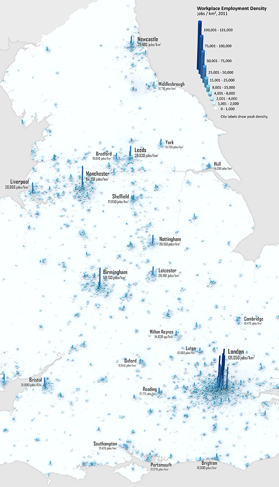
Explore urban dynamics with LuminoCity3D

If you didn't have internet connection during 2014, you might have missed some of the  buzz around LuminoCity 3D (more info here). This is probably the best interactive tool for visualizing and exploring the 2011 Census data of the UK*. 
It brings data from a wide range of topics. For example, it makes  it possible to visualize urban growth, analyze household energy use or compare living and working densities in cities across England and Wales, etc.


LuminoCity 3D is a project by Duncan A.Smith (CASA/UCL), who also runs the great blog 'City Geographics'. obs. It is such a great project that I fill a bit embarrassed that I'm only posting about it now.

Workplace Employment Density, 2011
[click on the image to enlarge it]
[image credit: Duncan Smith]


Journey-to-work flows
[image credit: Duncan Smith]


* DataShine is a similarly great project, by Oliver O’Brien (CASA/UCL).