Showing posts with label Chart of the Day. Show all posts

Thursday, December 6, 2018

Chart of the Day and a Biographical note

I was given this birthday card by my partner yesterday. Isn't she lovely?! This is a great chart  and bit too honest .

I also received yesterday an email I wrote myself five years ago. There is this website FutureMe, which allows you to send an email to your future self. You just have to write a message, point to a destination email address and the date when the email will be received. The email I received yesterday was written right after I had moved to Oxford. It was written by a younger Rafa who was thrilled to start a PhD but also insecure if he belonged to that place, and someone who had lots of questions about how my life would unfold in the following years. I'm glad about the answers I have today for the questions I had back then.

I write these emails to my future self once every two or three years. I find it a great exercise to reflect about life and to keep track of how my thoughts, ideas, fears, plans etc change over time. You should give it a try,


ps. FutureMe is a free website and they didn't pay me to write this post.

Tuesday, October 9, 2018

Chart of the Day

A 'very good' (exclamation mark) chart that "reveals exactly how positively and negatively the population perceives various descriptions to be." (ht Simon Kuestenmacher). This chart was created by Matthew Smith, and it was inspired in this older chart below on Perceptions of Probability and Numbers, by Zoni Nation.


Friday, July 6, 2018

Chart of the day: The rich cultural diversity of 200 Years of US immigration

The accumulated history of US immigration visualized as rings in a growing tree trunk. The chart was created by Pedro M. Cruz and John Wihbey using IPUMS data. It's the first time I see migration data depicted in this way and it does a really terrific job drawing attention to composition diversity and population history.

UPDATE: Leah Boustan has just drawn my attention on Twitter for an important shortcoming of this cart. Leah has rightly pointed that:
"This graphic is great for visualizing changes in composition of immigrant flow to US over time but obscures dramatic fluctuations in magnitude. ~1 mil immigrants entered per year in 1910, down to 100k by 1930 — yet the concentric circles makes it seem like entry grows over time"


Saturday, May 26, 2018

The creative process lollipop chart

Stefanie Posavec came up with this brilliant 'chart' to illustrate the creative process of coming up with a great idea.

It reminds me of a story of this Brazilian band (Paralamas do Sucesso), when the lead singer/composer was asked about their success. Long time ago a journalist asked him: "When a band releases a new album, they usually get one maybe two songs in the top hits. How come you get so many top hits for every new album you release after so many years on the road?". His secrete, his said, was that every day he would write the lyrics of a new song. It took a lot of discipline, for sure, but at the end of the year he would have more than 300 songs. Most of them would suck, of course, but certainly a few would be good material that could be worked further.

Ok, I don't remember the exact words of the dialogue, but you get the idea. And frankly, I think that's a good advice for young researchers looking for good research questions. Read a lot of papers so you have an informed understanding of what are the knowledge gaps in your field. Then put yourself to ask as many questions as you can think of and write them down without censoring yourself. At some point you will have many questions (20? 50?). Revisit your list of questions after a few weeks and some more reading. You'll realize most of them won't work. Some are too ambitious, some have been answered already, some are just not that relevant etc. Once you have three or four questions that sound reasonably good, it's time to do more reading and to discuss these questions with more experienced mentors/supervisors/friends. Remember to be humble.

"You ask me if I keep a notebook to record my great ideas. I've only ever had one." (Albert Einstein )

The bottom line is this:

Saturday, December 23, 2017

Chart of the Day: socket patterns worldwide

via Carlos Goes


Apparently, the image has a few minor errors including Uruguay, Malaysia, Indonesian, Switzerland. I guess this does not change the main message here.

credit: xkcd

Thursday, June 29, 2017

World population distribution by altitude

Another interesting chart by Bill Rankin, this one showing how the world population is distributed by altitude.
  • 6% of the world's population leaves above 1.6 Kilometres (1 mile)
  • 50% leaves below 165 meters of altitude
  • 0.2%  leaves below sea level
click on the image to enlarge it

Tuesday, August 9, 2016

Air quality in world cities by hour of the day

This comes from The Economist's Daily chart, where you can find other indicators and more information on the methodology (more here).

click on the image to enlarge it

Tuesday, February 9, 2016

Share of the population living in the largest Metro Area

The chart was created by Aron Strandberg, who has a great Twitter account with lots of demographic data visualization. The data comes from the World Bank (here and here). I've included some related links below.


Related Links:
  1. If Christaller had Google Earth
  2. Urban Primacy
  3. Urban Primacy in Latin Ameria
  4. Demographic evolution of cities, 1950-2025
  5. The Urban Observatory

Thursday, October 2, 2014

How to make your pie chart less terrible

The team at Darkhorse Analytics have already shared a nice tip for how to make tables less terrible. Now it is time to 'improve' your pie charts!


Tuesday, September 9, 2014

Chart of the Day

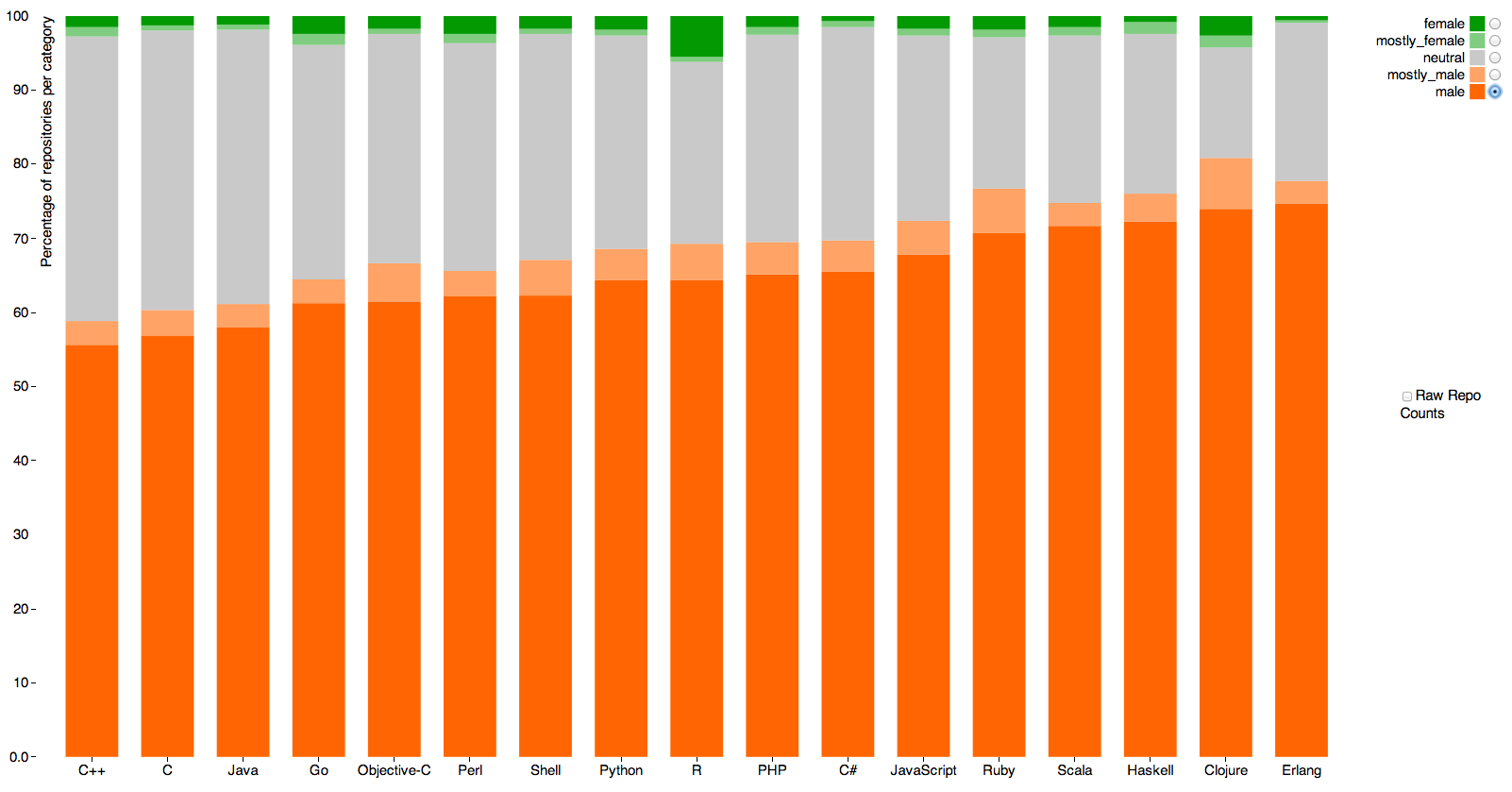
Nice data visualization on gender differences in GitHub repository ownership, by Alyssa Frazee. The green colors represent the share of GitHub repositories owned by (most likely) women in each programming language. 

The interactive version is here!

click on the image to enlarge it


[image credit: Alyssa Frazee]

Sunday, August 10, 2014

Chart of the Day

A new report by the World Bank brings this interesting chart on the Real GDP Per Capita and share of Global Population (via Timothy Taylor).


[click on the image to enlarge it]


[image credit: World Bank via Timothy Taylor via Conrad Hackett]

Tuesday, June 24, 2014

Chart of the Day

Comparing the UK Department for Transport forecasts of road traffic with actual road traffic (via George Monbiot). Interestingly, it repeats the same systematic error the US Department of Transportation has been making for years.

The full story is here: 
Since the 1980s, the Department for Transport has consistently forecast traffic growth along a steep trajectory. But the distance covered by car drivers in England is now 7% lower than it was in 1997. The total volume of traffic has flatlined since 2002, nixing every prediction the department has made. Last year, 32 transport professors wrote to the secretary of state pointing out that, in the absence of traffic growth, "the basis for major infrastructure spending decisions appears to be changing".
The only thing likely to induce more traffic growth, they argued, is building more trunk roads, and that would put intolerable pressure on the city streets into which they feed. The facts might have changed, but the policy remains the same. The department continues to make the same failed forecasts, using the same failed model. The desire to build – and to appease the construction industry and motoring lobby – comes first, and the forecasts are made to fit.

[image credit: Better Transport]

Friday, May 23, 2014

Tuesday, September 10, 2013

Chart of the Day

A nice chart showing the change in life expectancy for 190 countries over the last 20 years (via Thomson Reuters).

Friday, May 24, 2013