- Paper: "exposure to socioeconomic inequality in an everyday setting negatively affects willingness to publicly support a redistributive economic policy" by Melissa Sands
- Peak Artificial Intelligence
- Interactive historic map of every UK railway line that's ever existed, via Tim Dunn
- Oxford DEMIG databases with unprecedented coverage of migration & migration policy data now available for free download, via Hein de Haas
- Using machine learning in R to predict Automobile Collision and Bike Share Demand and subsidy via Ken Steif
- Awful AI: a curated list to track current scary usages of AI - hoping to raise awareness, HT Will Geary
- The software used to create the black hole in the movie 'Interstellar' is a full implementation of Einstein's equations in 40,000 lines of C++, and rendered thousands of 23-megapixel IMAX frames on a 32,000-core render farm at about 20 core-hours per frame via John Arundel
- What to consider when choosing colors for data visualization, by Lisa Rost
Structured Procrastination on Cities, Transport Policy, Spatial Analysis, Demography, R
Showing posts with label Migration. Show all posts
Thursday, December 20, 2018
Assorted Links
Marcadores:
AI,
Assorted links,
database,
dataviz,
History,
Interactive dataviz,
Machine Learning,
Migration,
R
Friday, July 6, 2018
Chart of the day: The rich cultural diversity of 200 Years of US immigration
The accumulated history of US immigration visualized as rings in a growing tree trunk. The chart was created by Pedro M. Cruz and John Wihbey using IPUMS data. It's the first time I see migration data depicted in this way and it does a really terrific job drawing attention to composition diversity and population history.
UPDATE: Leah Boustan has just drawn my attention on Twitter for an important shortcoming of this cart. Leah has rightly pointed that:
"This graphic is great for visualizing changes in composition of immigrant flow to US over time but obscures dramatic fluctuations in magnitude. ~1 mil immigrants entered per year in 1910, down to 100k by 1930 — yet the concentric circles makes it seem like entry grows over time"
Marcadores:
Chart of the Day,
dataviz,
Migration
Monday, January 15, 2018
Assorted Links
- Post-doctoral position at Lund University to work on sustainable urban mobility and accessibility with a focus on economics and transportation equity, HT Jean Ryan
- Rainbows make horrible colour maps... let's stop using them
- paper : Rich do not rise early: spatio-temporal patterns in the mobility networks of different socio-economic classes
- The Internet of Things in unexpected things
- An Open Letter from 1,470 Economists on Immigration
- There is an app to crowdsource data on shootings in Rio. Great initiative by Cecilia Olliveira
- A Catalog of Civic Data Use Cases, via Igor Calzada
- An interactive global overview of the magnitude, disparities and trend of infant mortality in the world between 1950 and 2011, by Ramon Martinez
Marcadores:
Assorted links,
database,
Equity,
Migration,
Mortality,
spatiotemporal
Tuesday, October 17, 2017
Migrating researchers are cited the most
This is according to a recent paper published in Nature. The authors analyzed 14 million papers published between 2008 and 2015 by nearly 16 million individual authors. Around 4% of those authors - more than 595K were considered to be “mobile,” meaning they had affiliations with academic institutions in more than one nation between 2008 and 2015.
The study looks very interesting throughout. Here are only two of the main results:
I thank Tim Schwanen for the pointer.
- "[...] mobile scholars have about 40% higher citation rates, on average, than non-mobile ones"
- "Regardless of region, mobility pays in terms of citations. Across all regions, mobile scholars are more highly cited than their non-mobile counterparts. The advantage varies by region. Mobile North Americans see only a 10.8% boost in citations over their non-mobile colleagues. For Eastern European scholars, the gulf is 172.8%."
Marcadores:
Academic writing,
Migration
Thursday, June 15, 2017
Mexicans didn’t cross the US border. The border crossed them
Carlos Goes pointed me to this short piece in The Economist:
"... communities have proved more durable than borders. The counties with the highest concentration of Mexicans (as defined by ethnicity, rather than citizenship) overlap closely with the area that belonged to Mexico before the great gringo land-grab of 1848."For the most part, Mexicans didn’t cross the US border. The border crossed them.
Marcadores:
Migration
Sunday, March 26, 2017
Assorted Links
- Uber suspends testing of self-driving cars after crash last frieday. Uber's SUV had the right of way and bears no blame
- Dr. Mae C. Jemison was the 1st African American woman to travel in space, in 1992.
- Harvey Miller's entry on Time geography andspace–time prism for the new International Encyclopedia of Geography. Harvey is also on Twitter
- paper: Network theory may explain the vulnerability of medieval human settlements to the Black Death pandemic
- Chronological map of Edinburgh showing expansion of the City from earliest days via Phil Taylor
- 15% of the entire housing stock of Florence historic centre is on AirBnB. David Wachsmuth also has a coming paper analyzing Airbnb’s impact on housing and gentrification in New York
- Where workers will be needed in the Asia, and where they could come from
- In 1900, W.E.B. Du Bois created these beautiful data visualizations for the Paris Exposition Universelle to show the economic and social progress of African Americans since emancipation (via Michal Migurski)
credit: W.E.B. Du Bois
Marcadores:
Assorted links,
autonomous vehicles,
cartography,
History,
Migration,
Network,
space-time,
Uber
Thursday, March 2, 2017
Special issue on Human migration and refugees
Nature has a new special issue on migration and refugees (via Nicolsa Perra).
The United Nations has declared that the number of displaced people has surged to unprecedented numbers. But a close examination of data reveals that current flows are just as high as in they were in the 1990s. Because it is difficult to track refugees, official data and statistics must be handled with care, and yet misleading reports are creating unjustified fears about refugees.
source: UNHCR via Nature
Marcadores:
Migration
Saturday, January 21, 2017
Assorted Links
- Challenge: try to guess how family income affects children’s college chances
- Twenty rules for good graphics , by Rob Hyndman
- David Levinson on 'On why bike lanes might appear underutilized'. Not eaxctly a new post, but really good
- The Carbon Map
- Global Talent Flows: the migration patterns of inventors, via Amine Ouazad
- Moore’s Law might be coming to and end soon … or maybe it just need to be reformulated, again
- A great interactive explanation of Ordinary Least Squares Regression, by Victor and Lewis
- Google Street View gets you inside the quads of many Colleges at Oxford University

credit: Rick Noak, WP
Marcadores:
Assorted links,
Cycling,
dataviz,
Education,
Inequality,
Migration,
Oxford,
statistics
Sunday, November 13, 2016
Assorted Links
- Rejected designs for the Eiffel Tower
- The effects of China's universal two-child policy
- What your political ideology tells about your ideal neighbourhood
- Kendra Levine has put together a superb collection of sources for transportation data and statistics. It's mostly focused on the US but there are some international resources too
- Historical maps of inequality in the US
- A Halloween hero
- Papers with shorter titles get more citations, apparently
- New research on human genomic variation refines previous models of historical human migration HT Marcelo Medeiros
125,000 years of human migration in 1 minute
Marcadores:
Assorted links,
database,
History,
Inequality,
Migration
Sunday, April 24, 2016
Friday, February 5, 2016
Historical international immigration to the US 1850-2010
John Weeks points out to this interactive map of international immigration to the US, based on population census data (1850 - 2010) .
This is probably one of the nicest dataviz of migration patterns I've seen and yet this is just one piece in a much broader project to build an atlas of the US History at the Uni. of Richmond.
credit: Digital Scholarship Lab
Marcadores:
History,
Migration,
USA,
visualizing complexity
Thursday, November 5, 2015
The difference between economic migrants and refugees
— Nando Sigona (@nandosigona) November 1, 2015
Marcadores:
Migration
Sunday, November 1, 2015
Assorted Links
- Fordlandia: The Failure Of Ford's Jungle Utopia ht Pablo Astudillo
- The most highly educated group of immigrants to the US are those from Africa (via William Easterly)
- The German radical Left Party wishes to deregulate walking
- Interactive map showing movement of refugees migrants to Europe since 2012 (via Population Europe)
- This Is What Happens When You Photoshop All The Men Out Of Politics
- Hack Your Way To Scientific Glory, or hot to manipulate your p-values to become publishable
- An incredibly detailed map of London in 1746
- Other things I'd rather be doing
- Welcome to Planet Voronoi, a Capital Place
Marcadores:
Assorted links,
Migration,
statistics
Friday, September 4, 2015
Where Are the Syrian Refugees Today?
Hans Rosling (aka the Mick Jagger of statistics) in an informative three-minute video about the Syrian Refugees.
Monday, August 31, 2015
Some migration and refugee trends
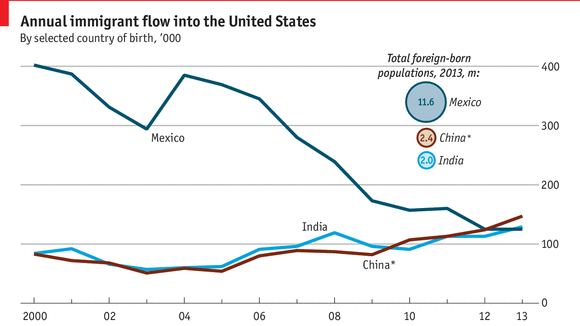
Tow daily charts from The Economist, showing the Annual immigration flow into the US since 2000 and the number of refugees by country of origin since 1975.
+ this interesting piece in the NYT showing the number of migrants and refugees applications between January to June this year for different European countries.
Marcadores:
Migration
Saturday, August 1, 2015
Some Demographic Assorted Links
- The UN has recently released the 2015 Revision of World Population Prospects (via Bernardo Queiroz)
- Cutting edge research behind new population projections
- Can Demography Affect Inflation and Monetary Policy? (via MR)
- Which countries have the most immigrants?
- There are now at least two good open access journals in demography/population studies. The well known Demographic Research (twitter) , and the new International Journal of Population Studies (twitter)
- The new Institute for Asian Demographic Research, in Shanghai (via Emilio Zagheni)
- In celebration to World Population Day (11th of July), Springer and BioMed have made freely available a selection of free articles that investigate the consequences of the ever increasing population on health, migration and the environment. These papers will be freely available until September 10, 2015
- Nice piece in the NYT on the The Unrealized Horrors of Population Explosion
- A great series of GIFs showing demographic changes in different counties (ht Conrad Hackett)
Marcadores:
Demographic Transition,
Migration,
Population Growth,
Projections
Friday, July 10, 2015
ReDesigning the Global Map of Refugees
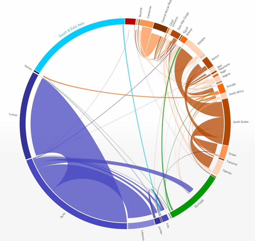
A couple of weeks ago, I wrote a post about the new UN annual report on forced migration and refugees and how the guys at the NYT (S.Peçanha and T.Wallace) did a great job in visualizing the data from the report. As a short update to that post, I would like to point out how the same dataset can be visualized in quite different ways. I highlight here only two other data visualization projects based on the same data set and which could be inspiring to other people working with flows data.The first project is the Global Flows of Refugees, where Nikola Sander and Ramon Bauer have used interactive circular plots to explore refugee flows between countries, regions, etc. The plot is quite effective in showing how flow sizes and origin-destinations change from 2013 to 2014.
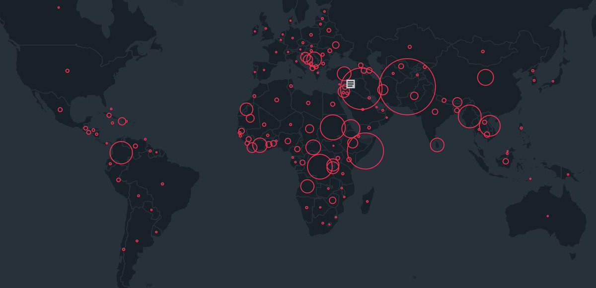
The second dataviz comes form the Refugee Project, which brings some geographical context and more historical information on forced migration year by year since 1975. It was designed by Ekene Ijeoma and the team at Hyperakt.
Marcadores:
Migration,
visualizing complexity
Tuesday, July 7, 2015
Assorted Links
- Beijing Quadrupled in Size in a Decade, NASA Finds
- Delhi metro could soon run completely on solar power
- 25+ Of The Most Majestic Libraries In The World
- What the coast cities of US and China might look like if predictions of rise sea levels are confirmed
- Great pictures of "International Borders Around The World"
- Good Dani Rodrik powerpoints on labor migration (pdf) via MR
- Self-driving Toilets might be the next 'invention' of Google
- Google has built a virtual simulation of California to test its self-driving cars (via Francesco M. Cerroni)
Marcadores:
Assorted links,
autonomous vehicles,
China,
environment,
google,
Migration
Sunday, June 21, 2015
Mapping the migration of displaced people
The United Nations High Commissioner for Refugees (UNHCR) published this month their annual report on Global Trends of forced migration and refugees.
Sergio Peçanha and Tim Wallace have done a terrific job in mapping the data and summarizing some of the key findings for the NYT (ht Harvey Miller).
The figures are staggering.
"Nearly 60 million people are displaced around the world because of conflict and persecution, the largest number ever recorded by the United Nations. About 14 million of those fled in 2014, according to a report released this week."
"About 11.6 million Syrians have been displaced, nearly half of Syria’s entire population."
Origin-Destination Flows of Refugees
[image credit: Sergio Peçanha and Tim Wallace, NYT]
Marcadores:
Migration
Wednesday, January 28, 2015
Assorted Links on Migration
- An antique and insanely detailed useless map of migration in the US (via Ben Henning)
- A more interactive and interesting way to visualize US internal migration 1900-2012
- paper: Spatial and Longitudinal Patterns in County Age-Specific Net Migration in the United States 1950–2010
- Opportunities to study international migration at Oxford
- paper: Immigration and the origins of regional inequality
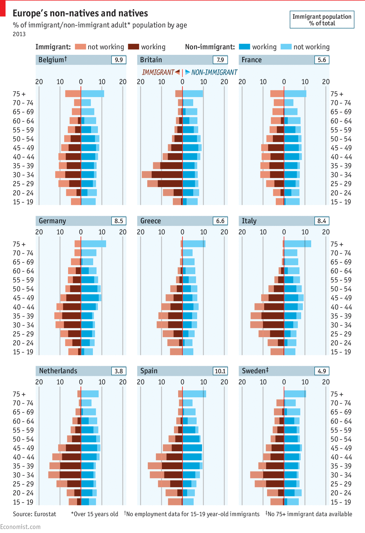
- A nice chart from The Economist comparing the age structure of natives and immigrants in a few European countries
The median age of Europeans living in their own country is 43, compared with 35 for migrants. [...] One OECD study found that in two-thirds of European countries in 2010-11, a higher share of immigrants had been to university than the native-born population. That helps them to find work, rather than sponge off the state.
Marcadores:
Migration
Subscribe to:
Posts (Atom)