Showing posts with label Segregation. Show all posts

Wednesday, November 27, 2019

An open-source framework for segregation measures


New paper by Renan Cortes and the Python Spatial Analysis Library (PySAL) team, giving a great contribution to the study of segregation. Eli Knap, one of the co-authors of the paper, has a great blog post summarizing some of the key contributions of the package.


Cortes, R. X., Rey, S., Knaap, E., & Wolf, L. J. (2019). An open-source framework for non-spatial and spatial segregation measures: the PySAL segregation module. Journal of Computational Social Science, 1-32.

Abstract:
In human geography and the urban social sciences, the segregation literature typically engages with five conceptual dimensions along which a given society may be considered segregated: evenness, isolation, clustering, concentration and centralization (all of which can incorporate or omit spatial context). Over the last several decades, dozens of segregation indices have been proposed and studied in the literature, each of which is designed to focus on the nuances of a particular dimension, or correct an oversight in earlier work. Despite their increasing proliferation, however, few of these indices remain used in practice beyond their original conception, due in part to complex formulae and data requirements, particularly for indices that incorporate spatial context. Furthermore, existing segregation software typically fails to provide inferential frameworks for either single-value or comparative hypothesis testing. To fill this gap, we develop an open-source Python package designed as a submodule for the Python Spatial Analysis Library, PySAL. This new module tackles the problem of segregation point estimation for a wide variety of spatial and aspatial segregation indices, while providing a computationally based hypothesis testing framework that relies on simulations under the null hypothesis. We illustrate the use of this new library using tract-level census data in two American cities.

image credit: Cortes et al 2019

Sunday, November 6, 2016

Income segregation at the block level

Herwig Scherabon, an incredibly talented graphic designer, has created this artistic representation of income segregation of Los Angeles, Chicago and New York at the block level. These pieces are shortlisted for the Information is Beautiful Awards. Thanks Linda Regber for the pointer.

Click on the images for higher resolution.

                           Chicago                                                        Los Angeles

New York

Wednesday, July 20, 2016

Residential mobility and social polarisation in Barcelona

A new study by Toni brings an interesting analysis on residential mobility and social polarisation in Barcelona.

López-Gay, A. (2016) “Barcelona’s got talent: migration, residential change and socioeconomic polarisation”, Perspectives Demogràfiques, num. 3, pp. 1-4.
"The data show that Barcelona has considerable power of attraction for a highly-qualified youthful population, but little power when it comes to distributing this population homogeneously among its neighbourhoods. The central part of the city is more attractive for the well-qualified population which is arriving, while hardly any of the less-educated population is moving into these neighbourhoods. Moreover, the internal residential mobility of the Barcelona inhabitants tends to perpetuate pre-existing socioeconomic differences in the city [...] . The combination of these dynamics is, then, contributing towards the process of socioeconomic polarisation in the city of Barcelona."


Friday, December 18, 2015

How the most segregated cities in the US and Brazil compare

Using the Dissimilarity Index to measure racial segregation, this his is how the most segregated cities in the US and Brazil compare. A remarkable difference, which I would love to understand more before making any comments.

This chart comes from a great piece on racial segregation in Brazil [only in Portuguese], via Maurício Santoro

[image credit: Nexo, Daniel Mariani, Murilo Roncolato, Simon Ducroquet e Ariel Tonglet]

Monday, December 7, 2015

Brazil Racial Dotmap

A few weeks ago, we made a blog post about the racial dot map of Rio de Janeiro, inspired by Bill Rankin's maps on segregation and the racial dot map of the US.

Fábio Vasconcellos has just pointed out on his twitter to the Racial Dotmap of Brazil, with 190 million dots distributed distributed within Brazilian census tracts. The map was created using a Python script in QGIS, which is available on GitHub.

Each dot represents a person. Blue dots represent white people, while green and red dots represent brown and black people.
[credit: Pata]


Here is the US racial dot map. The two maps are not 100% comparable since the racial categories used in both maps are not exactly the same, but they give a rough comparison of how white and black populations are spatially distributed in both countries.

[credit: Dustin Cable]

Monday, November 9, 2015

Measuring segregation using patterns of daily travel behavior

Mental note: New paper in my reading list. Big names from transport/geography studies pushing the boundaries of segregation research by going beyond the debate on residential segregation. 


Farber, S., O'Kelly, M., Miller, H. J., & Neutens, T. (2015). Measuring segregation using patterns of daily travel behavior: A social interaction based model of exposure. Journal of Transport Geography, 49, 26-38.

Abstract:
Recent advances in transportation geography demonstrate the ability to compute a metropolitan scale metric of social interaction opportunities based on the time-geographic concept of joint accessibility. The method we put forward in this article decomposes the social interaction potential (SIP) metric into interactions within and between social groups, such as people of different race, income level, and occupation. This provides a novel metric of exposure, one of the fundamental spatial dimensions of segregation. In particular, the SIP metric is disaggregated into measures of inter-group and intra-group exposure. While activity spaces have been used to measure exposure in the geographic literature, these approaches do not adequately represent the dynamic nature of the target populations. We make the next step by representing both the source and target population groups by space–time prisms, thus more accurately representing spatial and temporal dynamics and constraints. Additionally, decomposition of the SIP metric means that each of the group-wise components of the SIP metric can be represented at zones of residence, workplace, and specific origin–destination pairs. Consequently, the spatial variation in segregation can be explored and hotspots of segregation and integration potential can be identified. The proposed approach is demonstrated for synthetic cities with different population distributions and daily commute flow characteristics, as well as for a case study of the Detroit–Warren–Livonia MSA.

Thursday, November 5, 2015

The Racial Dot Map of Rio de Janeiro

A while ago, I've posted some of Bill Rankin's maps on segregation for different cities in the USA. Those maps got a lot public attention because they were innovative in the way they depicted racial segregation by  representing each individual as one single dot and each ethnicity as a different color. Needless to say this approach gives a much better visual effect than traditional choropleth maps.

Inspired in Rankin's map, Nicolau de Gusmão (geography student from Sao Paulo) has created in a racial dot map of Rio. Pretty neat. He used data from the 2010 population census and he created the map using QGIS. His post is written in Portuguese, but you don't need to speak the language to appreciate the maps and get your own conclusion about segregation levels in Rio.

Wednesday, November 6, 2013

The trend of income segregation in the US, 1970-2009


"In 1970, 65 percent of families lived in middle-income neighborhoods; by 2009, only 42 percent of families lived in such neighborhoods".
This is from a report recetly published by Kendra Bischoff and Sean Reardon showing the trend in residential segregation by income in the US between 1970 and 2009. (via Tyler Cowen)

[click on the image to enlarge it]
[Image Credit: Bischoff and Reardon, via Mother Jones]

Friday, September 13, 2013

Urban Picture

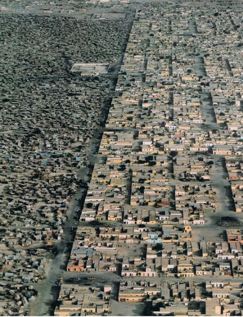
An invisible frontier in Nouakchott, Capital of Mauritania

[Photography: Steve McCurry National Geographic August 1987
invisible frontier, via Human Scale Cities]


Related Links:

Monday, April 22, 2013

An experimental confirmation of the Spatial Mismatch Hypothesis

Self-recommending: Getting to Work: Experimental Evidence on Job Search and Transportation Costs, by David Phillips.

Abstract:
In urban areas job vacancies often exist but poor, minority residents tend to be concentrated in neighborhoods with limited geographic access to these jobs. Using a randomized field experiment with public transit subsidies, I test whether this spatial mismatch of workers from jobs causes poor labor market outcomes. Randomly selected clients of a non-profit employment agency received a public transit subsidy to assist in applying to jobs and attending interviews with potential employers. I find evidence that the transit subsidies have a large, short-run effect in reducing unemployment durations with treatment causing the probability of finding employment within 40 days to increase by 9 percentage points, from 0.26 to 0.35. After 90 days, this difference narrows to a large but statistically insignificant 5 percentage points. I find weaker evidence that this decrease in unemployment duration results from more intense search behavior, with the transit subsidy group applying to more jobs and jobs further from home. To my knowledge, these results provide the first experimental confirmation that spatial mismatch of workers from jobs can cause adverse labor market outcomes for poor, urban individuals.
This study was presented last year at a conference on 'Research on Urban Mass Housing' that took place at Oxford. Nice programme, by the way.

Monday, December 5, 2011

Housing Finance Policy and Segregation


This would be a very nice hypothesis to be tested for the Brazilian case. Brazil had a huge housing finance policy from the 60's to the 80's with the National Housing Bank (BNH). Since 2009 the Federal Government has been carrying out a very big social housing program called Minha Casa, Minha Vida (My House, My Life). I think this is a good idea to consider if you are a PhD candidate in Brazil.

Thursday, September 15, 2011

Tuesday, December 21, 2010

Assorted links on Spatial Segregation


  • Post: On sputtering integration in Toronto (by Demography Matters)

  • Demographic Buffet: explore data from the Census Bureau's American Community Survey at the block level: race and ethnicity, income, education, and housing and families. (by the NY via FlowingData)

  • Article: Blacks and Hispanics Take Different Segregation Paths (by Brookings).
    - Segregation Data: Download segregation measures for U.S. states and the 100 largest metropolitan areas

  • extra link: US Census 2010 - first data release. (via Urbanophile)
    - Presentation
    - The data!


Tuesday, September 21, 2010

Race and ethnicity mapped

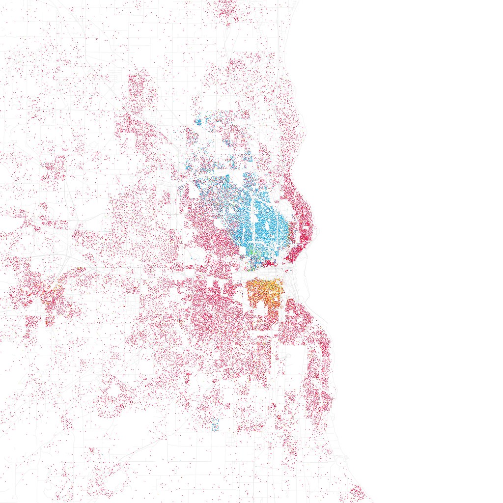
Inspired by Bill Rankin’s Chicago Boundaries (2009), Eric Fischer mapped race and ethnicity for other 40 American cities! obs. Red is White, Blue is Black, Green is Asian, and Orange is Hispanic, and each dot is 25 people. Data from Census 2000.


Washington DC


Detroit


Los Angeles
(by Eric Fischer via FlowingData)