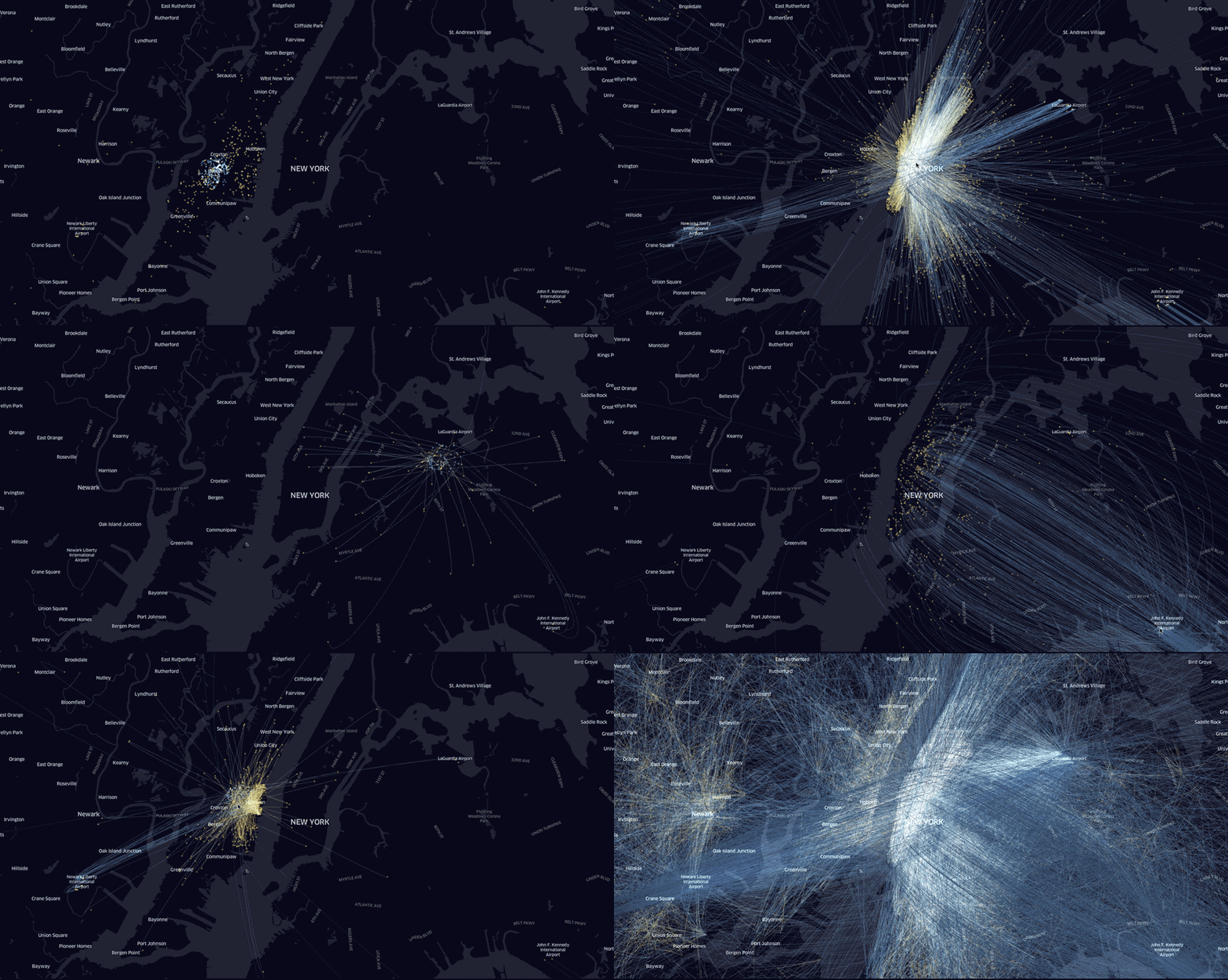
Here is a neat 3D animated map showing a full day of anonymized Uber trips in Los Angeles. You can also read Nicolas Belmonte on how Uber has been using data analytics and visualization in their work at Uber.
Dragging the cursor over a given radius area reveals distributions of Uber dropoffs in real-time. This is pretty cool. I was wondering if someone would be up for the challenge of building a similar interactive map with Shiny in R.
