Structured Procrastination on Cities, Transport Policy, Spatial Analysis, Demography, R
Thursday, December 31, 2015
Thursday, December 24, 2015
Tuesday, December 22, 2015
Quote of the Day: Anxiety
Anxiety will paralyze you, but dispair will break the spell. #phd
— Juliano Spyer (@jasper) December 21, 2015
Monday, December 21, 2015
R Links
- Check the new updates for ggplot2 2.0.0
- Micromap R package to link micromaps to charts via Patrick Gerland
- Analyze Google Trends in R
- Modeling Incomes and Inequalities in R
- 11 Tips on How to Handle Big Data in R
- Combine the power of ArcGIS and R via Alex Singleton
- Great guide on Manipulating and mapping US Census data in R by Zev Ross
- An interactive map of vehicle collisions in Edinburgh using Shiny, via Keir Clarke
Friday, December 18, 2015
How the most segregated cities in the US and Brazil compare
Using the Dissimilarity Index to measure racial segregation, this his is how the most segregated cities in the US and Brazil compare. A remarkable difference, which I would love to understand more before making any comments.
This chart comes from a great piece on racial segregation in Brazil [only in Portuguese], via Maurício Santoro
[image credit: Nexo, Daniel Mariani, Murilo Roncolato, Simon Ducroquet e Ariel Tonglet]
Thursday, December 17, 2015
Tuesday, December 15, 2015
Journal Spatial Demography
 I'm not sure if I have mentioned here in the blog the relatively new journal Spatial Demography. In any case, it promises to be a great journal for population studies, with an incredible editoral board and some very interesting publications.
The journal also brings some more practical publications, like how to use R for Spatial Analysis (parts 1 and 2) and how to Measure Residential Segregation, these two tutorials authored by Corey Sparks.
Monday, December 14, 2015
Friday, December 11, 2015
Assorted Links
- Cities bask in spotlight at Paris climate talks
- Why drivers in China intentionally kill the pedestrians they hit ht Leo Monasterio
- How complete is OpenStreetMap data coverage?
- How the United States generates its electricity
- A real-time map of cyber attacks via Flowing Data
- Autonomous Vehicles Need Experimental Ethics: Are We Ready for Utilitarian Cars? via Cesar Hidalgo
- A crowdsourced and open database for
 wheelchair-accessible places
 - Seven days of carsharing in Milan (project website)
Wednesday, December 9, 2015
Monday, December 7, 2015
Brazil Racial Dotmap
A few weeks ago, we made a blog post about the racial dot map of Rio de Janeiro, inspired by Bill Rankin's maps on segregation and the racial dot map of the US.
Fábio Vasconcellos has just pointed out on his twitter to the Racial Dotmap of Brazil, with 190 million dots distributed distributed within Brazilian census tracts. The map was created using a Python script in QGIS, which is available on GitHub.
Each dot represents a person. Blue dots represent white people, while green and red dots represent brown and black people.
[credit: Pata]
Here is the US racial dot map. The two maps are not 100% comparable since the racial categories used in both maps are not exactly the same, but they give a rough comparison of how white and black populations are spatially distributed in both countries.
India expected to overtake China′s population by 2026
Aron Strandberg has a great series of tweets on demographic trends.
Projection: #India overtaking #China as the world's most populous country. @conradhackett @MaxCRoser pic.twitter.com/epSN0pNw9k
— Aron Strandberg (@aronstrandberg) November 26, 2015
Nigeria is also expected to overtake the US population at some point after 2050.
Projection: #Nigeria closing in on the US as the world's third most populous country @conradhackett @MaxCRoser pic.twitter.com/gKQLRUX0xj
— Aron Strandberg (@aronstrandberg) November 26, 2015
Saturday, December 5, 2015
Friday, December 4, 2015
Tracking global bicycle ownership patterns
Weighted mean percentage household bicycle ownership
click on the image to enlarge it
This map comes from a new paper: Oke, O., et al. (2015). Tracking global bicycle ownership patterns. Journal of Transport & Health.
Abstract:
Over the past four decades, bicycle ownership has been documented in various countries but not globally analyzed. This paper presents an effort to fill this gap by tracking household bicycle possession. First, we gather survey data from 150 countries and extract percentage household bicycle ownership values. Performing cluster analysis, we determined four groups with the weighted mean percentage ownership ranging from 20% to 81%. Generally, bicycle ownership was highest in Northern Europe and lowest in West, Central and North Africa, and Central Asia. We determine worldwide household ownership patterns and demonstrate a basis for understanding the global impact of cycling as a sustainable transit mode. Furthermore, we find a lower-bound estimate of the number of bicycles available to the world׳s households. We establish that at the global level 42% of households own at least one bicycle, and thus there are at least 580 million bicycles in private household ownership. Our data are publicly available and amenable for future analyses.
The data and supporting code (in Python) are available here.
Thursday, December 3, 2015
Tuesday, December 1, 2015
Climate change and the state of carbon consumption
Consumption, Consumption, Consumption. Nice videographic, by The Economist.
China and India are perceived to be the worst emitters of carbon dioxide, but that view is not so clear when adjustments are made for population, GDP levels, and carbon consumption per person.
Sunday, November 29, 2015
Thursday, November 26, 2015
Revise and Resubmit
How motivated I am with a 'revise/resubmit' decision after six months of submitting the paper.
credit: Kostas Siozios
Wednesday, November 25, 2015
Where do women have Maternity leave and Who pays for it
Where do women get Maternity leave and Who pays for it Cc @simonhedlin @lisawade #maternityleave pic.twitter.com/Jv5oRSU3Dr
— Urban Demographics (@UrbDemogrphics) September 19, 2015
Monday, November 23, 2015
Assorted links
- Mapping LA's 20 Year Mobility Plan
- Should Your Driverless Car Kill You to Save Two Other People?
- 13 women who transformed the world of economics via MR
- Color use in paintings, by year
- Seagull Skytrails
- Same BMI, different bodies (the problem with averages)
- Ratio of Workers to Retirees Will Plummet Worldwide
- Grid-based statistics in 3D using Three.js and D3.js.
Thursday, November 19, 2015
Exploring 1.1 Billion NYC Taxi and Uber Trips
Todd Schneider has posted a thorough analysis of 1.1 Billion NYC Taxi and Uber Trips where he explores the city's neighbourhoods, night-life, airport traffic etc. You can replicated all that using publicly available data, R, PostgreSQL and PostGIS. GitHub repository here.
Tuesday, November 17, 2015
Programming Music with Punched Cards
I've just learned this 'instrument' is called a fairground organ. This is as hipster as you can get with coding.
ps. in case you're under 30, there is a high chance you don't know what a Punched Card is. You might like reading this.
ps. in case you're under 30, there is a high chance you don't know what a Punched Card is. You might like reading this.
Monday, November 16, 2015
Walking Tube map, or the most important map when you are in London
Map of the last week: Transport for London (TFL) has recently published new map that shows how long it takes to walk between stations on the London Tube (a.k.a. underground or subway).
Click here for the full size map.
Saturday, November 14, 2015
Thursday, November 12, 2015
Spatial + Temporal patterns of bike sharing in Moscow
Urbica (a design company based in Moscow) have done a great job in analyzing the spatial and temporal patterns of bike sharing in Moscow (ht Andrey Karmatsky). To our delight, their source code is available on GitHub.
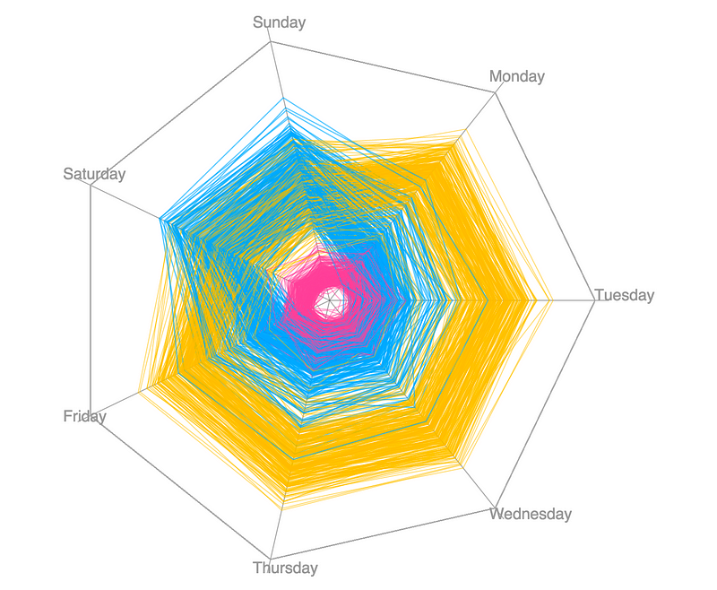 I would highly recommend you to
 procrastinate on check their website. You can also read a nice summary of their results here.
ps. You might want to check a few related links at the bottom of this post.
 I would highly recommend you to
 ps. You might want to check a few related links at the bottom of this post.
Quote of the Day
"Each of us knows that some of our opinions are wrong, and none of us know which they are. For if we did, they would not be our opinions."John Stuart Mill
Monday, November 9, 2015
Measuring segregation using patterns of daily travel behavior
Mental note: New paper in my reading list. Big names from transport/geography studies pushing the boundaries of segregation research by going beyond the debate on residential segregation.
Farber, S., O'Kelly, M., Miller, H. J., & Neutens, T. (2015). Measuring segregation using patterns of daily travel behavior: A social interaction based model of exposure. Journal of Transport Geography, 49, 26-38.
Abstract:
Recent advances in transportation geography demonstrate the ability to compute a metropolitan scale metric of social interaction opportunities based on the time-geographic concept of joint accessibility. The method we put forward in this article decomposes the social interaction potential (SIP) metric into interactions within and between social groups, such as people of different race, income level, and occupation. This provides a novel metric of exposure, one of the fundamental spatial dimensions of segregation. In particular, the SIP metric is disaggregated into measures of inter-group and intra-group exposure. While activity spaces have been used to measure exposure in the geographic literature, these approaches do not adequately represent the dynamic nature of the target populations. We make the next step by representing both the source and target population groups by space–time prisms, thus more accurately representing spatial and temporal dynamics and constraints. Additionally, decomposition of the SIP metric means that each of the group-wise components of the SIP metric can be represented at zones of residence, workplace, and specific origin–destination pairs. Consequently, the spatial variation in segregation can be explored and hotspots of segregation and integration potential can be identified. The proposed approach is demonstrated for synthetic cities with different population distributions and daily commute flow characteristics, as well as for a case study of the Detroit–Warren–Livonia MSA.
Thursday, November 5, 2015
The Racial Dot Map of Rio de Janeiro
A while ago, I've posted some of Bill Rankin's maps on segregation for different cities in the USA. Those maps got a lot public attention because they were innovative in the way they depicted racial segregation by representing each individual as one single dot and each ethnicity as a different color. Needless to say this approach gives a much better visual effect than traditional choropleth maps.
Inspired in Rankin's map, Nicolau de Gusmão (geography student from Sao Paulo) has created in a racial dot map of Rio. Pretty neat. He used data from the 2010 population census and he created the map using QGIS. His post is written in Portuguese, but you don't need to speak the language to appreciate the maps and get your own conclusion about segregation levels in Rio.
The difference between economic migrants and refugees
— Nando Sigona (@nandosigona) November 1, 2015
Wednesday, November 4, 2015
How bad is the problem of ghost cities in China?
More than more than 50 ghost cities:

You can download their study here and play around with the interactive map here.

[image credit: Guanghua Chi, Yu Liu, Haishan Wu]
Sunday, November 1, 2015
Assorted Links
- Fordlandia: The Failure Of Ford's Jungle Utopia ht Pablo Astudillo
- The most highly educated group of immigrants to the US are those from Africa (via William Easterly)
- The German radical Left Party wishes to deregulate walking
- Interactive map showing movement of refugees migrants to Europe since 2012 (via Population Europe)
- This Is What Happens When You Photoshop All The Men Out Of Politics
- Hack Your Way To Scientific Glory, or hot to manipulate your p-values to become publishable
- An incredibly detailed map of London in 1746
- Other things I'd rather be doing
- Welcome to Planet Voronoi, a Capital Place
Thursday, October 29, 2015
China is moving to a Two-Child Policy
Chris Buckley, reporting for the NYT.
Related Links:
The announcement came after the party’s Central Committee concluded a four-day meeting in a heavily guarded hotel in western Beijing where it approved proposals for China’s next five-year development plan, which starts next year. The terse announcement from Xinhua, the state news agency, about the sharp shift in family planning policy gave no details.
Related Links:
Monday, October 26, 2015
Growth and Decline of Urban Agglomerations in Germany
Ben Hennig has posted an interesting analysis on the changing geographies of city regions in Germany.
Annual Population change, 2008-2013
[image credit: Ben Hennig]
Related Links
Sunday, October 25, 2015
Friday, October 23, 2015
Can the Pope alleviate congestion ?
Apparently, yes. Not because of a miracle, though. (via The Overhead Wire and Robert Thomson)
A report prepared by staffer Wenjing Pu finds that “overall, a modest reduction in traffic volumes led to a significant reduction in congestion and an even larger improvement in travel time reliability on freeways, and transit ridership notably declined for the week” of the papal visit to the District, highlighted by many events on Sept. 23 and 24.
Traffic flow before the Pope's visit and on the day of his visit
[image credit: TPB]
Monday, October 19, 2015
Assorted Links
- Using Google Street View to map where sidewalks aren't good for wheelchairs
- Interactive Dot map visualizing the spatial distribution of jobs in the United States via Maps Mania
- 'A simple agent-based spatial model of the economy: tools for policy', by Bernardo Furtado
- Depth of field
- Planning a Metropolitan area for 130 million people (via MR)
- Tim Riffe is building a unified model of demographic time . Stay tuned.
- A camera that shoots 1 trillion frames per second
- Visualizing Algorithms Great link to loose you day learning some cool stuff
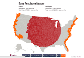
- The Equal Population Mapper (old link, but still pretty neat)
Monday, October 12, 2015
Build and they will come, or The Black Hole Theory of Highway Investment
"Initial investments in improved highway facilities result in greater ease of travel and hence altered travel patterns, including an increase in average trip length and in the number of trips being made. Over time, as shown in Figure 18.1, this increased demand stimulated by the initial investment in increased transport supply fuels the need for even more facilities, and the feedback process repeat itself. This familiar phenomenon has been called the black-hole theory because some people claim that investing in highways is like throwing money into a black hole" (Plane, 1995 p.439)
Reference:
- Plane, D. A. (1995). Urban transportation: policy alternatives. In Hanson & Giuliano (Eds.) The geography of urban transportation. (2nd ed.) New York ; London: Guilford Press.
Sunday, October 11, 2015
Thursday, October 8, 2015
Compare the subway systems of Rio and Shanghai between 1979 and 2014
A nice GIF comparing the expansion of the subway systems in Rio de Janeiro and Shanghai between 1979 and 2014.
[image credit: ? via Lucas Gaspar on FB]
We've seen this before, but I couldn't resist posting this GIF (it covers a wider time span, it is quite straightforward and I love gifs
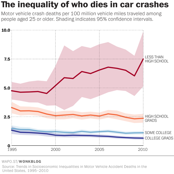
The hidden inequality of who dies in car crashes
Emily Badger has written an interesting piece on The Washington Post covering a recent study that discuss socioeconomic inequalities in car crashes in the US between 1995 and 2010.
Friday, October 2, 2015
Sunday, September 27, 2015
Assorted Links
- Taking Data Visualization From Eye Candy to Efficiency
- Fuck Nuance, a manifesto for more bold social theories, by Kieran Healy (via Analise Real)
- Machine Learning Classes at Oxford (videos, presentation and code)
- 2015 Ig Nobel prizes: a study shows that nearly all mammals take the same amount of time to urinate (about 21 seconds)
- There is a Space Syntax Toolkit for QGIS (ht Renato Saboya, who runs a great blog about urbanism written in Portuguese: Urbanidades)
- 10 things you need to know about the Magna Carta
- Slum tourism and its discontents. Not exactly a new article but a good summary of arguments (ht Fabiana Freitas, my lovely partner)
- The Value of Democracy: Evidence from Road Building in Kenya [unagated paper]
-

Thursday, September 24, 2015
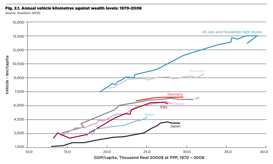
How much do Americans drive compared to other countries?
This comes from a new report published by LSE Cities. Commentary by Richard Florida and Aria Bendix here.
Annual vehicle kilometres per person against wealth levels: 1970-2008
Wednesday, September 23, 2015
Saturday, September 19, 2015
The Human Hemisphere
We have seen Bill Rankin's inventive map of the World Population Distribution by lat long. More recently Bill has come with other ways of thinking our hemispheres. Here is my favourite one.
ps. On a related topic, here is map showing how geographically unbalanced the distribution of the world population is.
Redefining Urban Futures
Nice presentation by Kent Larson summarizing some of the projects they have been developing at MIT Media Lab and that are contributing to redefine the future of our cities, in some way.
I wouldn't say these ideas are new, revolutionary or even disruptive in a way that will solve the most pressing issues in most cities for every one. However, the work of Kent and his team make an enormous difference in bringing these ideas closer to reality.
I wouldn't say these ideas are new, revolutionary or even disruptive in a way that will solve the most pressing issues in most cities for every one. However, the work of Kent and his team make an enormous difference in bringing these ideas closer to reality.
Friday, September 18, 2015
Before there was ggplot
Before Hadley Wickham was born, when there was no ggplot, this is how people used to create maps using small multiples (nice example here).
Results of the US Presidential Election from 1789 to 1876, published in 1877
Wednesday, September 16, 2015
Transport disruptions, big data and travel behavior
A new discussion paper shows how a strike in the underground system of London could actually improve general welfare and make individuals' travel behavior more efficient. (via Tyler Cowen).
Abstract: We estimate that a significant fraction of commuters on the London underground do not travel their optimal route. Consequently, a tube strike (which forced many commuters to experiment with new routes) taught commuters about the existence of superior journeys -- bringing about lasting changes in behaviour. This effect is stronger for commuters who live in areas where the tube map is more distorted, thereby pointing towards the importance of informational imperfections. We argue that the information produced by the strike improved network-efficiency. Search costs are unlikely to explain the suboptimal behaviour. Instead, individuals seem to under-experiment in normal times, as a result of which constraints can be welfare-improving.
The researchers examined 20 days' worth of anonymised Oyster card data, containing more than 200 million data points, in order to see how individual tube journeys changed during the London tube strike in February 2014.
Here is a very interesting point to emphasize and that I'm sure cartographers will like: "The London tube map itself may have been a reason why many commuters did not find their optimal journey before the strike. In many parts of London, the actual distances between stations are distorted on the iconic map. ... the researchers found that those commuters living in, or travelling to, parts of London where distortion is greatest were more likely to have learned from the strike and found a more efficient route."
Soundtrack:
Tuesday, September 15, 2015
The shifting patterns of how Londoners live and work
Here is an interesting piece about passenger trends in London’s Underground system since 2001 and how this piece of information helps us better understand how the city's economy is changing (I saw this via Iain Docherty).
One obvious change in passenger patterns captured by this chart shows the notion of 'peak time' has widened over the past fifteen years or so. As the article suggest, this is likely a reflex of some of the changes observed both in the labor market (with the increase in the number of workers that are self-employed and have more flexible time shifts) and in the housing market, where the prohibitive housings costs of London are pushing people farther from the city.
Thursday, September 10, 2015
Assorted Links
- The changing gap between male and female life expectancy in the UK
- Till Nagel is starting a collection of bike visualizations (maps, flows, timelines…)
- Great piece at The Economist on the role of land in modern economies and the role of housing wealth in rising inequality ht Leo Monasterio
- A real-time map of cyber attacks via @flowingdata
- Nice interactive version of Schelling's Segregation Model in JavaScript
- London's historic road network from Roman Times to today
- Other things I'd rather be doing
- A new tool from Google can estimate the total sunlight a rooftop receives throughout the year
- Visualizing usage patterns of the bike sharing scheme in Philadelphia, by Randal Olson
Wednesday, September 9, 2015
Returners and explorers dichotomy in human mobility
Pappalardo, L., Simini, F., Pedreschi, D., Barabasi, L. et al. (2015). Returners and explorers dichotomy in human mobility. Nature Communications, 6. doi:10.1038/ncomms9166
Abstract:
The availability of massive digital traces of human whereabouts has offered a series of novel insights on the quantitative patterns characterizing human mobility. In particular, numerous recent studies have lead to an unexpected consensus: the considerable variability in the characteristic travelled distance of individuals coexists with a high degree of predictability of their future locations. Here we shed light on this surprising coexistence by systematically investigating the impact of recurrent mobility on the characteristic distance travelled by individuals. Using both mobile phone and GPS data, we discover the existence of two distinct classes of individuals: returners and explorers. As existing models of human mobility cannot explain the existence of these two classes, we develop more realistic models able to capture the empirical findings. Finally, we show that returners and explorers play a distinct quantifiable role in spreading phenomena and that a correlation exists between their mobility patterns and social interactions.
[image credit: Pappalardo et al. 2015]
Tuesday, September 8, 2015
Saturday, September 5, 2015
Friday, September 4, 2015
Where Are the Syrian Refugees Today?
Hans Rosling (aka the Mick Jagger of statistics) in an informative three-minute video about the Syrian Refugees.
Monday, August 31, 2015
Some migration and refugee trends
Tow daily charts from The Economist, showing the Annual immigration flow into the US since 2000 and the number of refugees by country of origin since 1975.
+ this interesting piece in the NYT showing the number of migrants and refugees applications between January to June this year for different European countries.
Thursday, August 27, 2015
Data visualization with R: geographic networks
I just bumped into this blog from a team at SNAP, where Matthew Leonawicz and his colleagues share some great data visualizations they've been creating with R (and some code snippets). Here are two nice examples of geographic networks on a flat map and on a 3D model of the Earth.
This is very similar to the work of James Cheshire (UCL) on mapping the World’s Biggest Airlines, global migration and commuting patterns. Neat stuff. I've just added their blog to my feedly.
  |
[image credit: Matthew Leonawicz]
Quote of the Day
"The social sciences makes something everyone understands but no one is interested in and turns it into something no one understands and everyone seems interested in."
(Tony King on a lecture titled "The Tale of Three Cities") ht Kelsi Nagy
Tuesday, August 25, 2015
The Globe of Economic Complexity
The Atlas of Economic Complexity is a project born from the collaboration between Cesar Hidalgo (MIT) and Ricardo Hausmann (Harvard). The Atlas has an online tool with interactive chars and maps that enables users to visualize a country’s total trade, track how these dynamics change over time and explore growth opportunities for more than a hundred countries worldwide.
More recently, the project has resealed a new visualization tool, the Globe of Economic Complexity (created by Owen Cornec and Romain Vuillemot.). The Start Intro is quite hypnotic, perfect for a few hours of curious procrastination.
Latest project: The Globe of Economic Complexity http://t.co/qzFDmZeX7r coded by Owen Cornec @WikiGalaxy #webgl pic.twitter.com/jb9gyR6o3w
— Romain Vuillemot (@romsson) August 25, 2015
Tuesday, August 18, 2015
A Cheat Sheet for Raster analysis in R
Etienne Racine has written a great Cheat Sheet for Raster analysis in R. Some of you might find it useful as well.
|
|  |
|
|


