Friday, January 30, 2015

Geographic Effects on Intergenerational Income Mobility

Another paper to my never ending reading list (ht Flavia Feitosa)

Rothwell, J. T., & Massey, D. S. (2015). Geographic Effects on Intergenerational Income Mobility. Economic Geography, 91(1), 83-106. Ungated version here.

Abstract:
Research on intergenerational economic mobility often ignores the geographic context of childhood, including neighborhood quality and local purchasing power. We hypothesize that individual variation in intergenerational mobility is partly attributable to regional and neighborhood conditions—most notably access to high-quality schools. Using restricted Panel Study of Income Dynamics and census data, we find that neighborhood income has roughly half the effect on future earnings as parental income. We estimate that lifetime household income would be $635,000 dollars higher if people born into a bottom-quartile neighborhood would have been raised in a top-quartile neighborhood. When incomes are adjusted to regional purchasing power, these effects become even larger. The neighborhood effect is two-thirds as large as the parental income effect, and the lifetime earnings difference increases to $910,000. We test the robustness of these findings to various assumptions and alternative models, and replicate the basic results using aggregated metropolitan-level statistics of intergenerational income elasticities based on millions of Internal Revenue Service records.

Thursday, January 29, 2015

Taxi vs Public Transit in major US cities

Nate Silver has recently published a nice piece in his blog comparing the travel time performance of taxis (usin data from Waze) vs public transit (using GTFS data behind Google Maps). Nate compared average journeys from the Airport to downtown during weekdays in major US cities. Here is the result:

[image credit: Allison Mccann 538]

Monday, January 26, 2015

Sunday, January 25, 2015

Quote of the Day

“You are the average of the five people you spend the most time with.”
(Jim Rohn)    


Not sure about the math, but I quite like the general idea.

Thursday, January 22, 2015

Street art + Satellite pictures

Street art + Satellite pictures = the world's largest GIF, by INSA

[image credit: BALLANTINES]

More info here:


Tuesday, January 20, 2015

Monday, January 19, 2015

The Big Data trap

Tim Harford's talk on the perils of big data at the Royal Statistical Society (RSS):


Here is a short summary of one of the main arguments:
Hidden biases in data are a problem. Even the largest of datasets have bits of information missing. Quoting Microsoft researcher Kate Crawford, Harford said one might think they have all the data, but there will always be people missing from any dataset.

To illustrate this, Harford pointed to the City of Boston's Street Bump smartphone app - a clever idea to tackle the problem of potholes. Bostonians were encouraged to download the app and set it running when out in their cars so that when their vehicles hit a pothole, the bump would be recorded by the phone's accelerometer and location data sent to the city's public works department. What happened, of course, was that most of the potholes that were identified and fixed were those in young, affluent areas - areas where people owned smartphones and could download the app.

City officials might have thought they had found a way to record every pothole, but that wasn't the case. As Harford concluded: "Some might think we are now able to measure everything; that we can turn everything into numbers. But we need to be wise enough to know that is always an illusion."

Sunday, January 18, 2015

Urban Picture

Canton Valais, Switzerland

[image credit: Jean Revillard via NYT]

Thursday, January 15, 2015

Wednesday, January 14, 2015

The multilayer network of public transport in the UK, now available

Riccardo Gallotti and Marc Barthelemy have recently published an interesting paper on the Anatomy and efficiency of urban multimodal mobility.

As a by-product of their research, they have also made a great contribution to transport studies in the UK. This is because the data they gathered on the UK public transport system are now made available. This includes a really large multi-modal system with flights, rail, ferry, coach, subway, bus, tram, light rail, etc

Thanks to Gallotti and Barthelemy, you can easily have access to all these data for free, here !


[image credit: Gallotti and Barthelemy, Rendered with MuxViz]


[image credit: Gallotti and Barthelemy, Rendered with MuxViz]

Monday, January 12, 2015

Assorted links


  1. The Best Satellite Images of 2014

  2. Extrapolating the backgrounds of famous art with machine learning

  3. We've Been Incorrectly Predicting Peak Oil For Over a Century

  4. Forbes Magazine has recently published their list of 30 Under 30 Science, with brightest scientists in 15 different fields under the age of 30. A huge congrats to my Department friend John Mittermeier ! Mom, I told you I'm not on the list! By the way, John has some amazing photos as well

  5. The most detailed tweet map ever, with 6 Billion Tweets (high definition), by Eric Fischer

  6. A great selection of the best Data Visualizations of 2014

  7. The Reversal of the Latitude-Income Correlation

  8. A Fully Interactive Map of the Middle Earth, from The Lord of the Rings

  9. The Modern Beauty of 19th-Century Data Visualizations

US population composition by place of birth, 1790-1890
[click on the image to enlarge it]
[image credit: 1870s statistical atlas, via Laura Bliss]


Saturday, January 10, 2015

Explore urban dynamics with LuminoCity3D

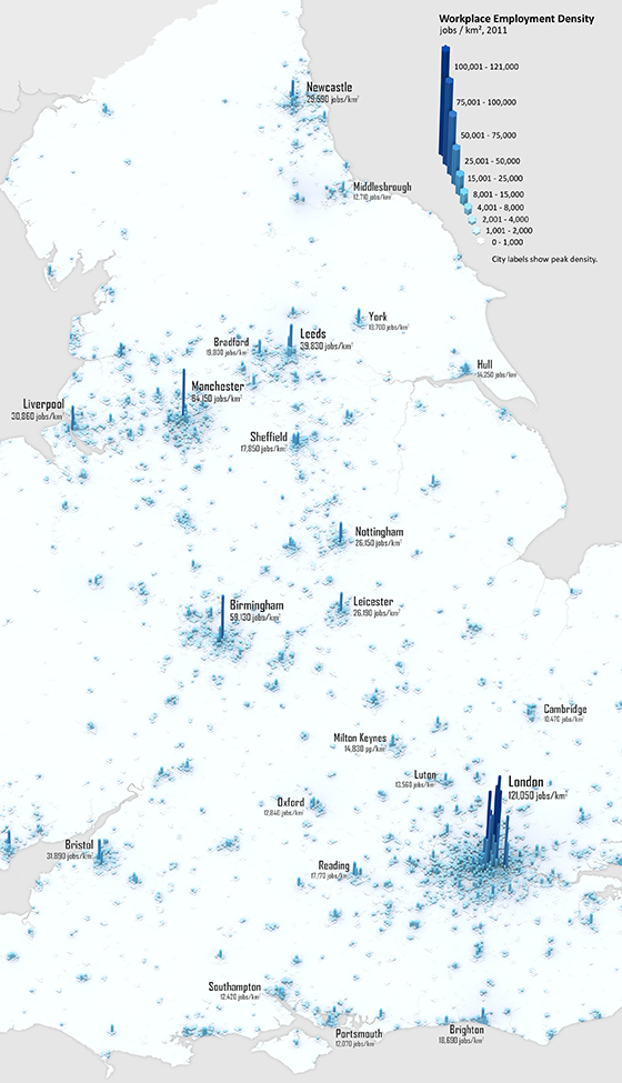
If you didn't have internet connection during 2014, you might have missed some of the  buzz around LuminoCity 3D (more info here). This is probably the best interactive tool for visualizing and exploring the 2011 Census data of the UK*. 
It brings data from a wide range of topics. For example, it makes  it possible to visualize urban growthanalyze household energy use or compare living and working densities in cities across England and Wales, etc.


LuminoCity 3D is a project by Duncan A.Smith (CASA/UCL), who also runs the great blog 'City Geographics'. obs. It is such a great project that I fill a bit embarrassed that I'm only posting about it now.

Workplace Employment Density, 2011
[click on the image to enlarge it]
[image credit: Duncan Smith]


Journey-to-work flows
[image credit: Duncan Smith]


* DataShine is a similarly great project, by Oliver O’Brien (CASA/UCL). 

Thursday, January 8, 2015

Nobel Dialogue on Population Aging

The Nobel Week Dialogue of last year was dedicated to the topic of population aging, with many interesting presentations (ht Population Europe and Bernardo Queiroz). I liked these two sessions in particular, but other presentations are also available here.


Related Links: